
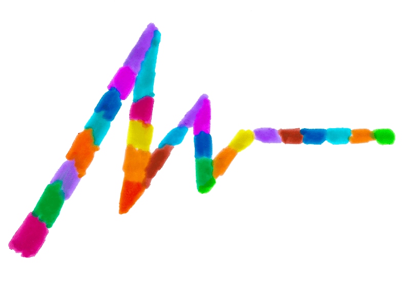
When it comes to type, I bloom
Over time, I’ve explored a wide range of creative outlets—acting, drumming, bookbinding, poetry slams (very millennial, I know), and even art made with duct tape. But nothing has captivated me quite like working with letters, and nothing is closer to my heart.
I’m a curious person who moves with the times—without jumping on every trend. I have a deep love for the city of Bern, its people, and the Bernese Dialect. I enjoy dancing to techno, and if you ever find yourself at the beautiful Bremgarten Cemetery near my studio, you might just spot me there meditating.
Even as a child, I loved crafting, drawing, and writing letters. If I could have seen into the future back then, I think I would have been very happy to know that I’d turn this passion into a profession in a related form.
Art sales, graphic design commissions
Tell me…
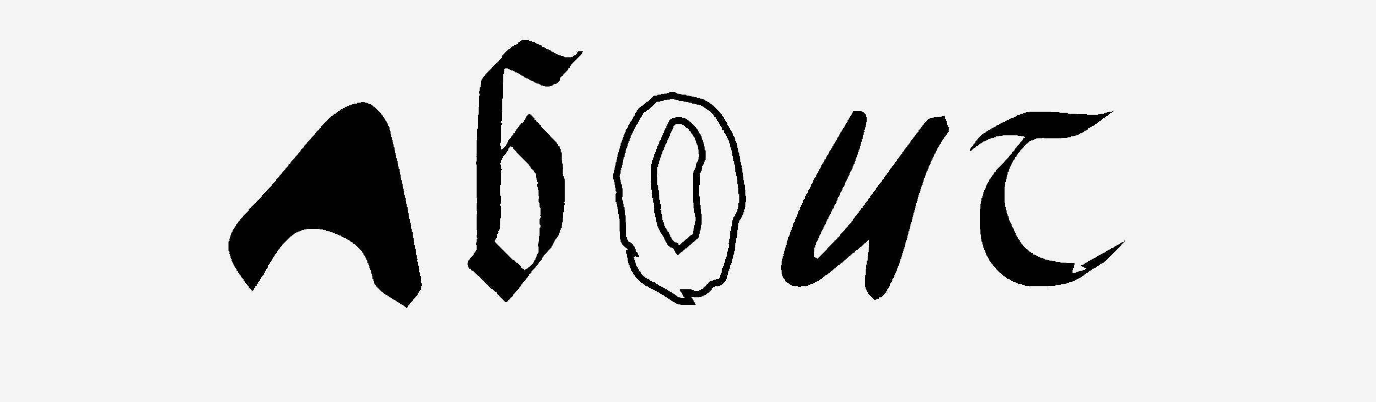
Your favourite font?
Other long-time favorites and regular contenders for my next favorite typeface:
- ‹Frutiger› by Adrian Frutiger,
- ‹Neue Haas Unica› by Toshi Omagari
- ‹Franklin Gothic› by Morris Fller Benton
- ‹Trebuchet MS› by Vincent Connare
- ‹Rotis› by Otl Aicher
- ‹FF Meta› by Erik Spiekermann
- ‹Centaur› by Bruce Rogers
Hidden talent?
I give brilliant movie recommendations.
Heroes?
In the world of type: Adrian Frutiger and Zuzana Licko. Outside of it: Sophie Hunger and Helge Schneider.
Strengths?
I’m a good listener and can handle criticism well.
Weaknesses?
No, I won’t dance around it and just say “perfectionism.” In my case, it’s sometimes almost the opposite: I can be too quick to settle for a result and, as a consequence, miss out on better or more meaningful options. I’m aware of this weakness and actively try to approach projects with a calm mind and more patience—especially when it comes to early, direction-defining decisions.
Why type?
I’m always open to good conversations, but I’m generally a rather calm, introverted person. With type, I can express myself without saying a word. I also like the idea that good typography helps spread knowledge and gives language its form.
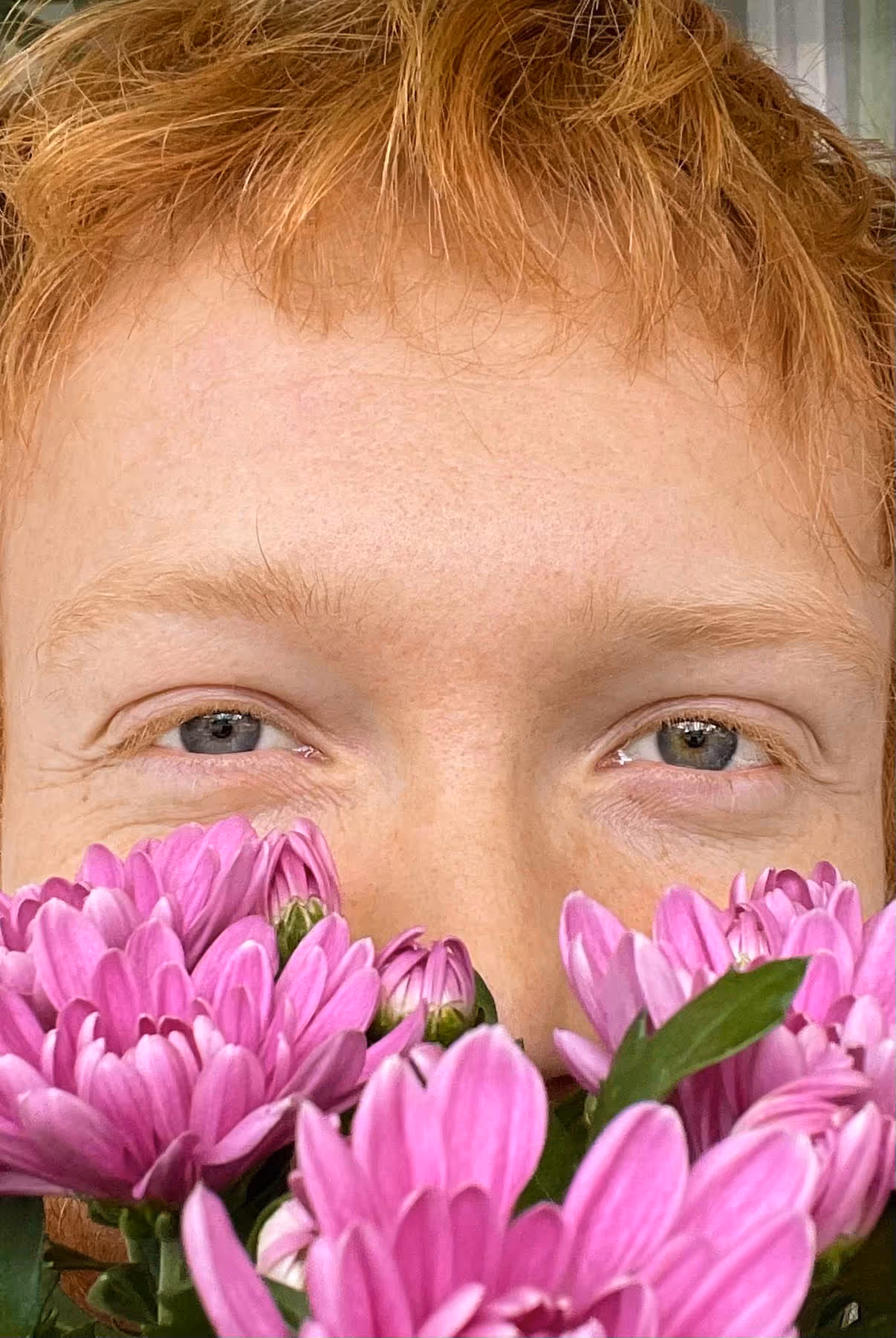
What’s it like being a redhead?
It’s alright. But you definitely stand out.
Notable experience?
I spent three months in Iceland. During that time, I read a lot and had the space to reflect on myself and the world. It did me good. I returned to Switzerland feeling refreshed and full of new energy.
Who is der utan?
Under this artist name I create artworks on the side, including type art. The website der-utan.ch features a selection of 20 artworks available for purchase..ch I show a selection of 20 works.
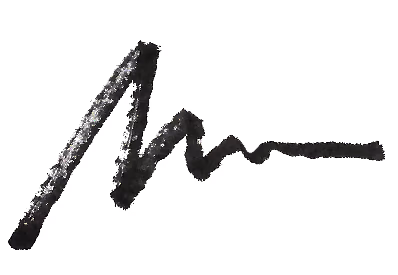
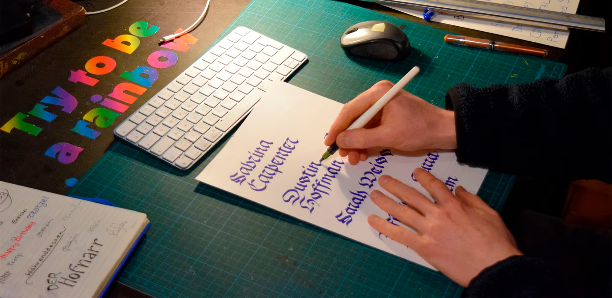
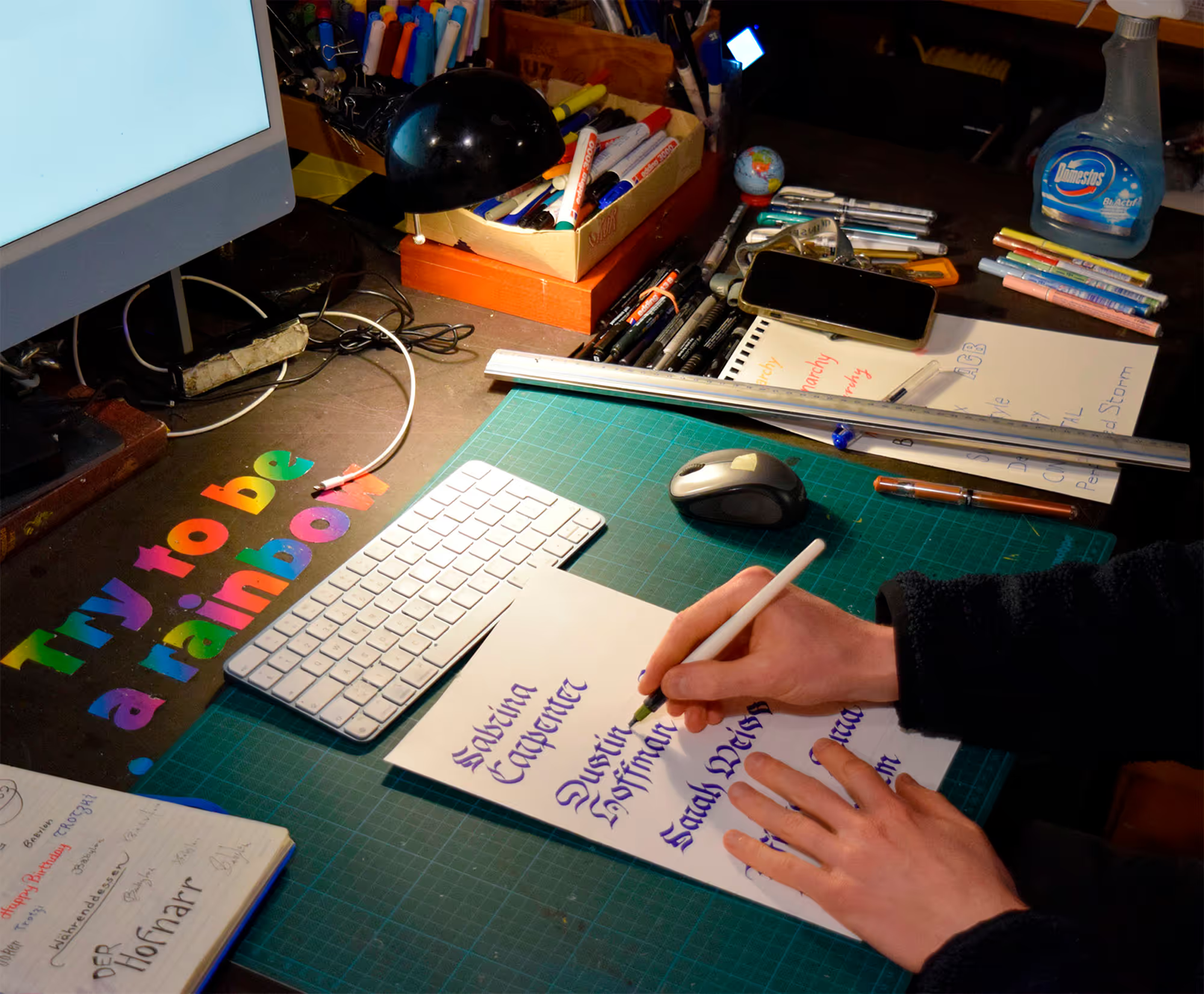
What does your handwriting look like?
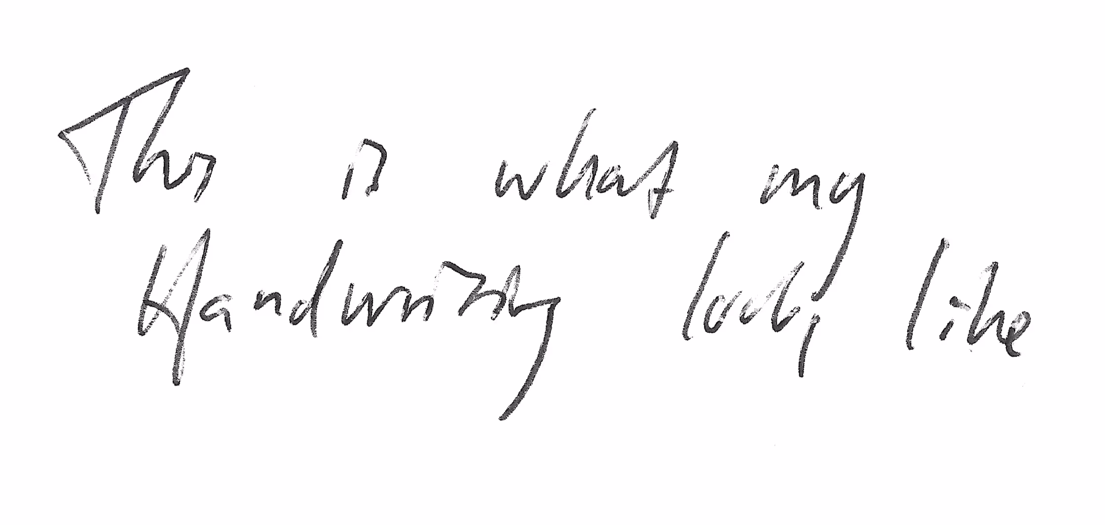
Voilà. Pretty messy scribbles for a lettering artist, aren’t they? Sometimes I feel like my mind gets a little scrambled from all the different lettering and calligraphy styles I practice and work with.
.gif)