


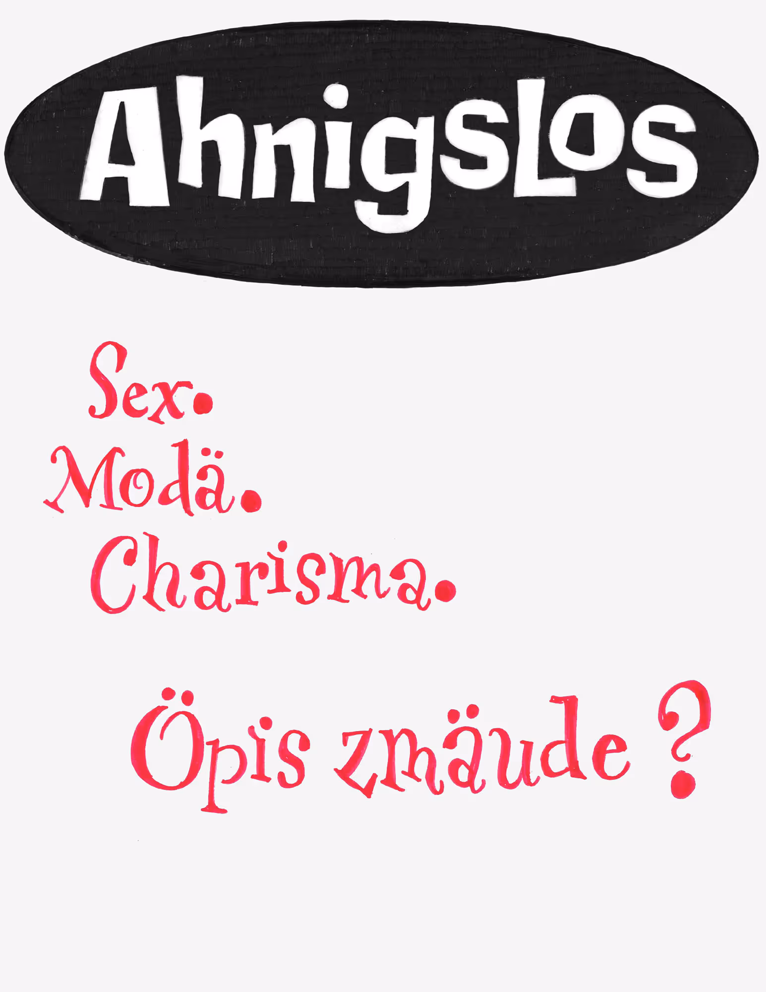
Fonts in use in the logo: • ‹RL Horizon› by Radek Łukasiewicz (radluka) • ‹AM Assab› by Alessandro Bombieri (CAST)


No items found.
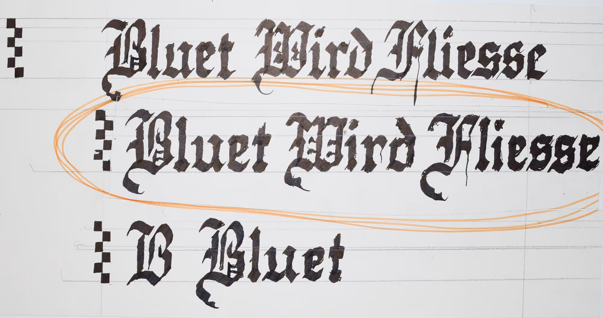
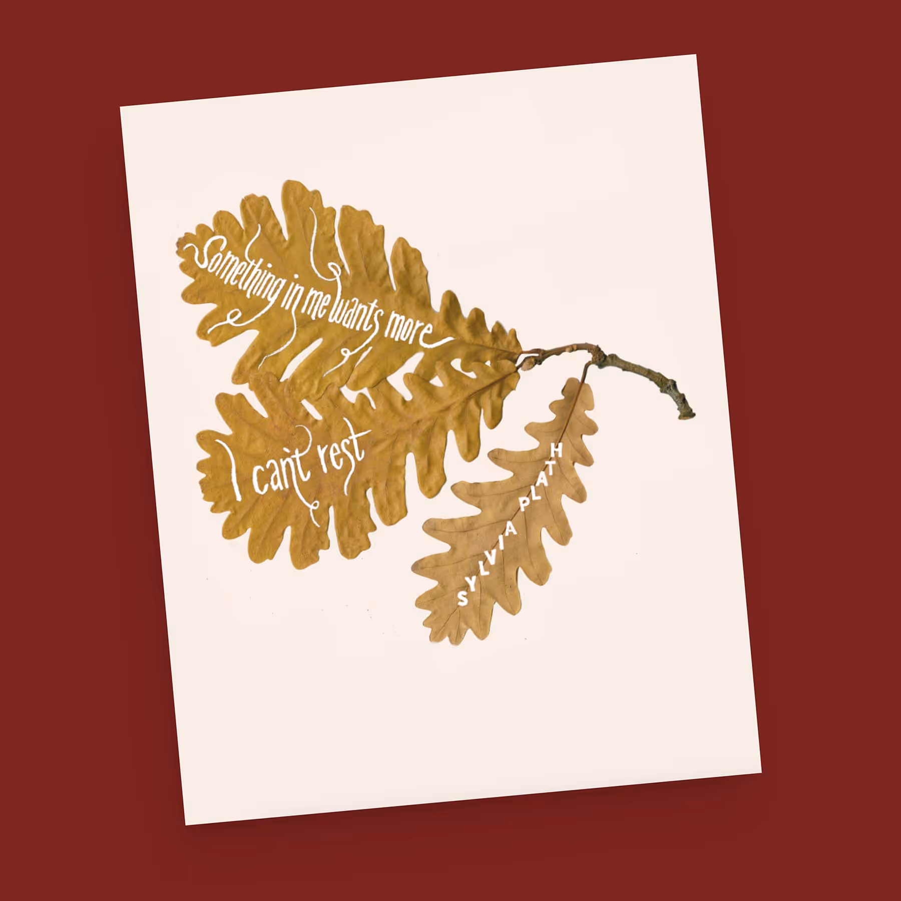
The lettering for “There Will Be Blood” was particularly interesting. It’s a Fraktur and I achieved the rough texture through a slight trembling motion while writing with a broad nib pen.


No items found.
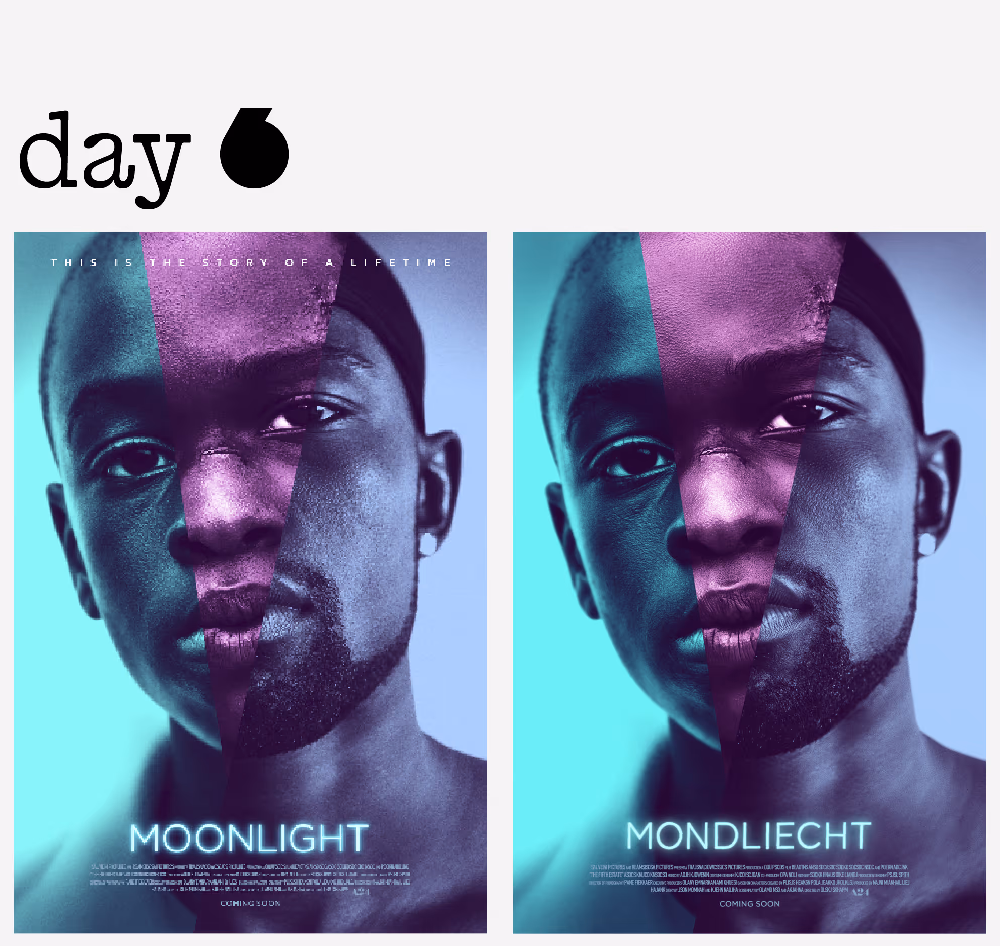
“All That Jazz” was quite a challenge. The lettering on the original American poster is a photograph of a scaffold made of light bulbs, in a typical Broadway style. The unusual perspective added to the difficulty. The imitation of the glowing effect almost happened by accident when I slightly smudged the ink; After inverting the lettering from black to white, the soft glow became visible. "Mondliecht" (Day 6) also features a glow, but in that case I created it through digital post-processing. Compared to that, I find the analog effect in "Die ganzi Chose" more elegant and closer to the spirit of analog lettering.


No items found.
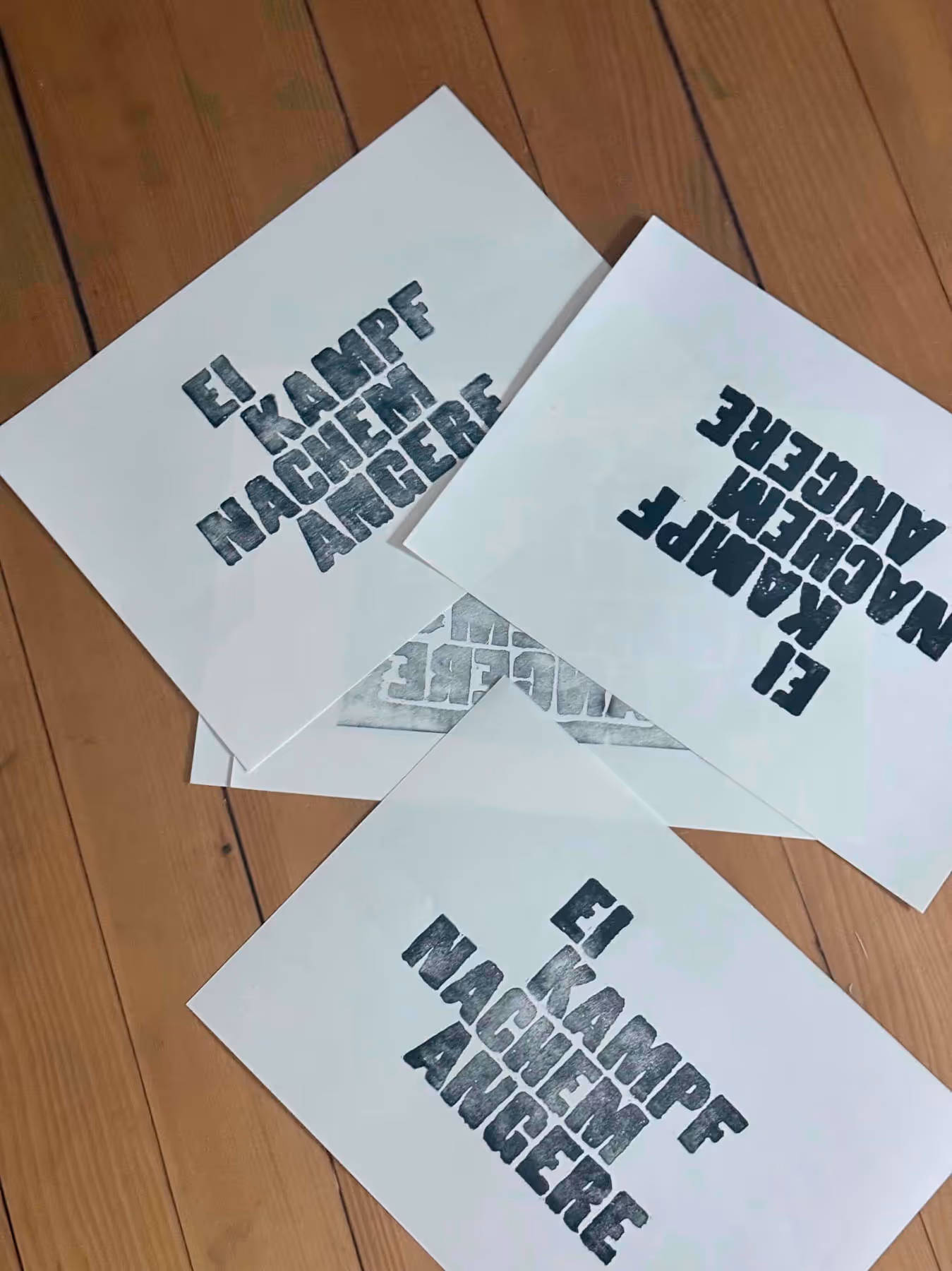
The designer of the original poster, Bill Nuske (above, yellow T-shirt), printed the lettering using wood type. This inspired me to have my own lettering produced as a linocut print by my friend Richard Cervenka of RC Prints. It was worth it—the type looks even better in print and is much closer to the spirit of the original reference.


No items found.
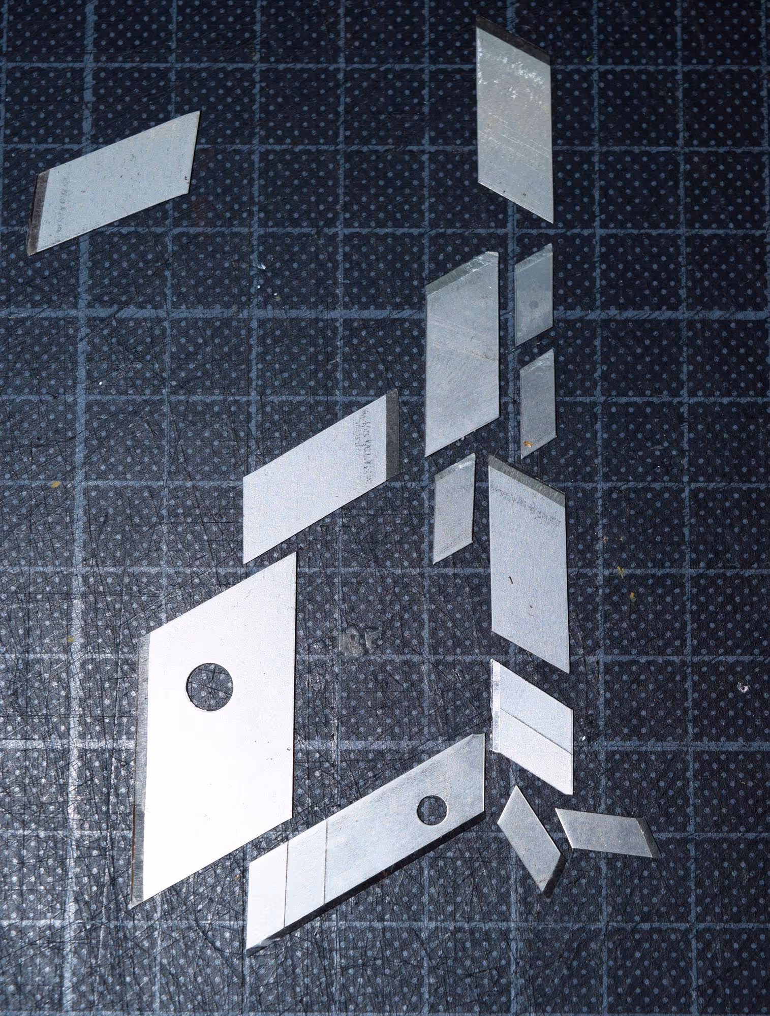
With “Uncut Gems,” I deviated for the first time from my previous approach of recreating lettering as closely as possible to its original form. The Japanese knife blades I used—ones I've collected over the years—fit the film's mood perfectly. The resulting typeface, with its arrangement of blades, almost takes on the character of a blackletter face.
Challenges & Solutions
×
Goals | Challenges | Solutions | Learnings
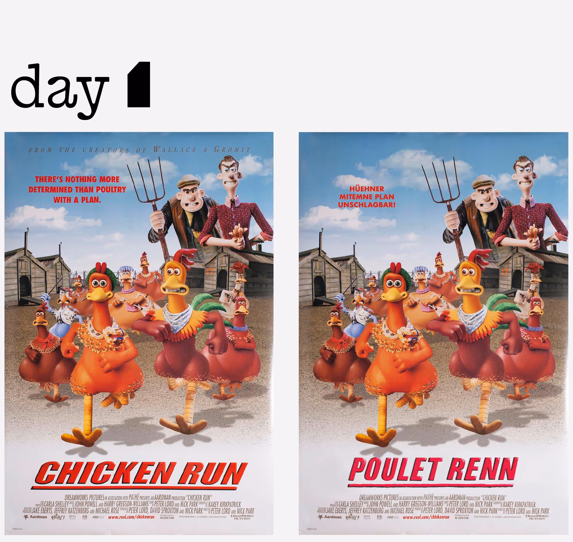
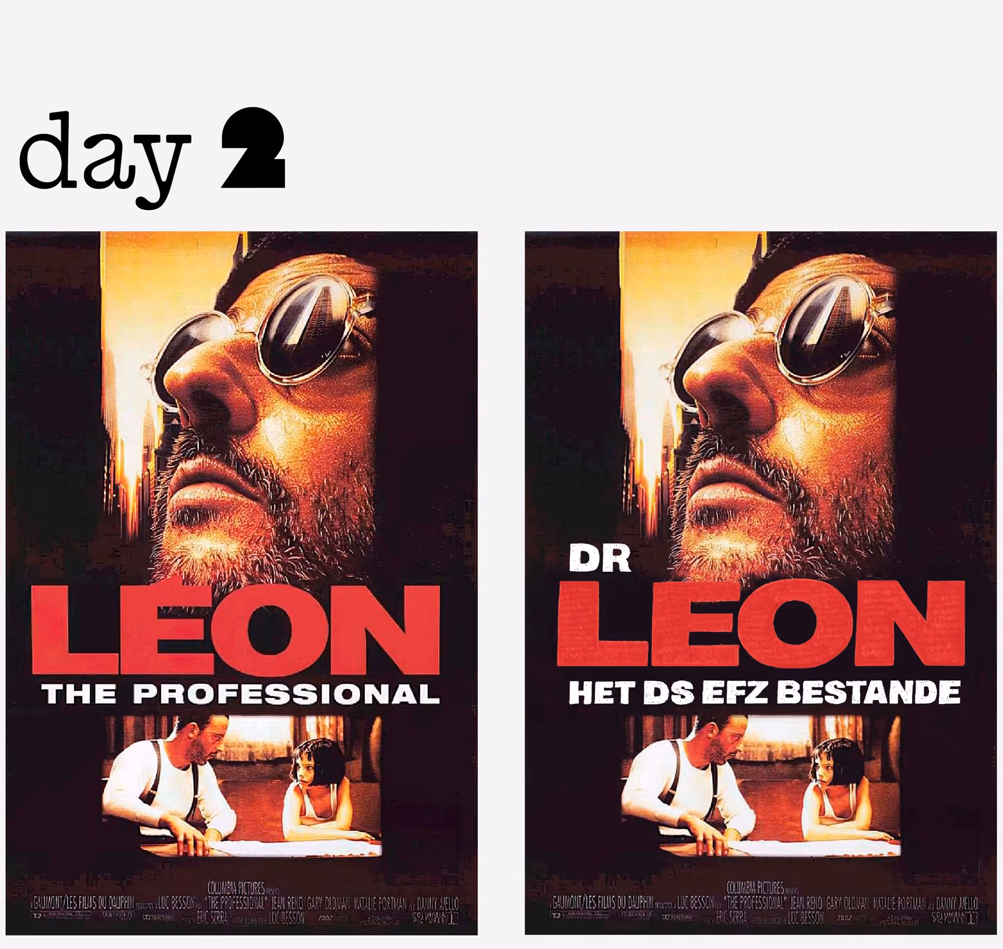
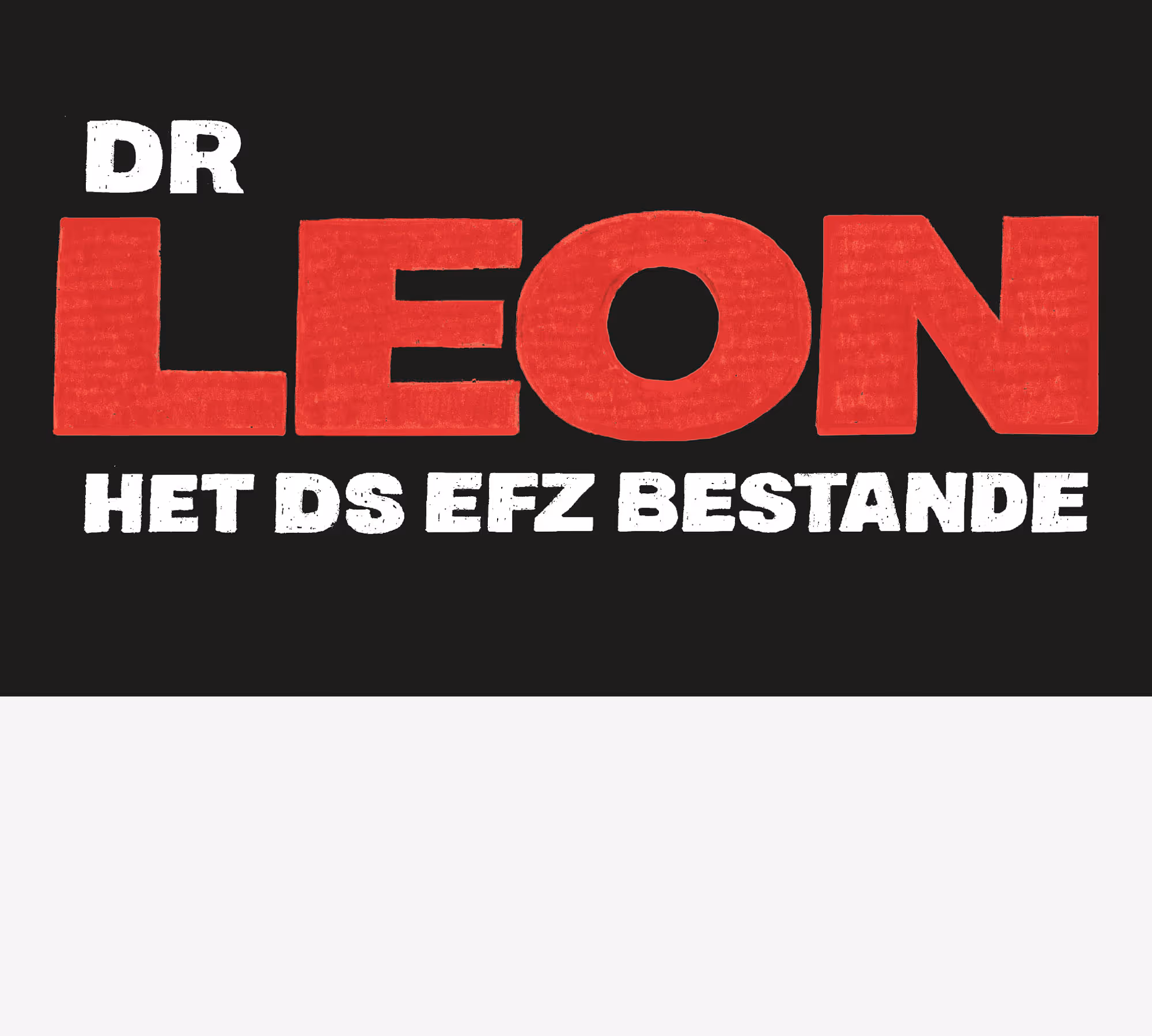
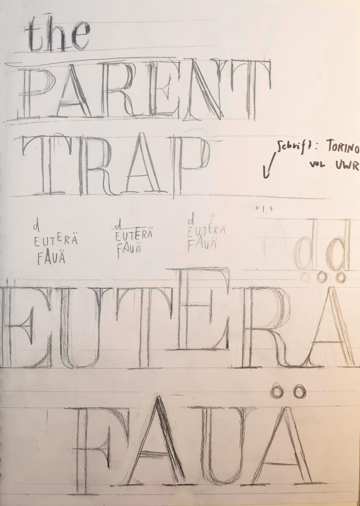
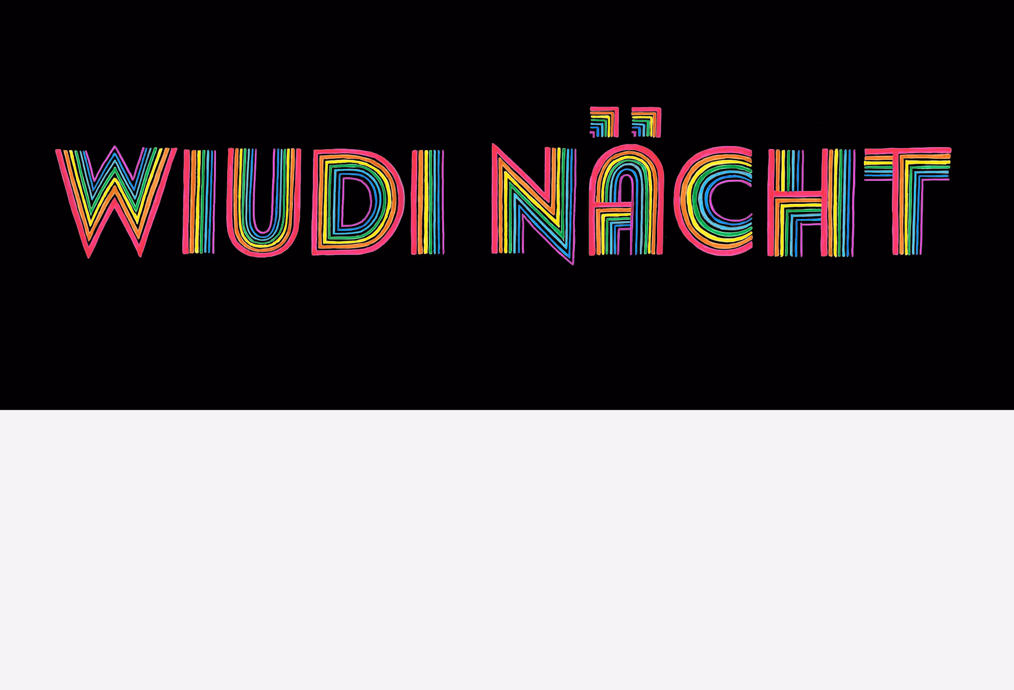
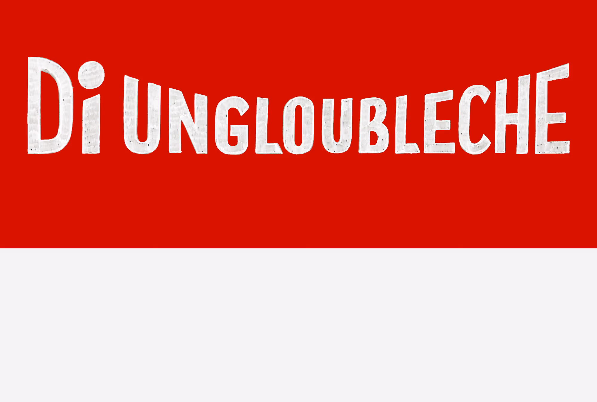
The concept of the “100-Days Project” was introduced by Michael Bierut as a graphic design professor at Yale University. He wanted to show his students what can be achieved in 100 days. The challenge is typically intended for simpler creative exercises, such as taking a daily photo at the same street corner or making one collage per day. I may have taken on a bit too much with this project—especially with the additional work of producing videos about the process. In order to maintain quality and not exhaust my creative energy, I now create a poster every second day. As long as I end up with 100 Swiss German film posters, I’m satisfied. Through this project, I learn about the composition of film posters, train my eye for type recognition, and expand my lettering skills. The most difficult film titles to letter are those that seem the simplest at first glance: sans-serifs like Helvetica or Gotham—precisely because of their constructed nature. In addition, I’m learning how to present the results in short, engaging video formats. I also collect all sketches and outcomes in a dedicated large-format book.
Goals | Challenges | Solutions | Learnings
The concept of the “100-Days Project” was introduced by Michael Bierut as a graphic design professor at Yale University. He wanted to show his students what can be achieved in 100 days. The challenge is typically intended for simpler creative exercises, such as taking a daily photo at the same street corner or making one collage per day. I may have taken on a bit too much with this project—especially with the additional work of producing videos about the process. In order to maintain quality and not exhaust my creative energy, I now create a poster every second day. As long as I end up with 100 Swiss German film posters, I’m satisfied. Through this project, I learn about the composition of film posters, train my eye for type recognition, and expand my lettering skills. The most difficult film titles to letter are those that seem the simplest at first glance: sans-serifs like Helvetica or Gotham—precisely because of their constructed nature. In addition, I’m learning how to present the results in short, engaging video formats. I also collect all sketches and outcomes in a dedicated large-format book.

.gif)
© MW 2026 | Made with ❤ in Webflow
“Of all the achievements of the human mind, the birth of the alphabet is the most momentous.”
Frederic Goudy