


8 min read
April 2026
Gossip
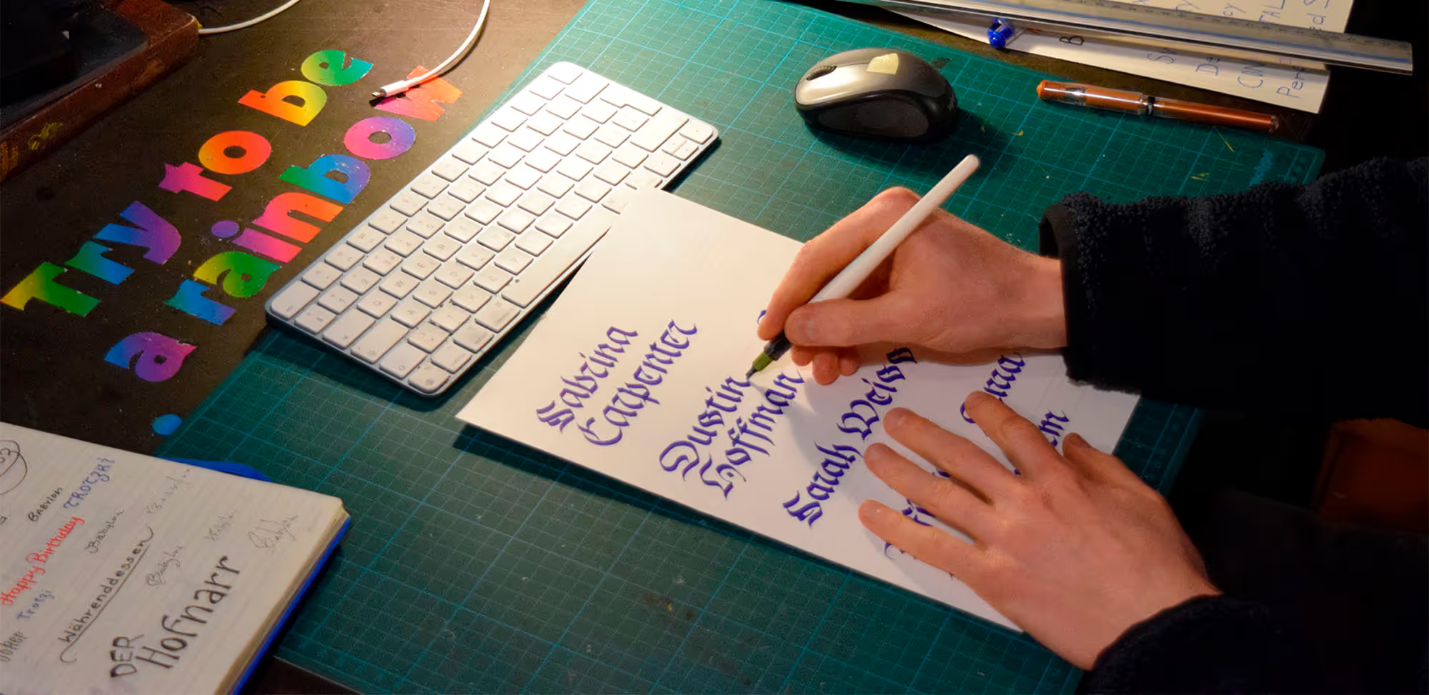
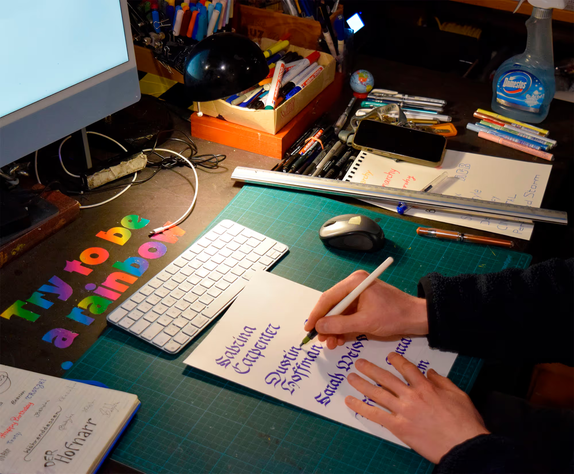
One day, when I picked up a small box labelled “FREE” from the street, I had no idea what would emerge from its contents.
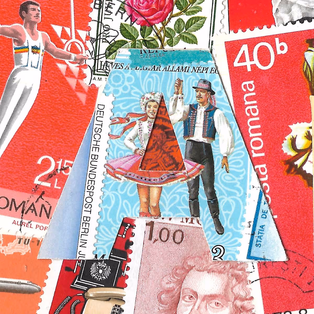
The box contained a good number of postage stamps. As a child, I was an avid collector and loved browsing the stamp catalogue, always hoping to find a valuable piece—unsuccessfully. As a lettering artist, my first thought was naturally: why not write with stamps? When I spread the finds out on the table, however, I initially found it more interesting to sort them by colour. With this almost instinctive approach, the foundation for the first composition was laid. I then sourced a high-quality, large-format handmade paper and began to glue the stamps in place.

No items found.
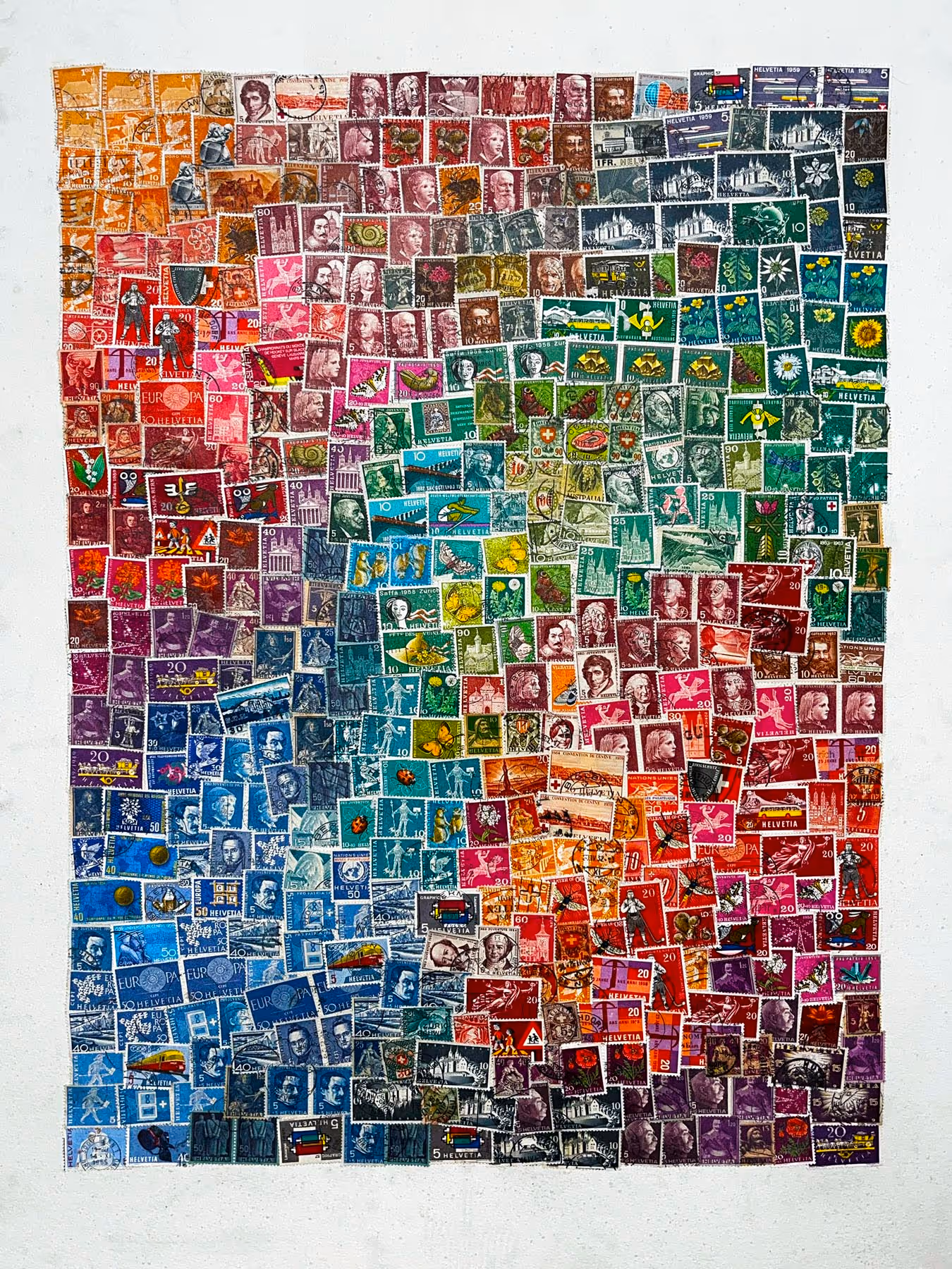
I titled the piece “Gossip.” I liked the idea that each of these stamps, in some way, helped transmit messages—birthday greetings, love notes, important correspondence, or perhaps even gossip and rumours. The work consists of approx. 400 Swiss postage stamps, mostly from the 1960s. The luminous colour gradients, best perceived from a certain distance, feel surprisingly contemporary and are reminiscent of modern visual languages such as Instagram. This creates a striking contrast with the aged stamps.

‹Gossip›, 2024, 57 × 77 cm | SOLD
Frutiger
The lettering is part of the work and set in “Frutiger Neue,” a typeface developed specifically for the Swiss Post as its corporate typeface, based on the timeless “Frutiger” by Adrian Frutiger. When I contacted the Swiss Post art collection to ask whether they would be interested in the piece, I was unsuccessful. However, their stamp magazine “Die Lupe” did publish a short article about the work, alongside other artists who also work with postage stamp art.
Artikel zum Bild
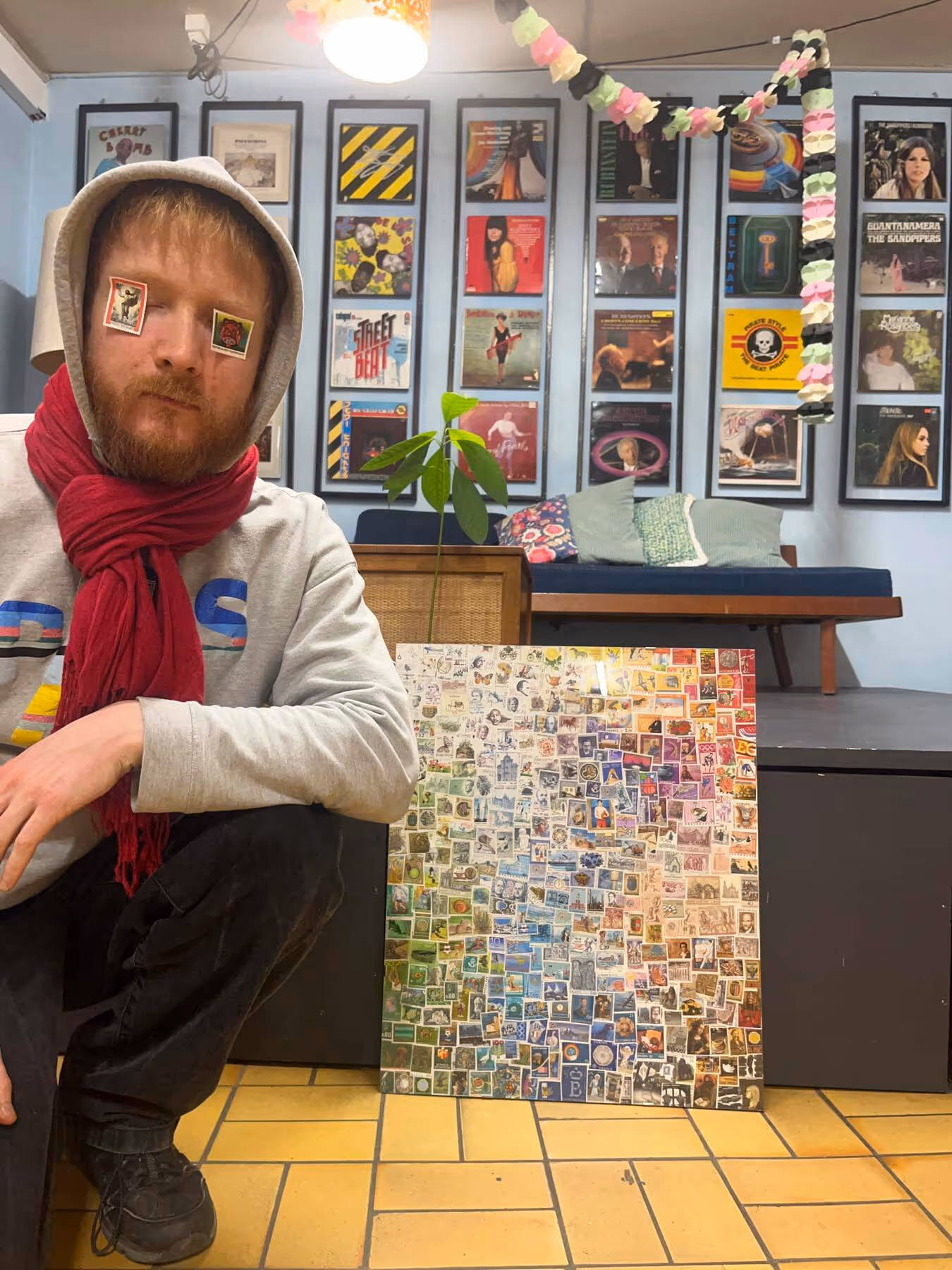
When I shared the piece on social media, I eventually did find a buyer, and I also received two additional commissions for stamp-based works.

No items found.
“Gossip Vol. 2”, 2025, 40 × 60 cm, commissioned work | The colour gradients are more subtle than in “Gossip,” as I had a more limited selection of stamps due to the specified year range. Another difference: this piece is full-bleed, whereas in the first work the stamps themselves form the frame.


No items found.

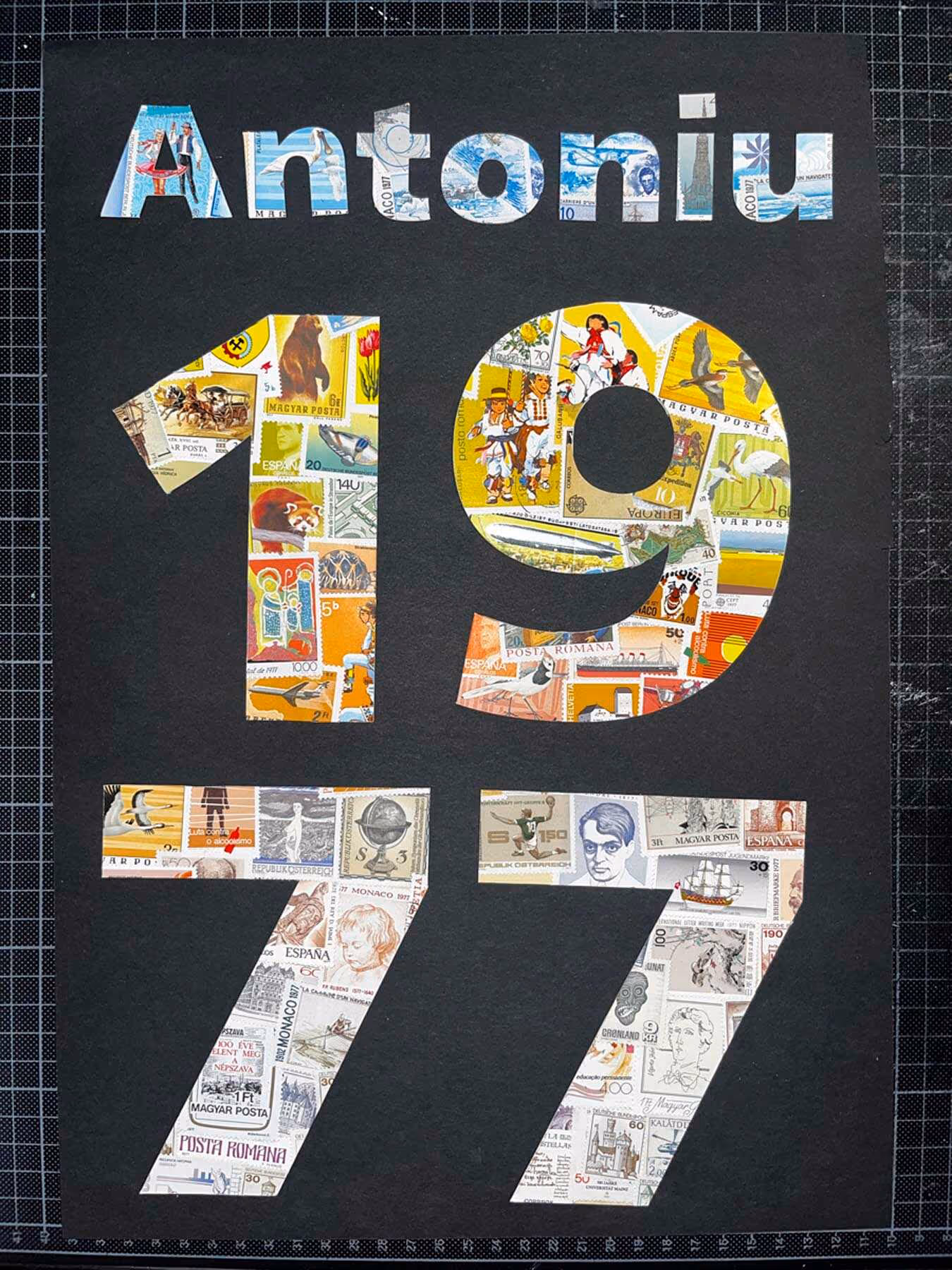
“Antoniu,” 2026, 40 × 60 cm, commissioned work | The piece was used as a birthday gift. I used only stamps from the year of birth, 1977. To do so, I ordered complete year sets from various countries. The letters and numbers blur within the overall composition but become recognisable with longer viewing, almost like a kind of stereogram.
Pixels
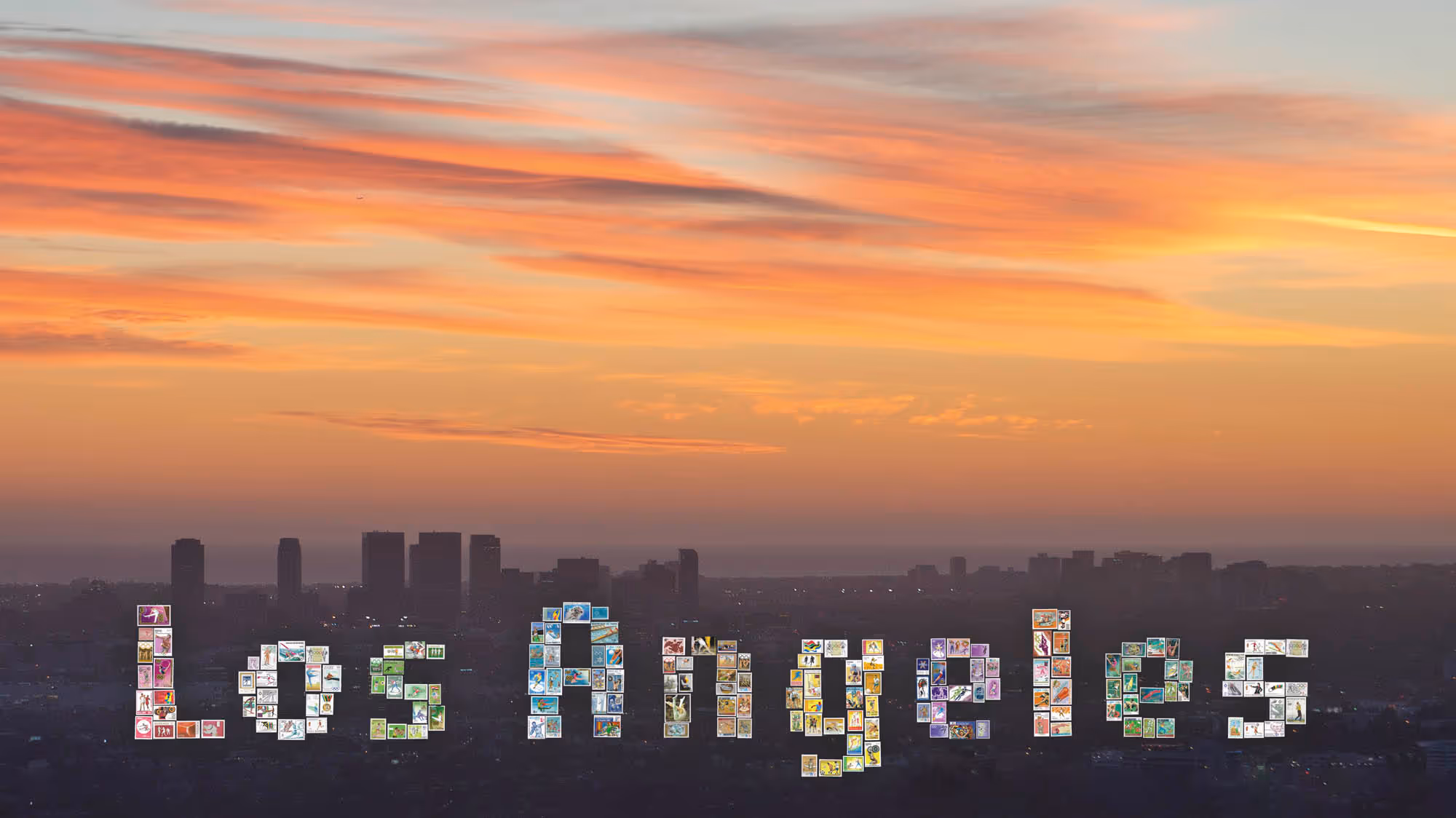
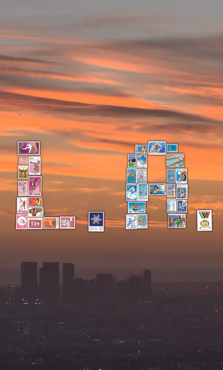
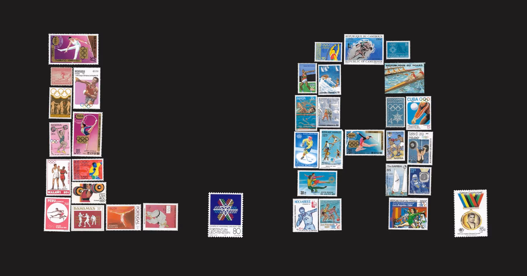
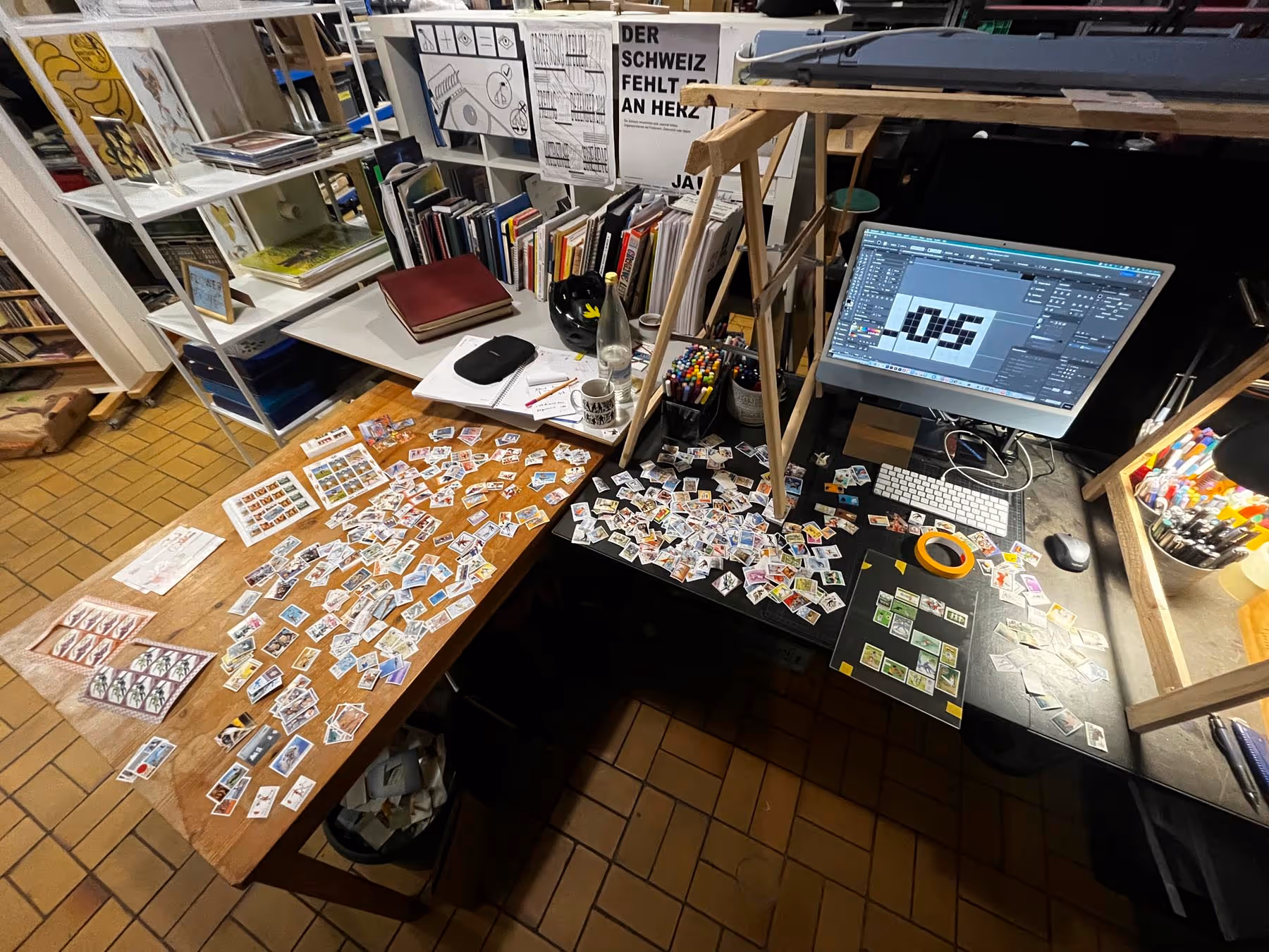
With the piece above, I returned to my original idea of writing with stamps. However, the act of gluing gradually lost its appeal and it began to feel increasingly repetitive within the compositions. I only regained momentum when I was contacted by someone who offered me their dusty stamp albums from the basement. These were carefully curated thematic volumes, including one dedicated to the 1984 Olympic Games in Los Angeles. This also led to a new approach to the lettering: from then on, I treated the stamps as pixels in a pixel typeface.


No items found.
My reference was the typeface “Lo-Res 9” by Zuzana Licko. Since postage stamps are not square, I could only approximate the grid and had to improvise in the arrangement.

A logical and interesting continuation of the project would certainly be to develop a full alphabet from the concept. As soon as I find new momentum, I will start working on it.
Updated on 24 April 2026 | Title image background: licensed via Adobe Stock

Once a year is enough
Don’t worry—my newsletter won’t turn into annoying spam. I only send it out once a year, around Christmas, as a small digital gift with insights into the life of a type artist.
Danke! Du hörst von mir – einmal im Jahr.
Ups! Da ist etwas schiefgelaufen.
Aktualisiere die Seite und versuche es nochmal.
Aktualisiere die Seite und versuche es nochmal.
Your data is protected and will not be shared with third parties. Privacy policy
Comission Inquiry
Let's work together to make type stand out: Here's an easy and no-obligation request for your project.
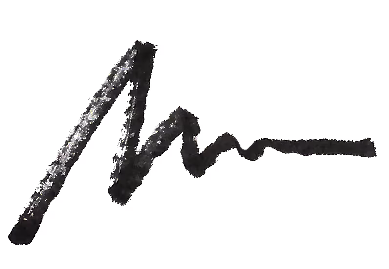
Clean up!
Go rough!
Micha Weiss
Type Artist and Graphic Designer
Community Studio F22
Federweg 22, 3018 Bern, Switzerland
weissmichabc@gmail.com
Type Artist and Graphic Designer
Community Studio F22
Federweg 22, 3018 Bern, Switzerland
weissmichabc@gmail.com
© MW 2026 | Made with ❤ in Webflow
“Typography has one plain duty before it and that is to convey information. No argument or consideration can absolve typography from its duty.”
Emil Ruder