




No items found.
No items found.
No items found.
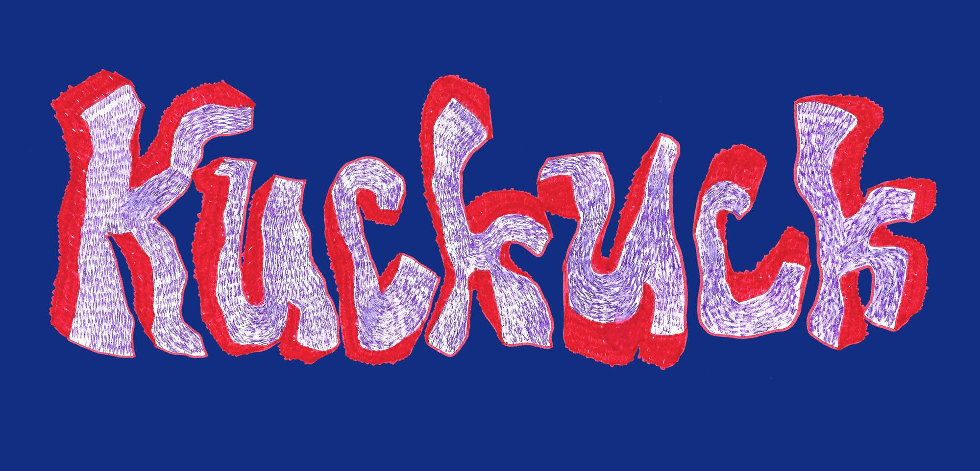
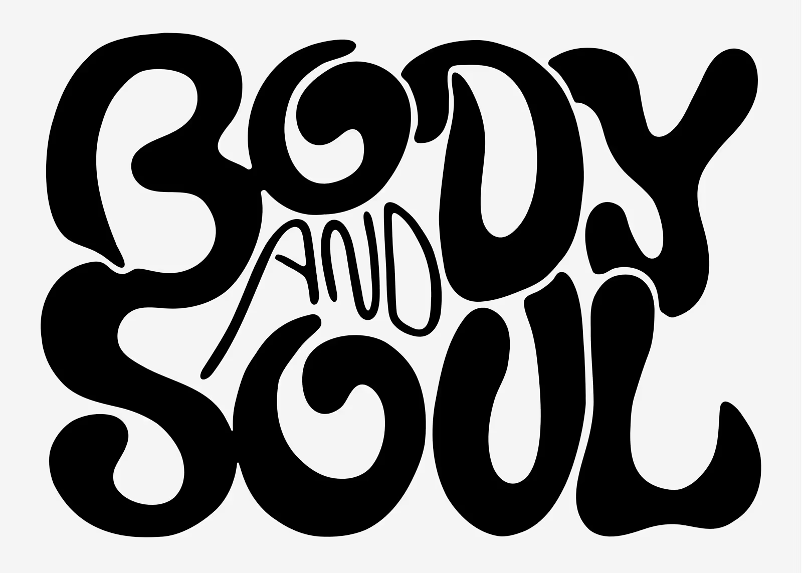
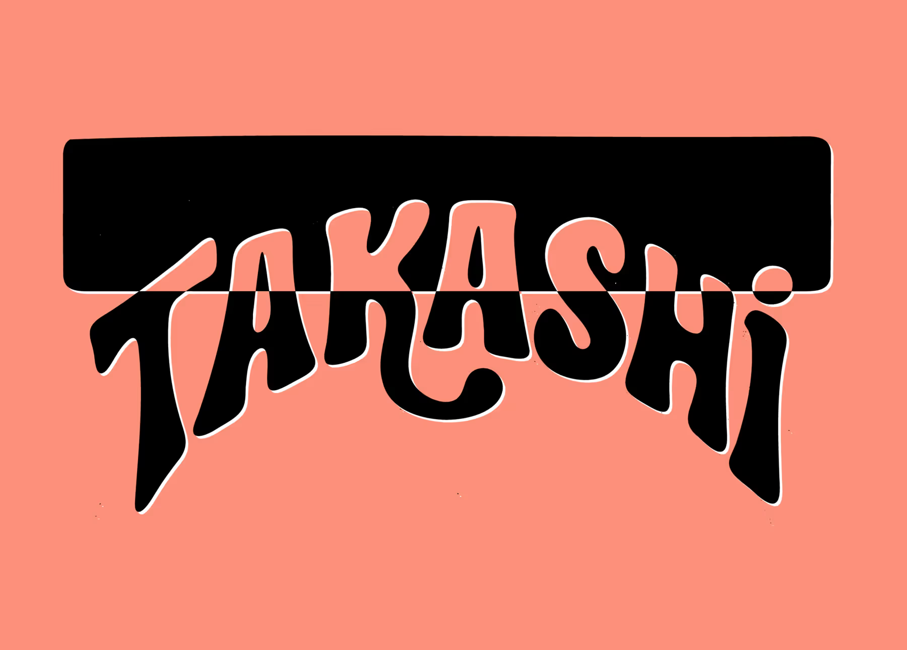
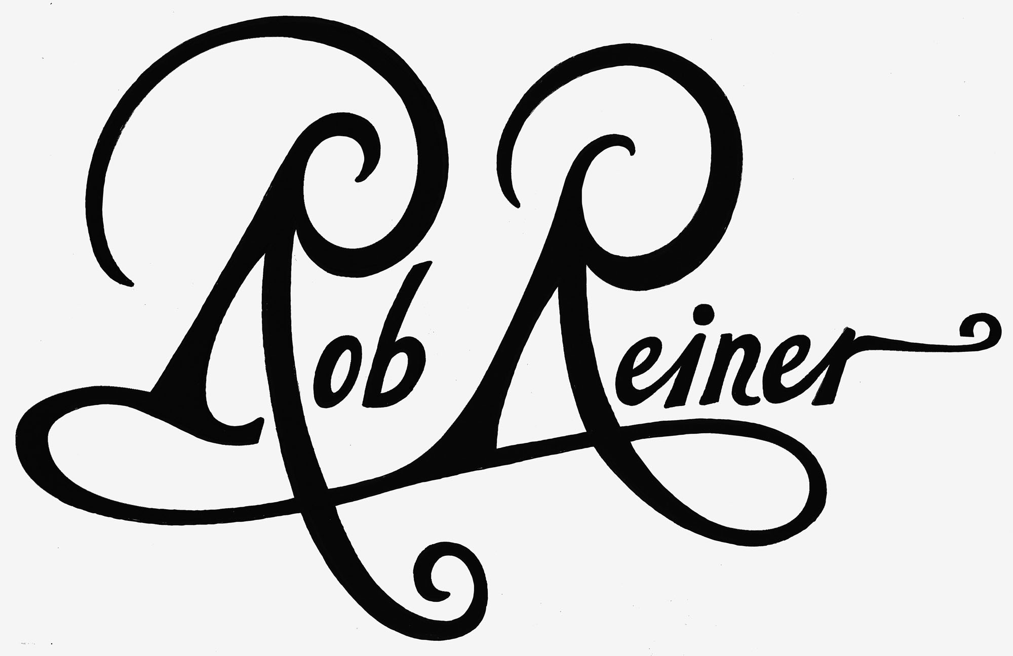
No items found.
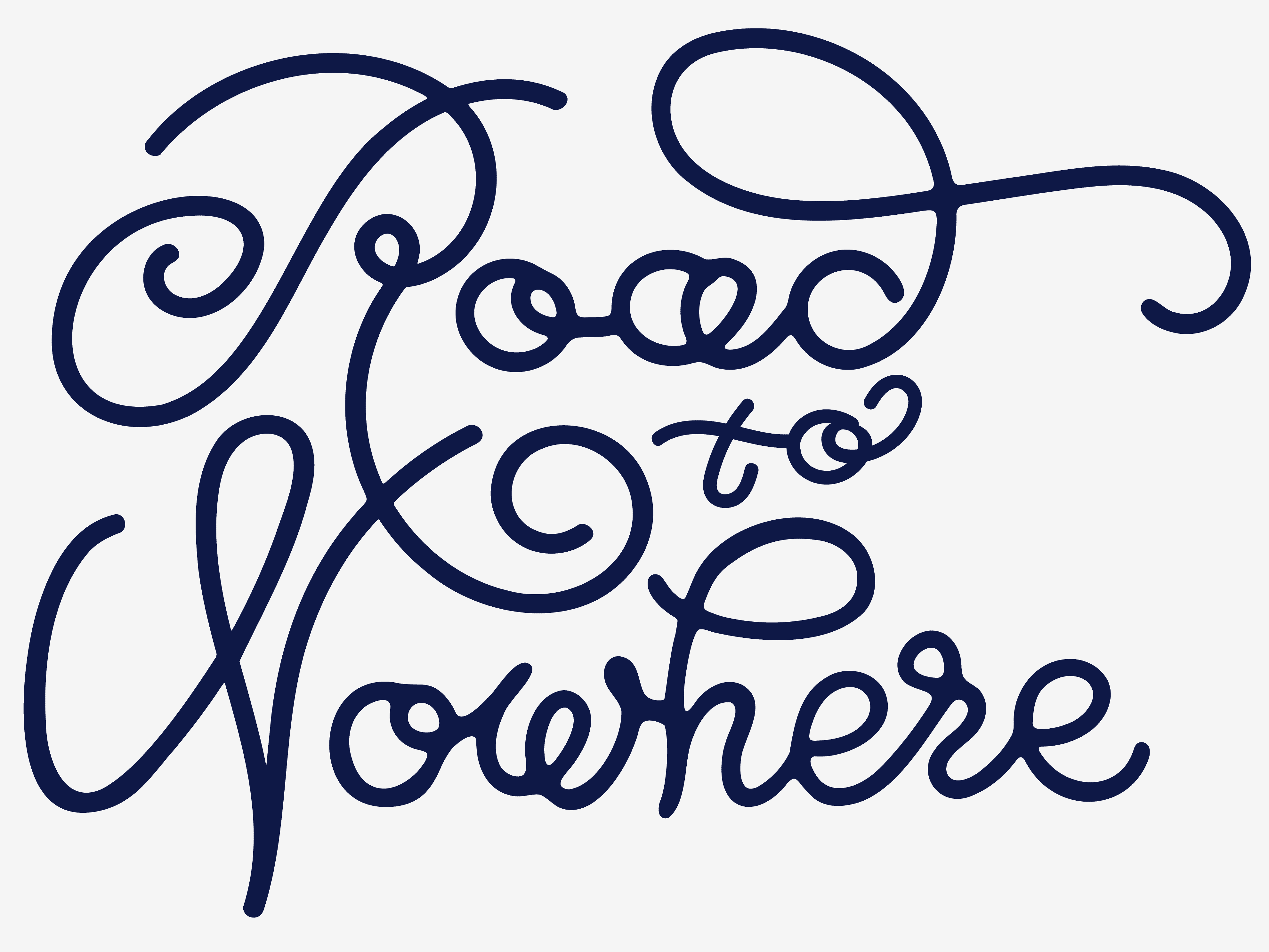
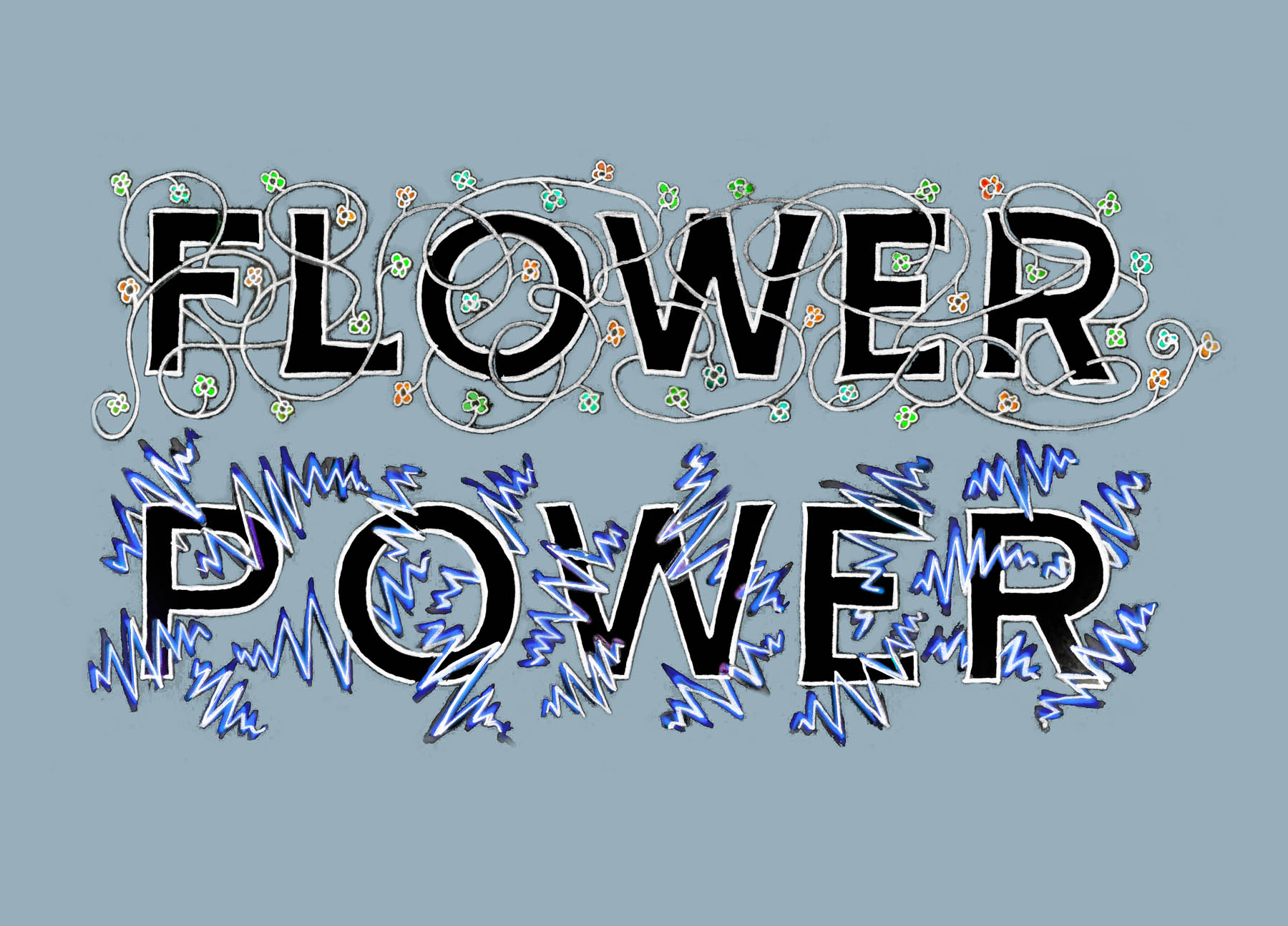
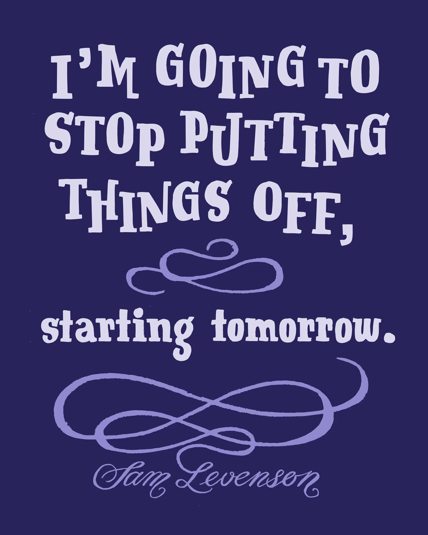
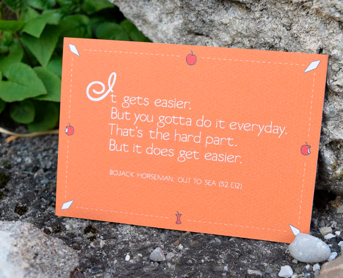
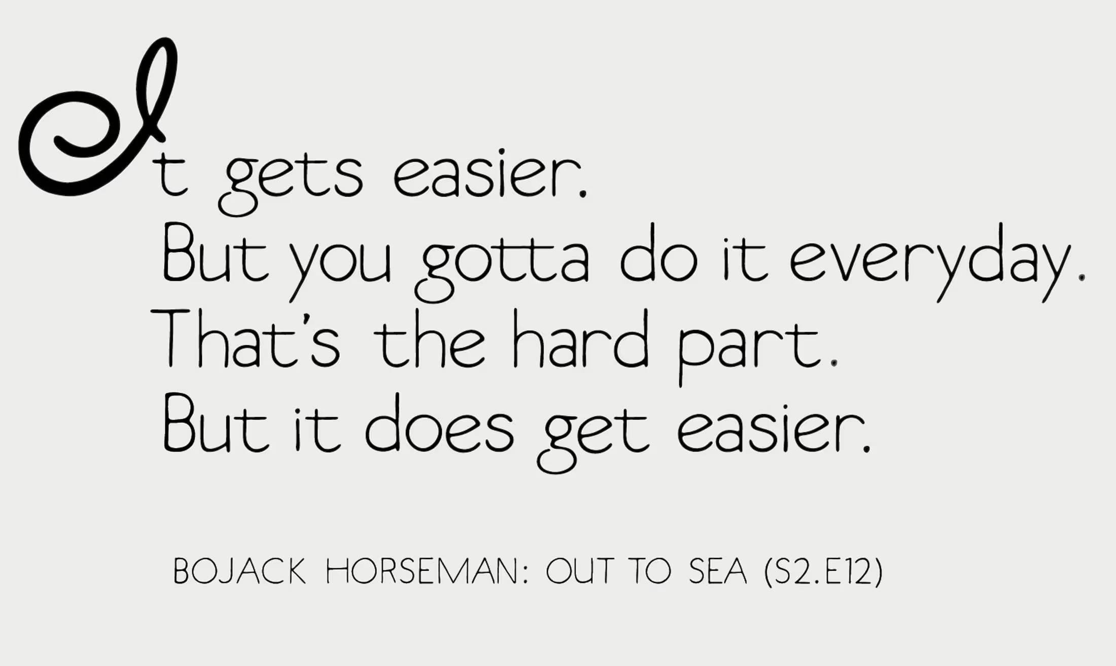
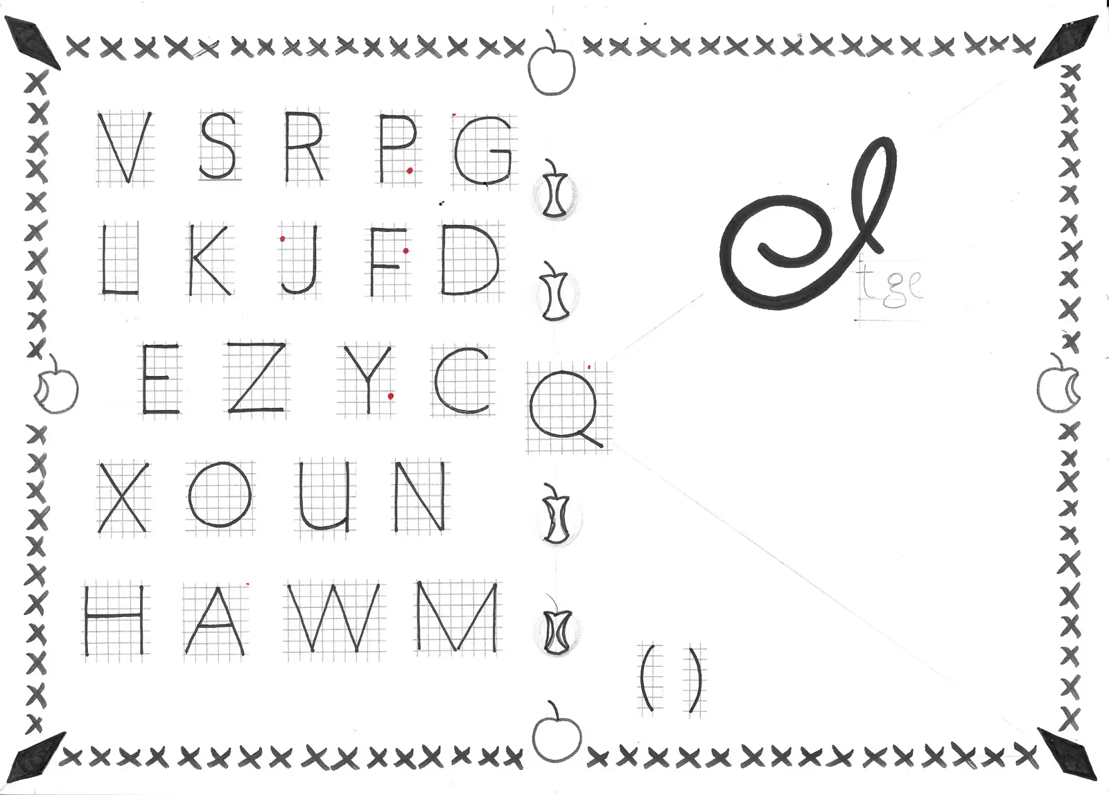
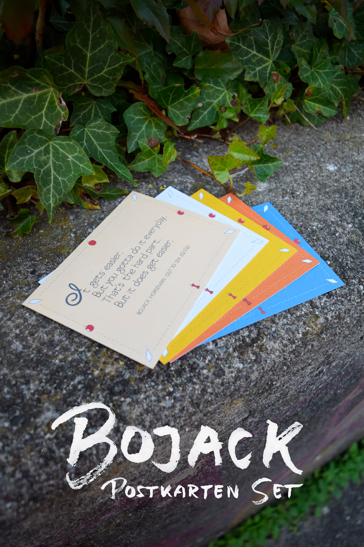
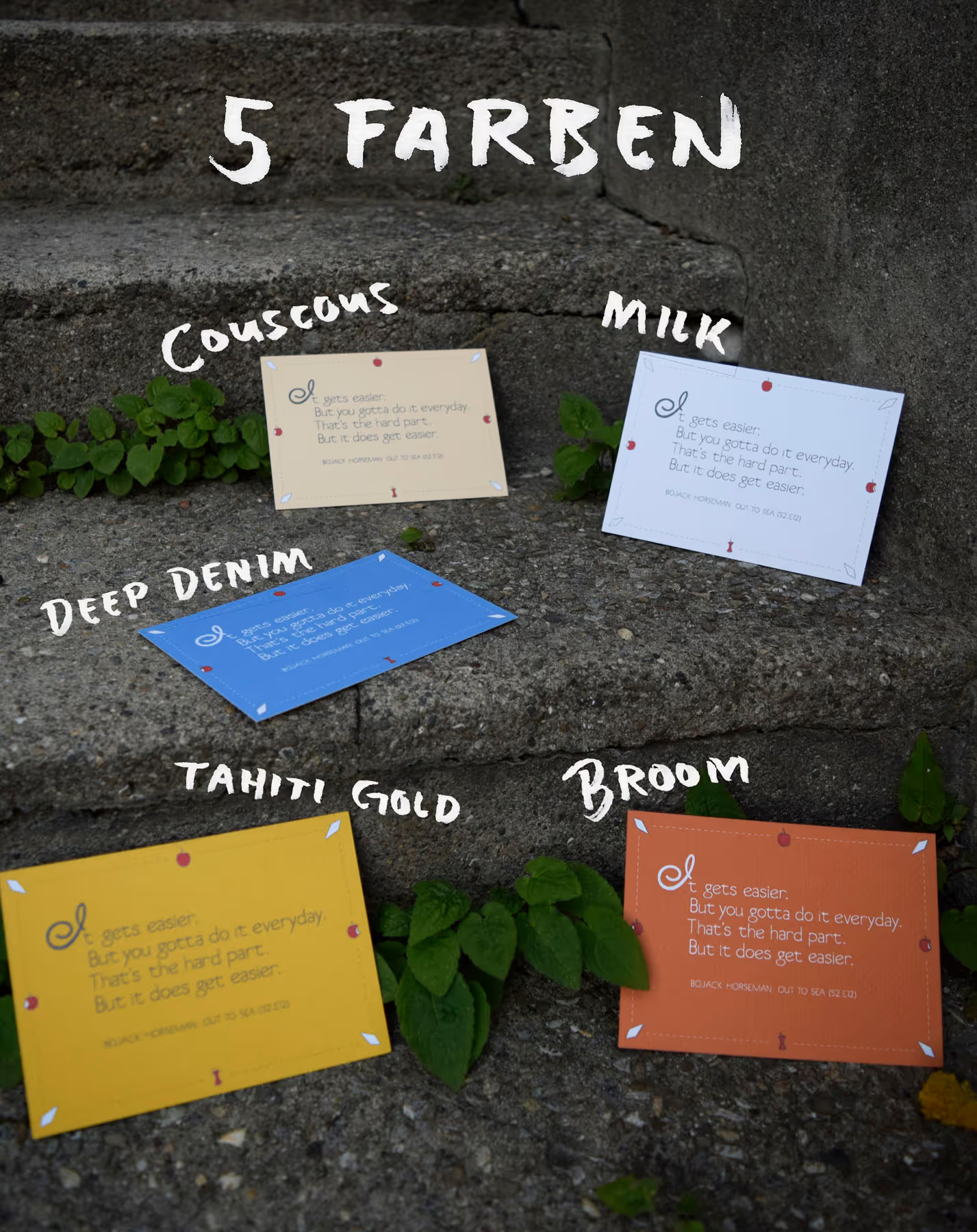
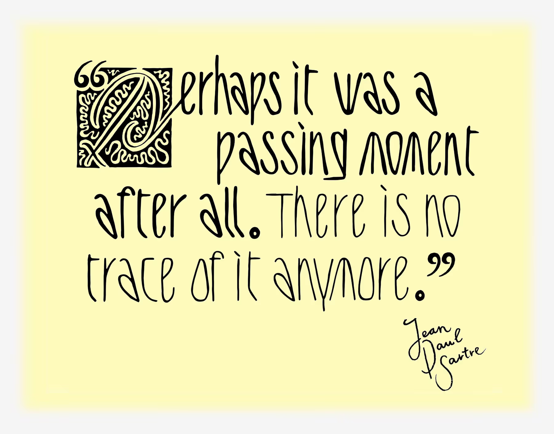
Postcard featuring a quote from the TV series “BoJack Horseman,” with custom-designed lettering. Self-initiated


No items found.
No items found.
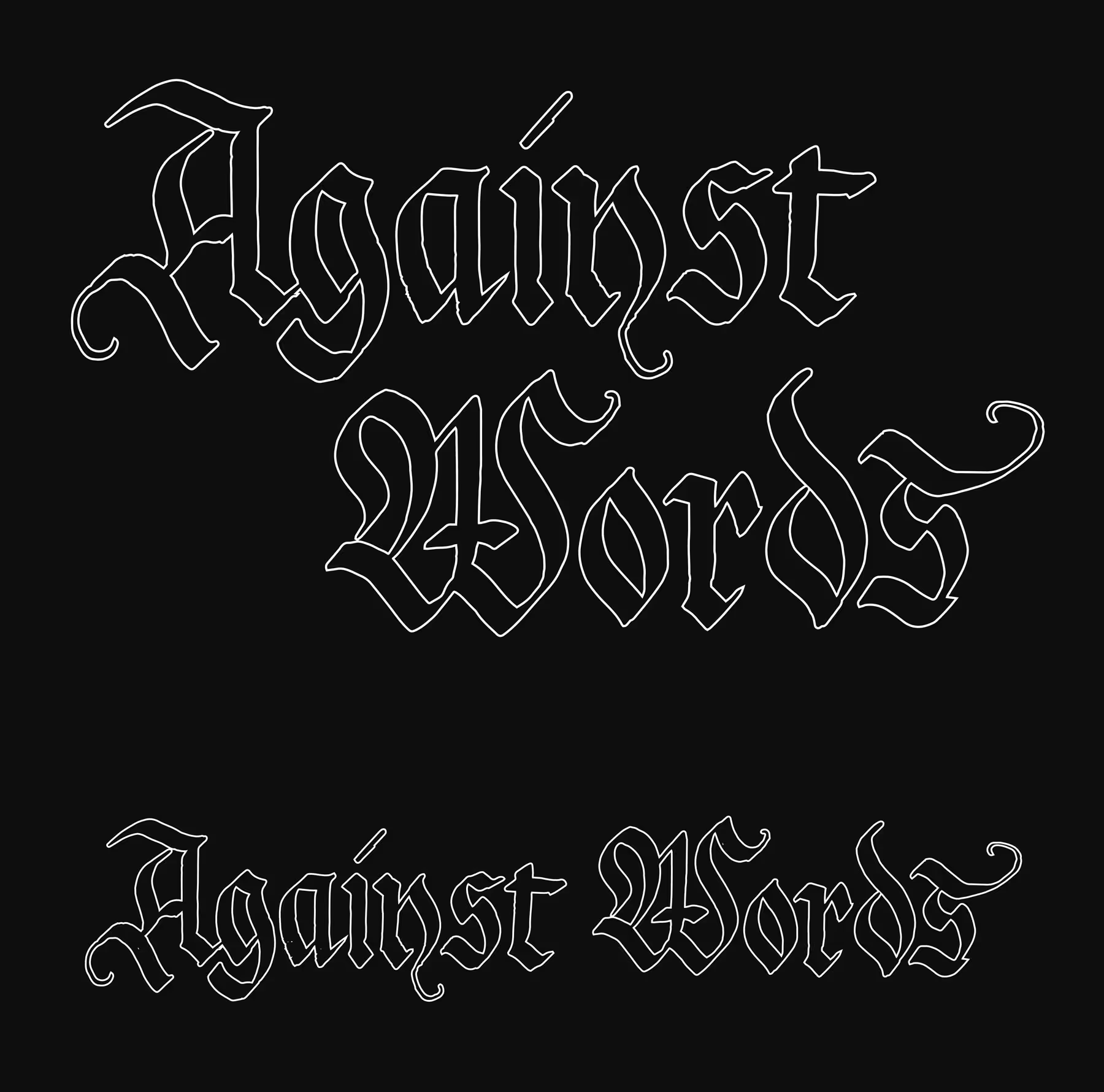
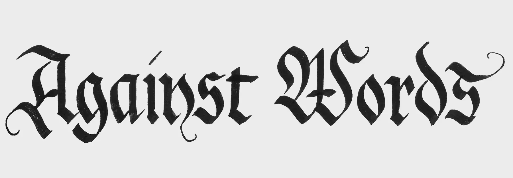
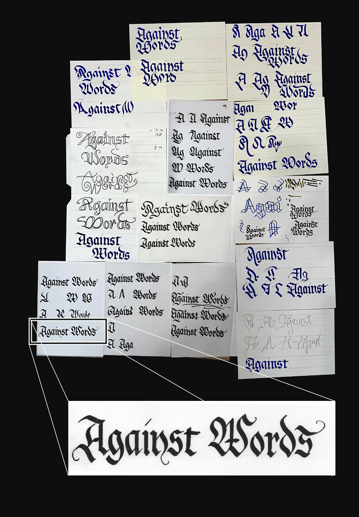
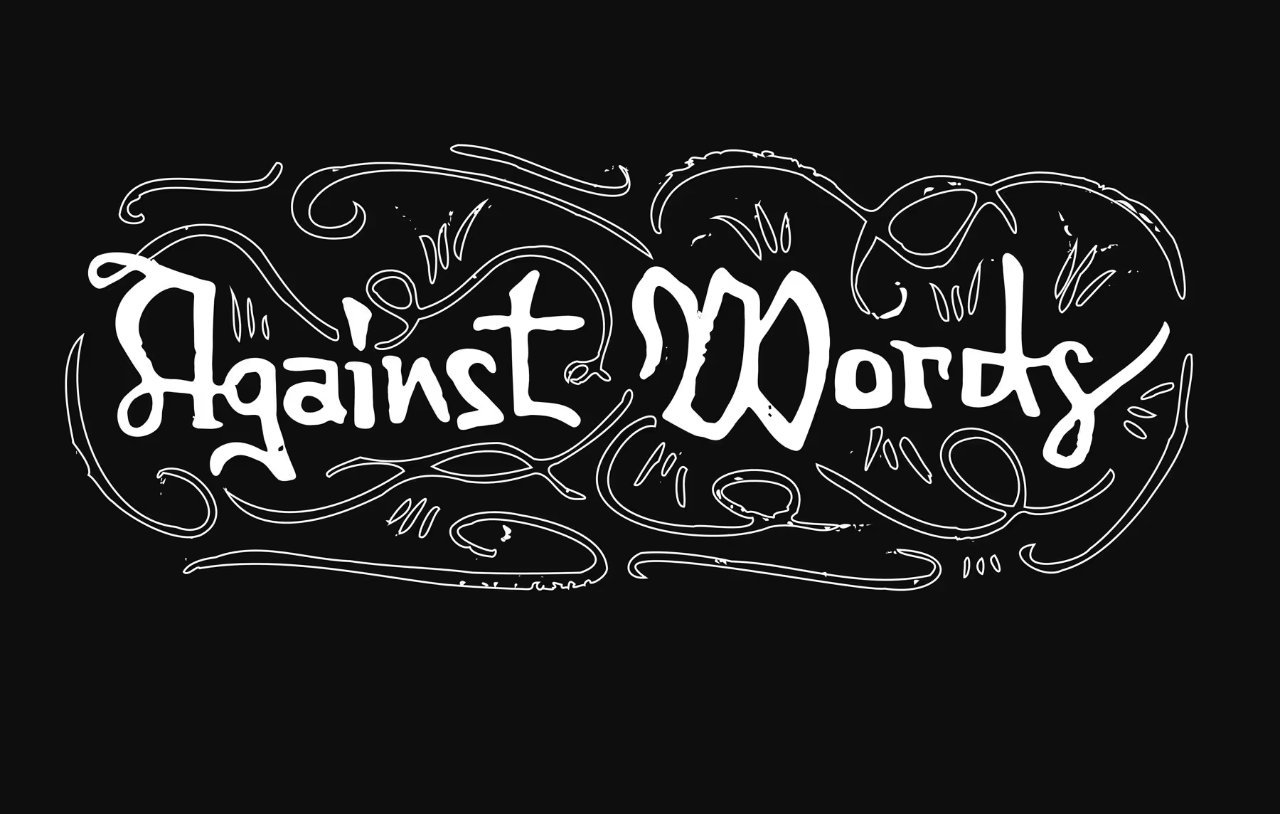
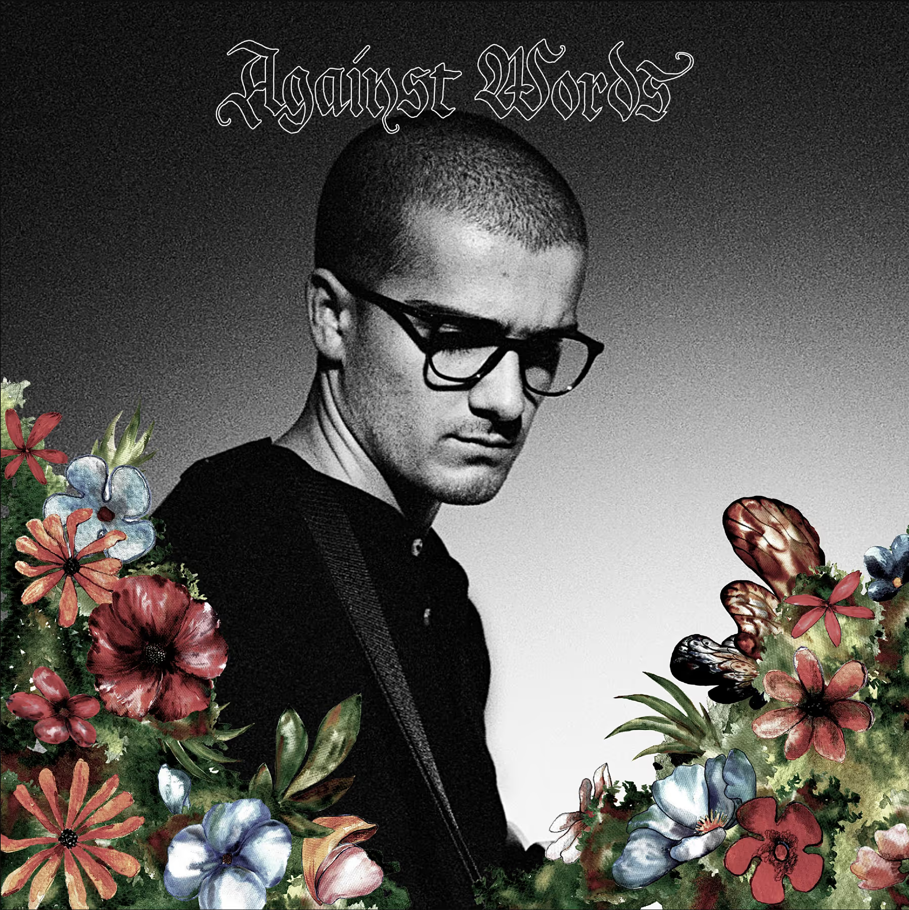
Lettering for the single “Against Words” by Samuele Taghizadegan. His brief for the title: an elegant white-outlined wordmark. The result is a calligraphic hybrid of Bastarda and a classical Fraktur. Note: The design of the single itself is not my work (see “process and context”).
No items found.
No items found.
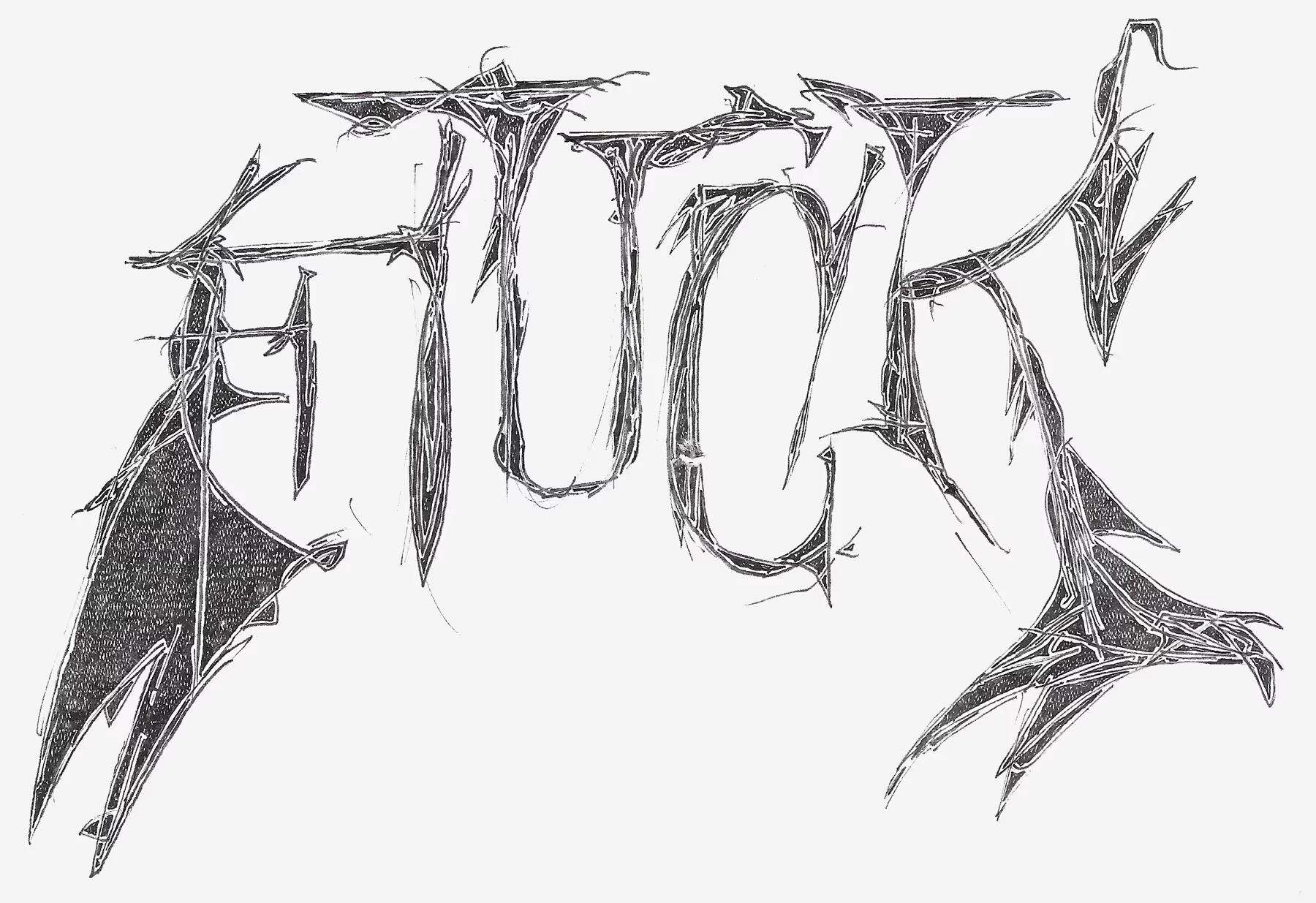
A word can also be censored through its design
No items found.
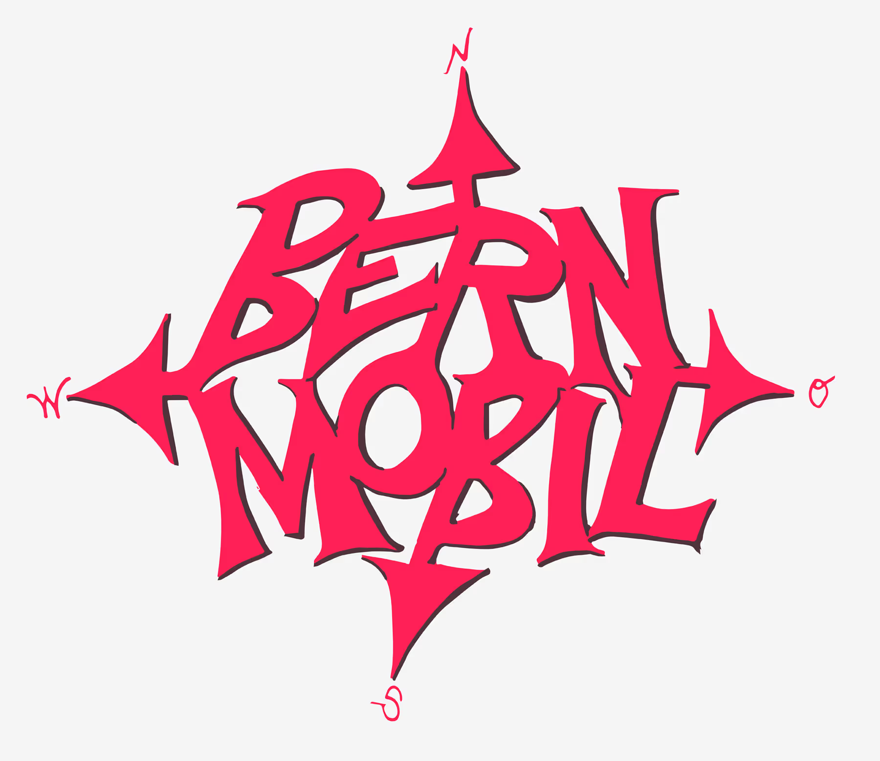
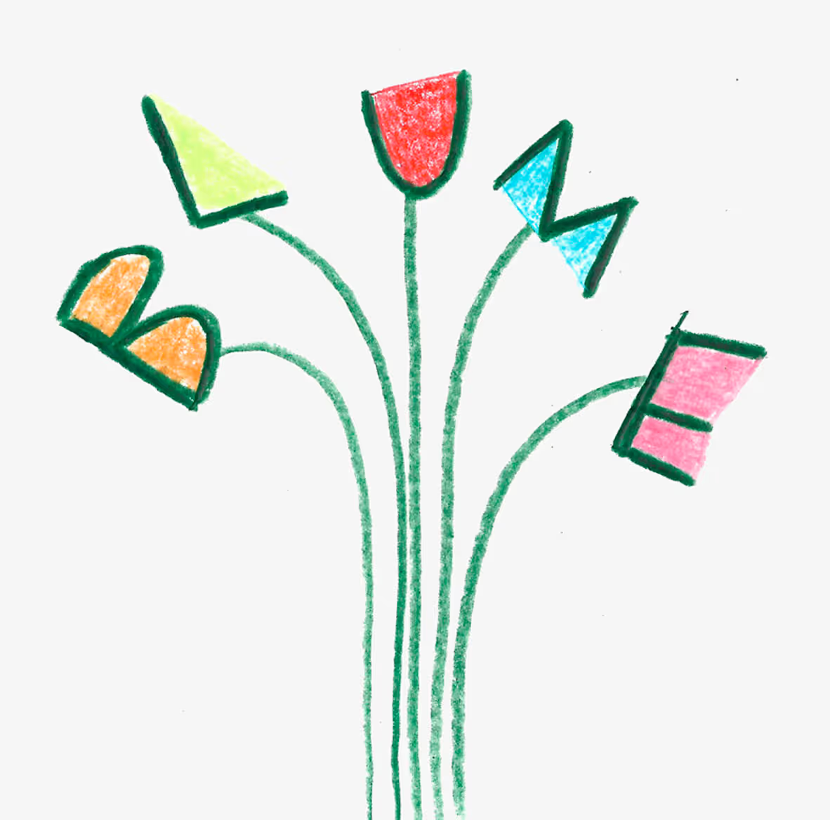
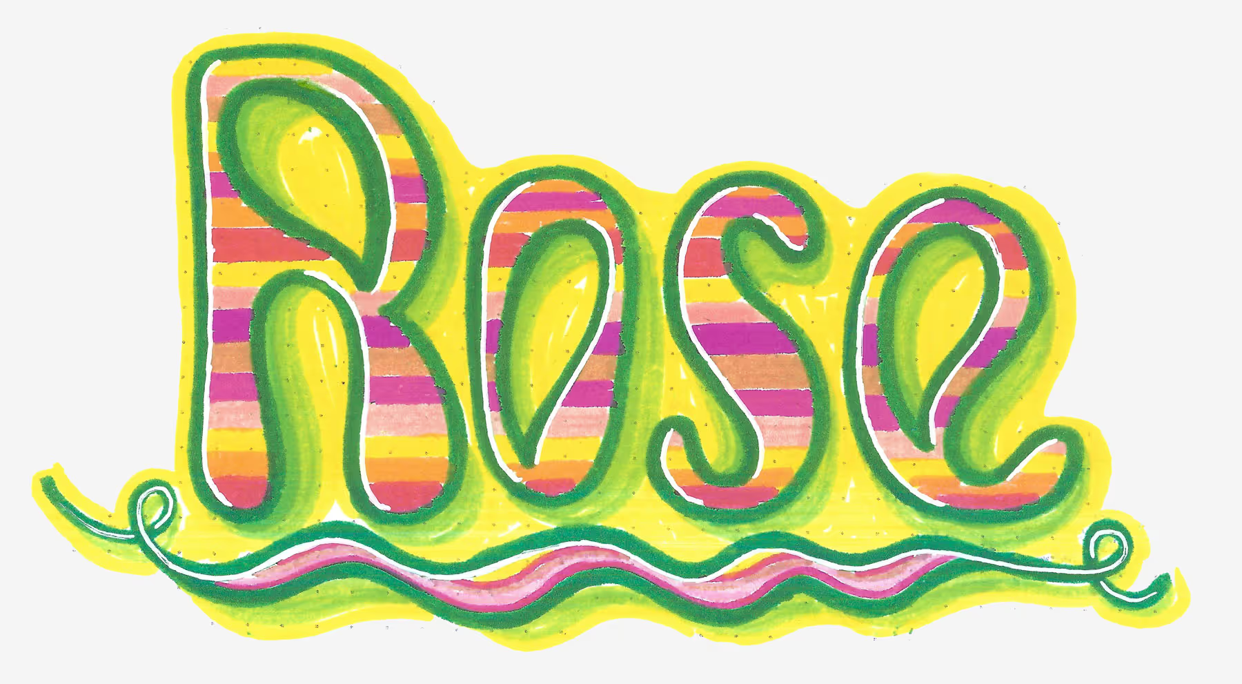
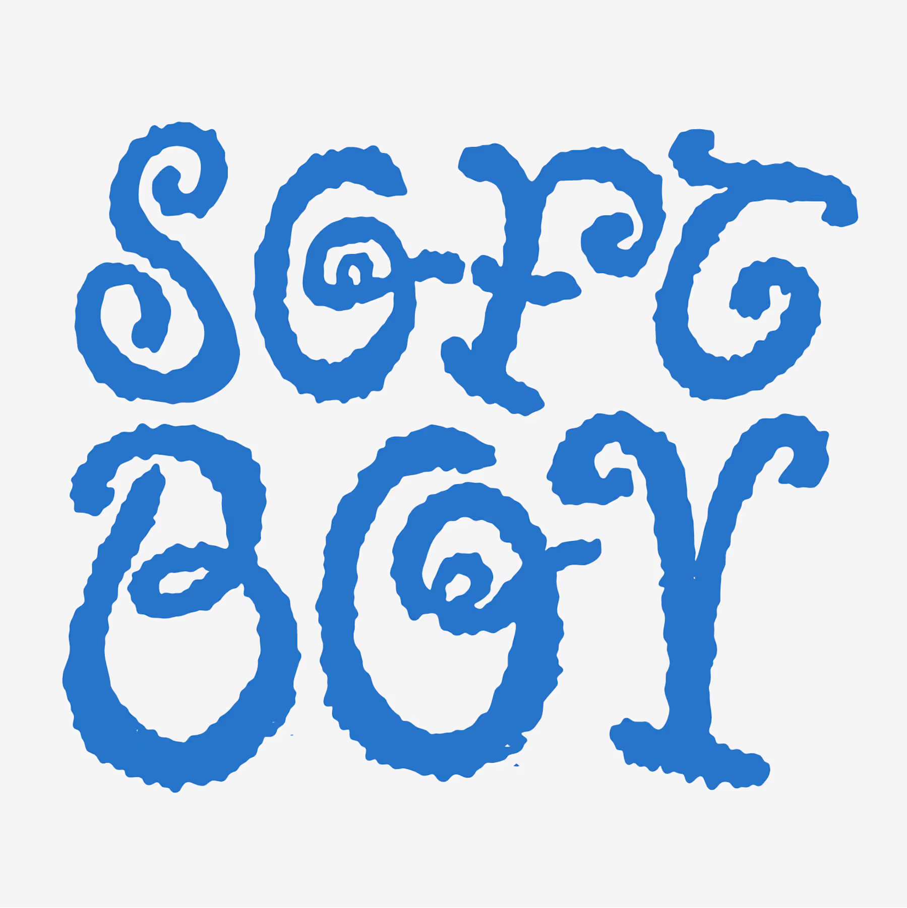
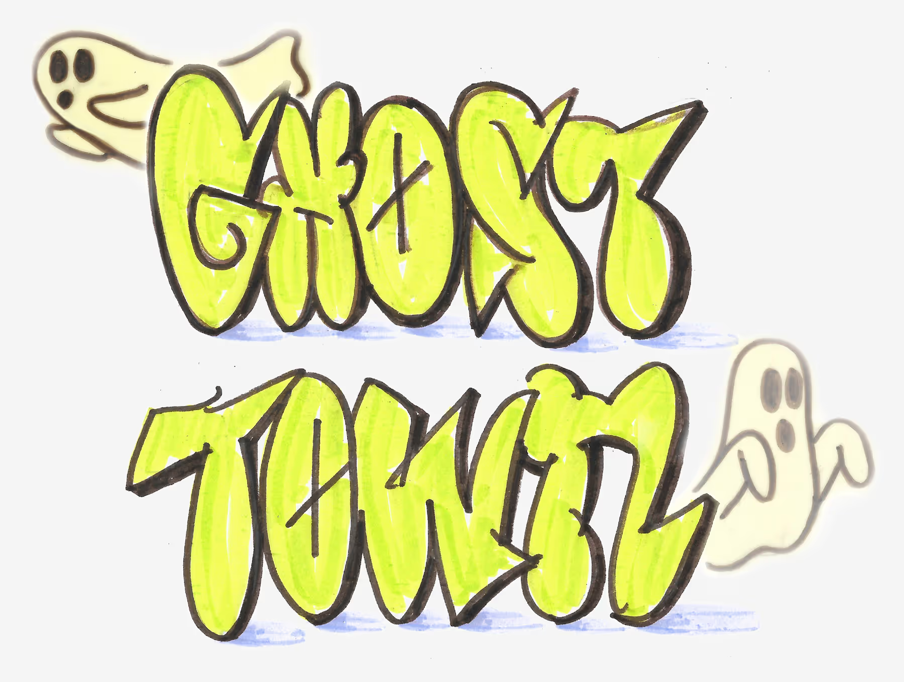
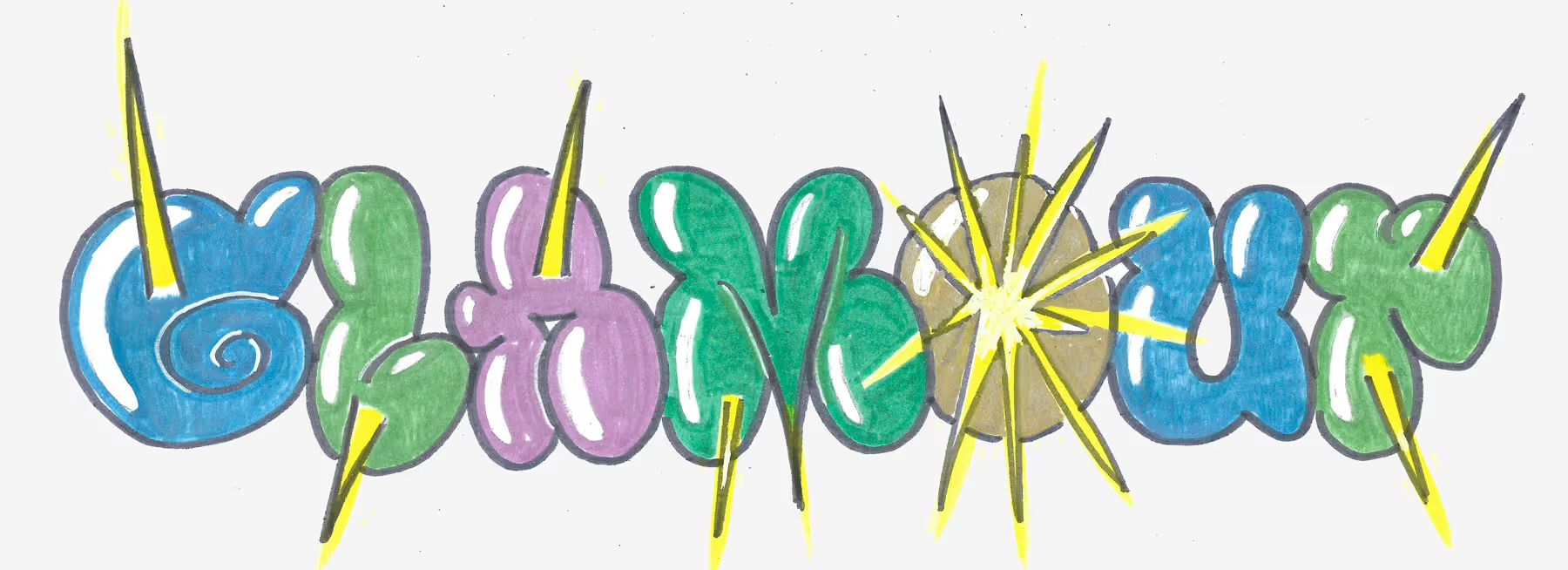
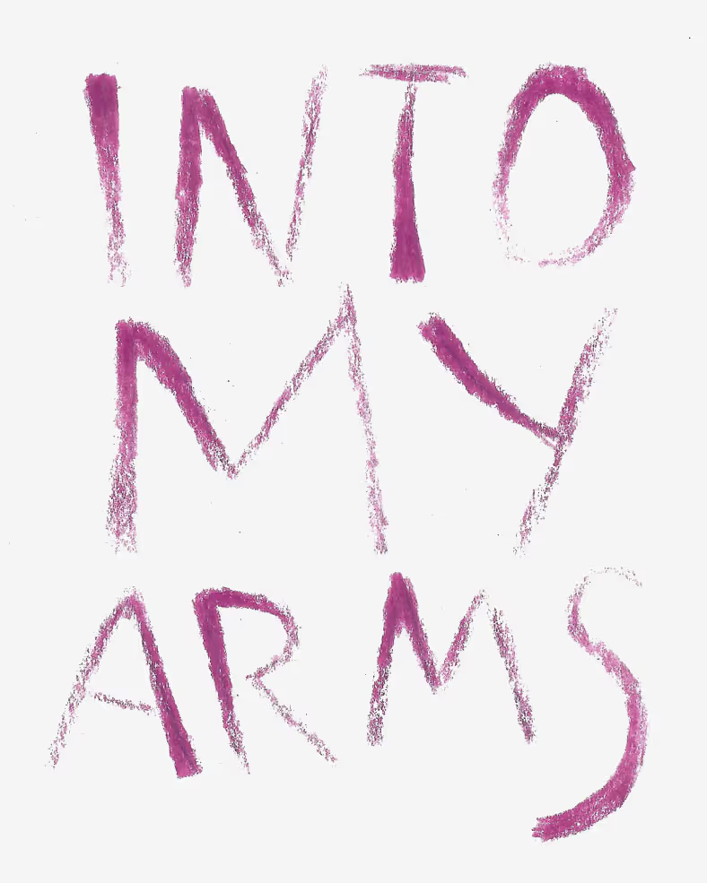
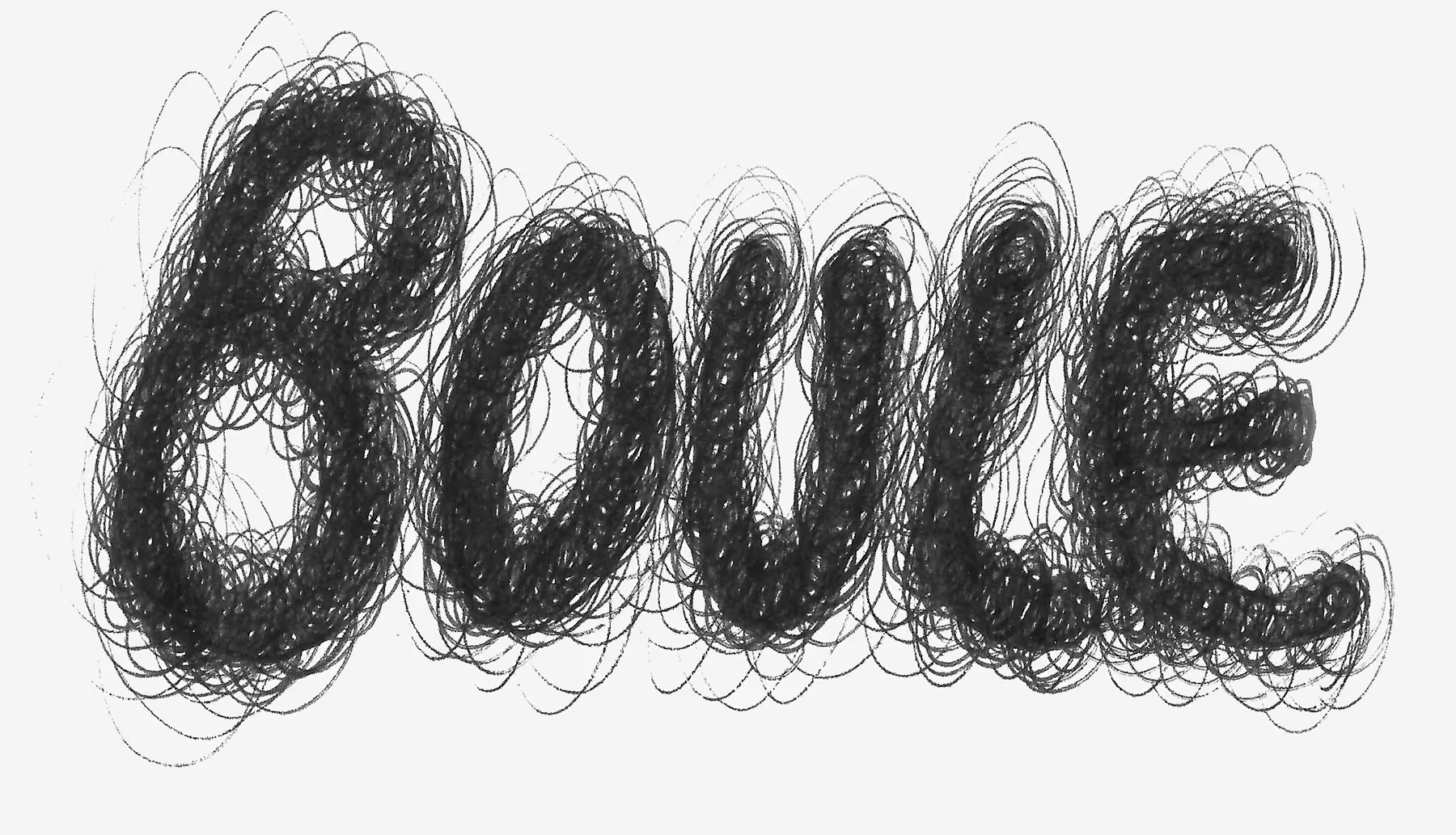
No items found.
Challenges & Solutions
×
Goals | Challenges | Solutions | Learnings
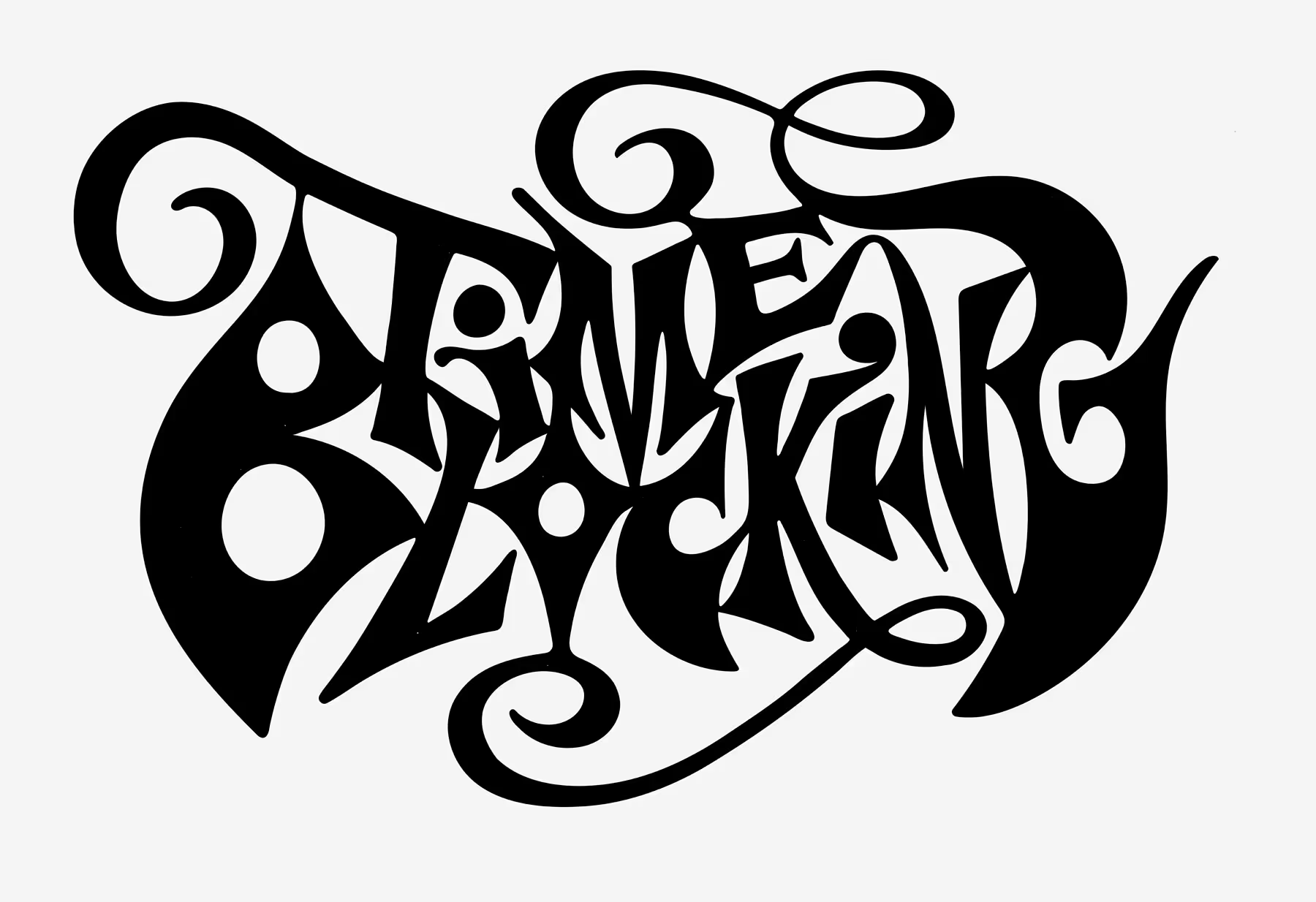
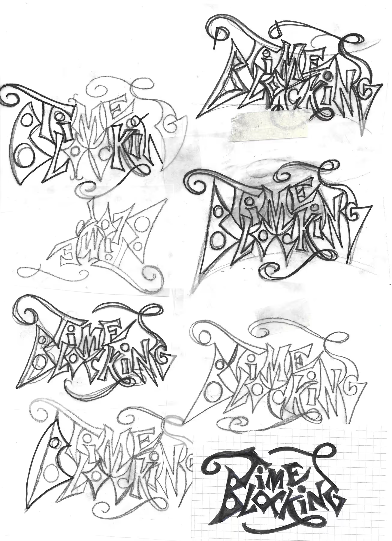
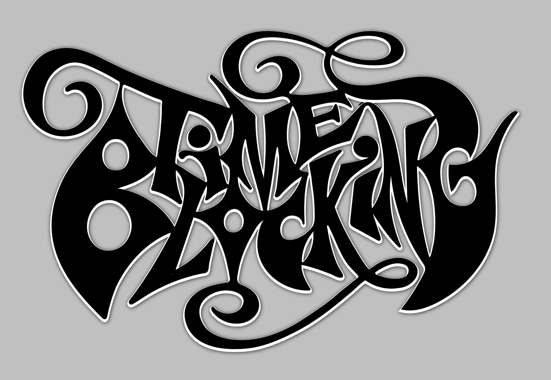
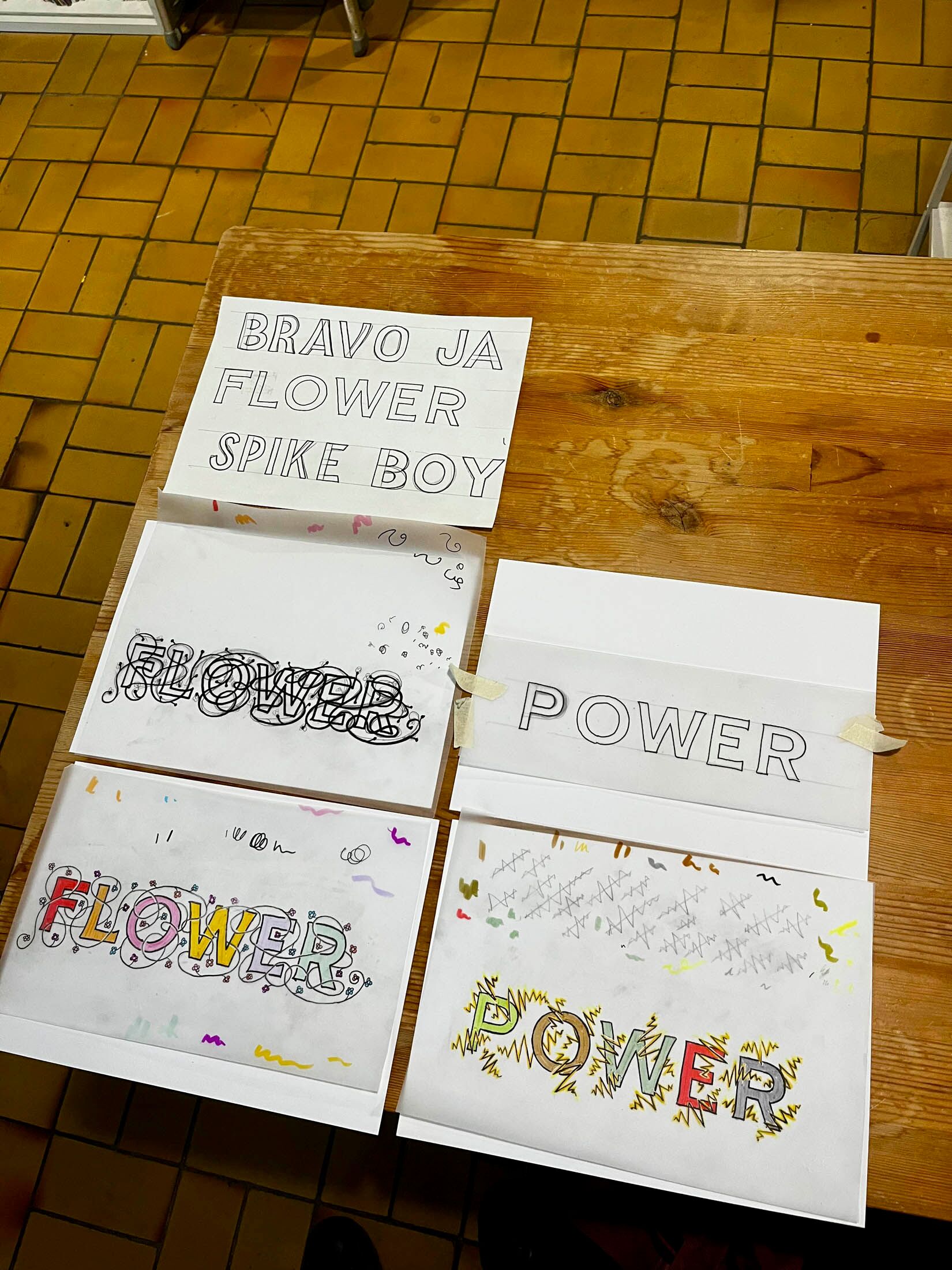
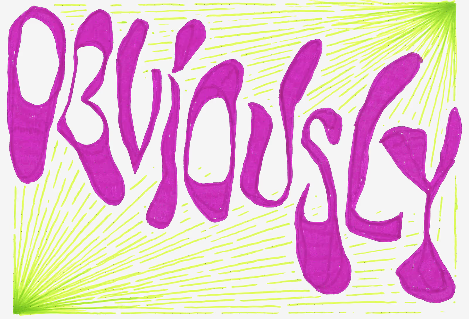
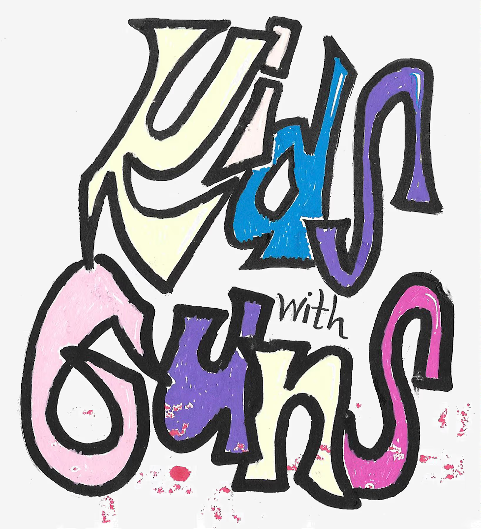
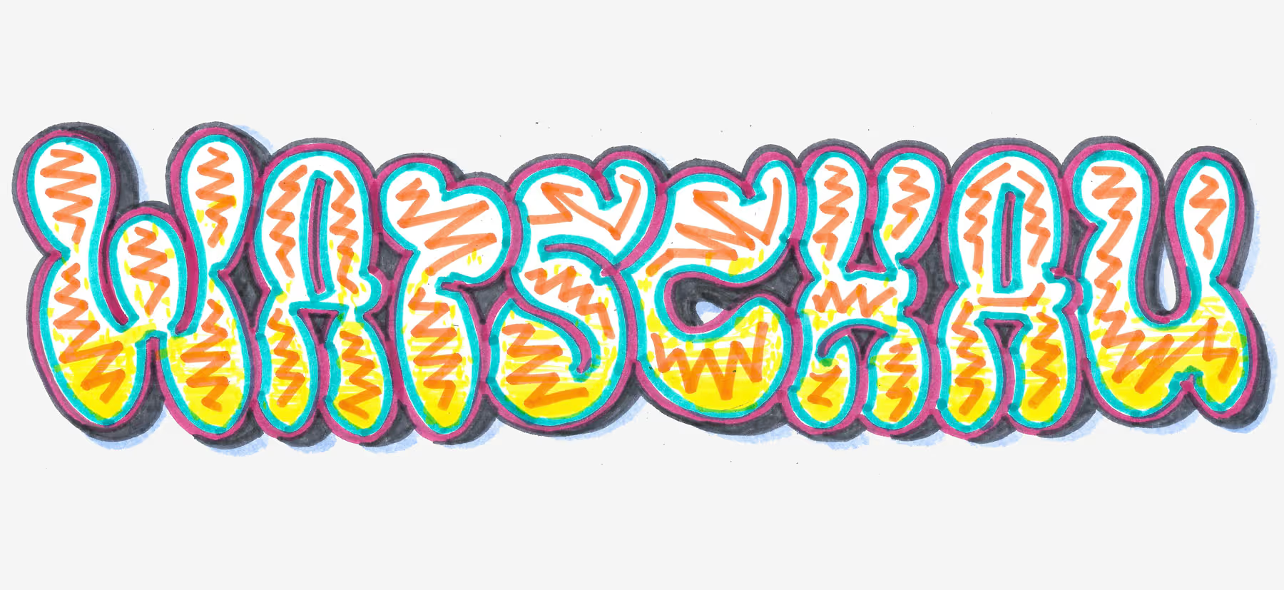
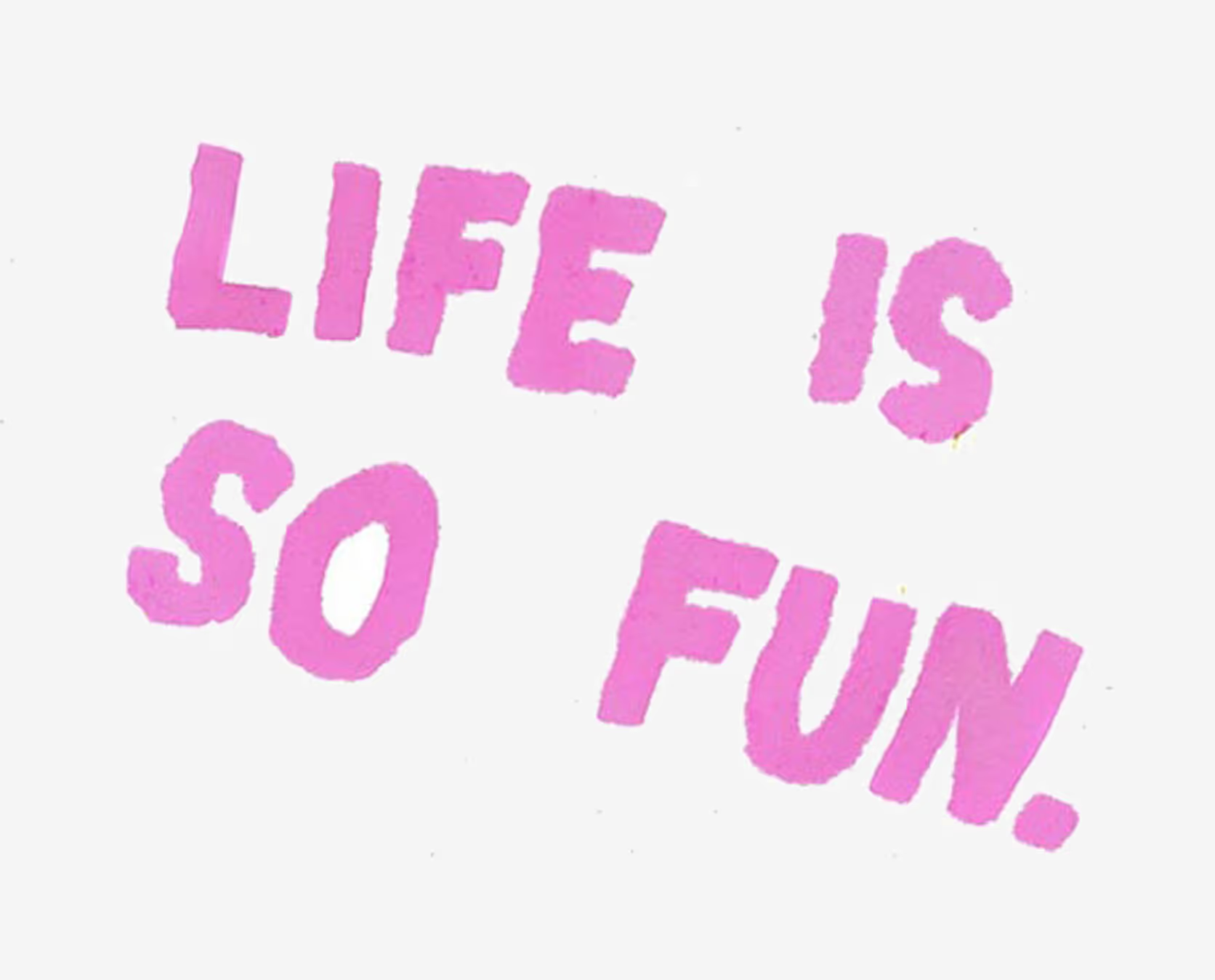
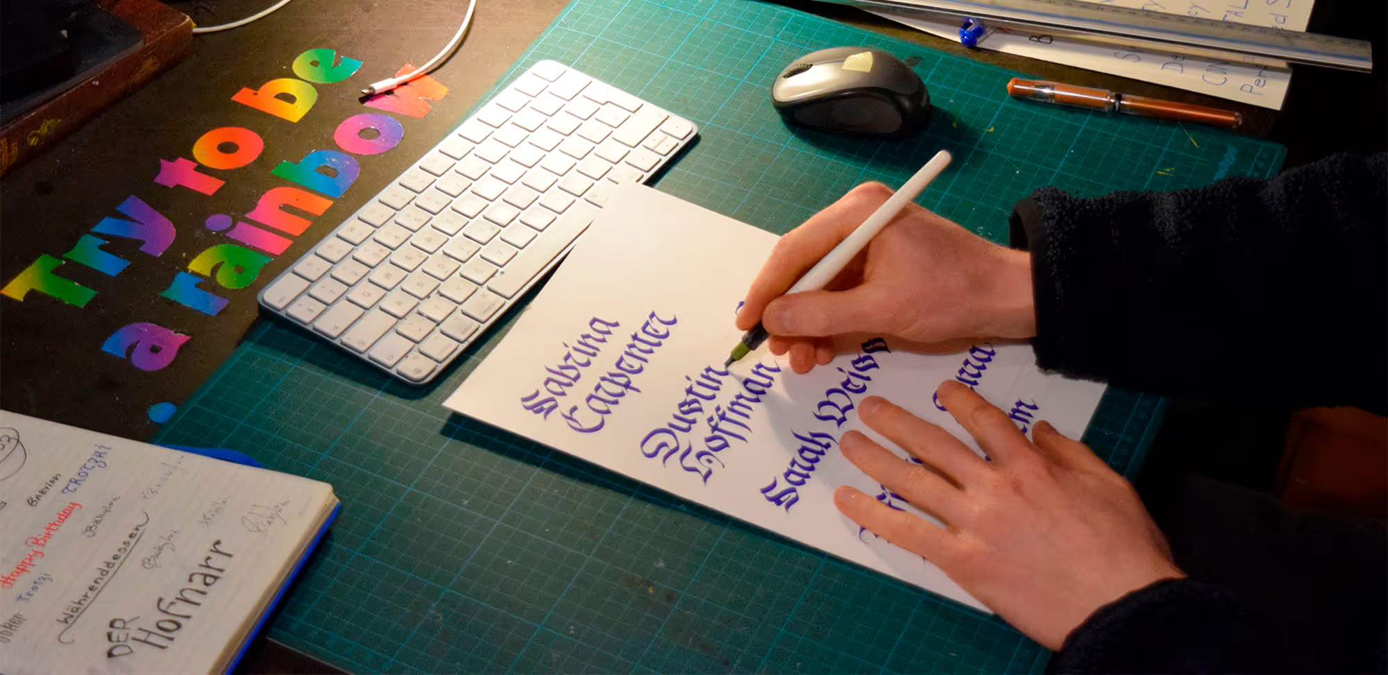
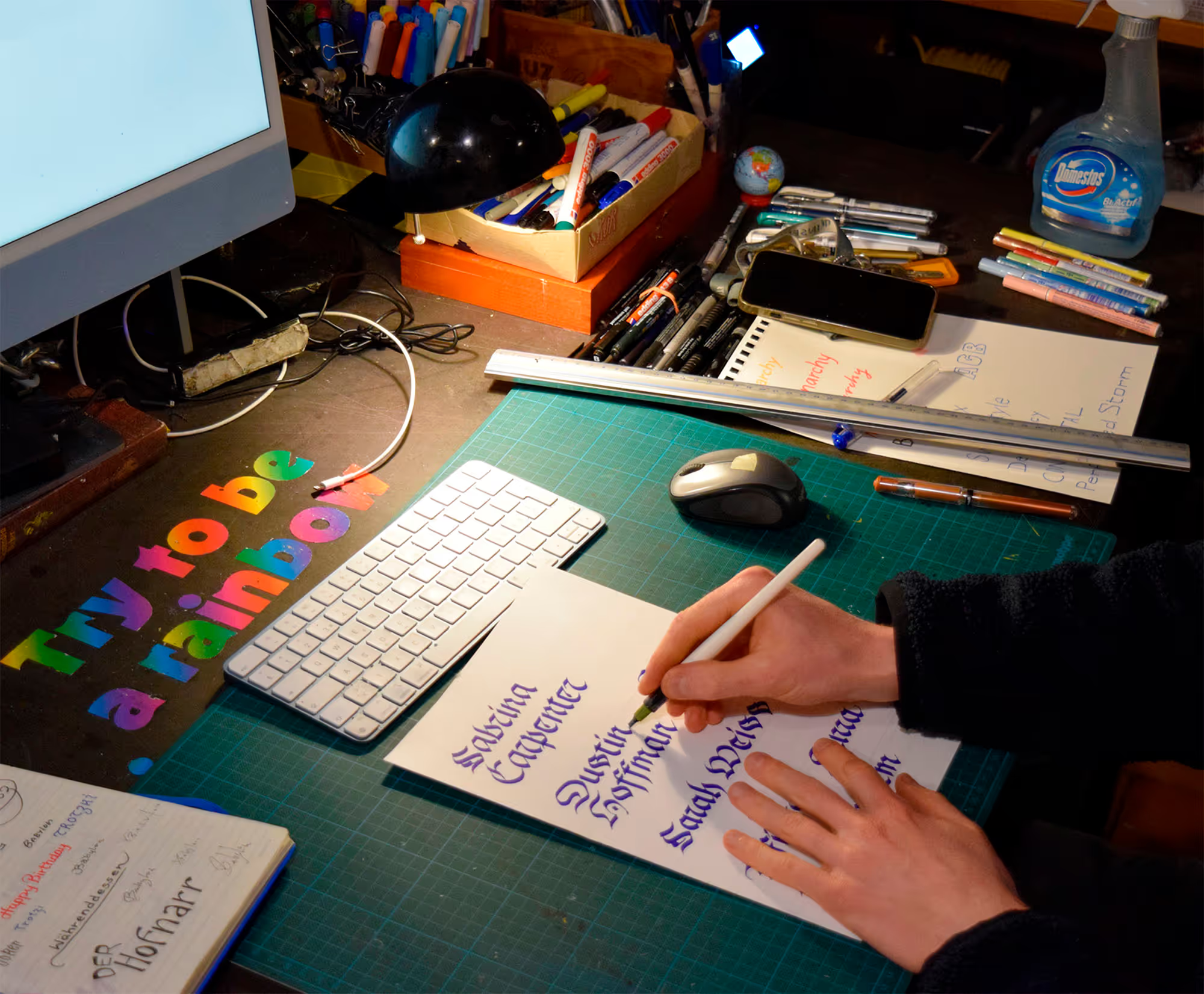
My main goal in lettering: clear legibility combined with an engaging and visually compelling design. I start almost every project on paper, which gives me room for experimentation and a feel for the writing tool. Only then do I vectorize or edit the drafts digitally.
Goals | Challenges | Solutions | Learnings
My main goal in lettering: clear legibility combined with an engaging and visually compelling design. I start almost every project on paper, which gives me room for experimentation and a feel for the writing tool. Only then do I vectorize or edit the drafts digitally.


.gif)

© MW 2026 | Made with ❤ in Webflow
“Of all the achievements of the human mind, the birth of the alphabet is the most momentous.”
Frederic Goudy