




No items found.
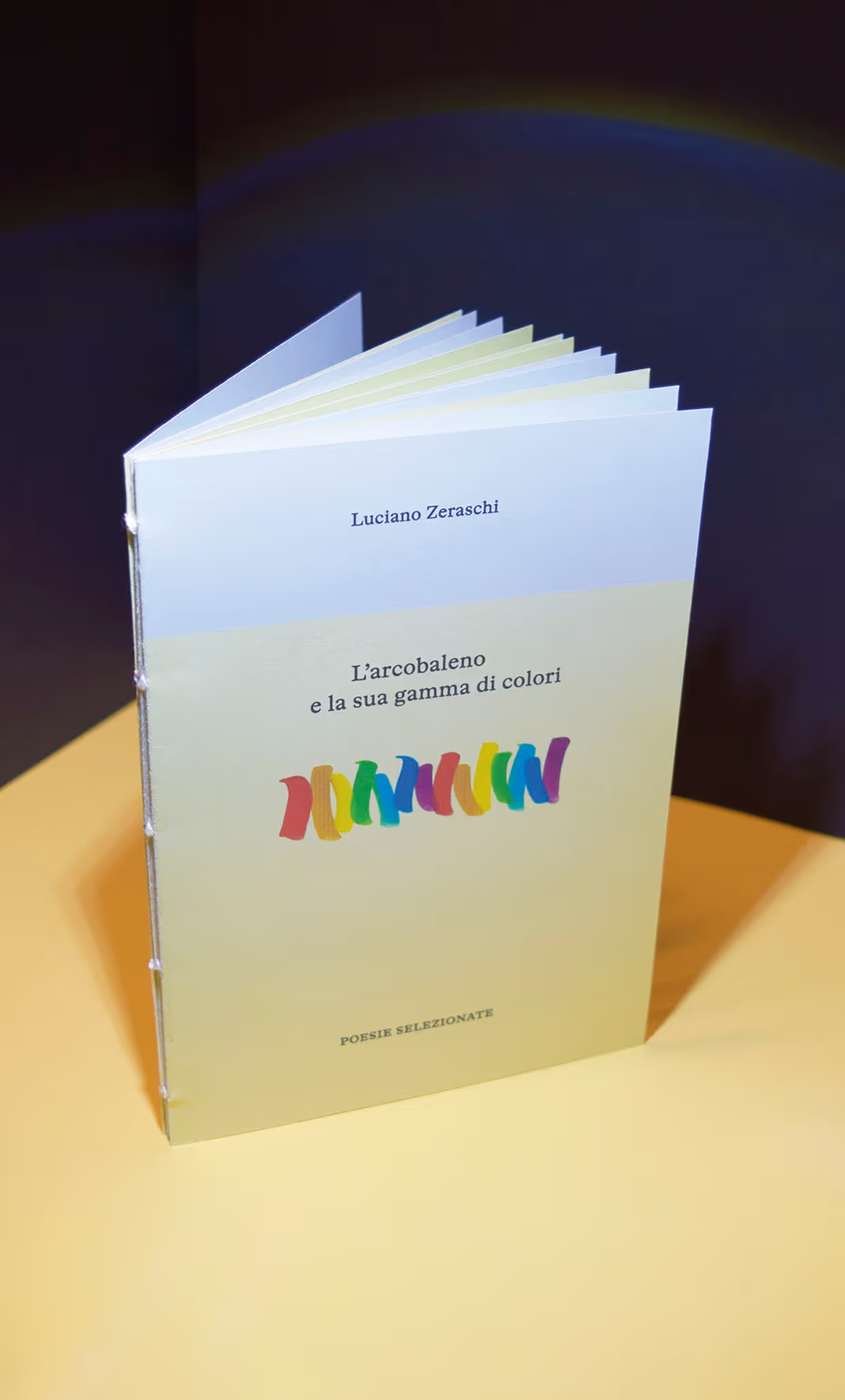
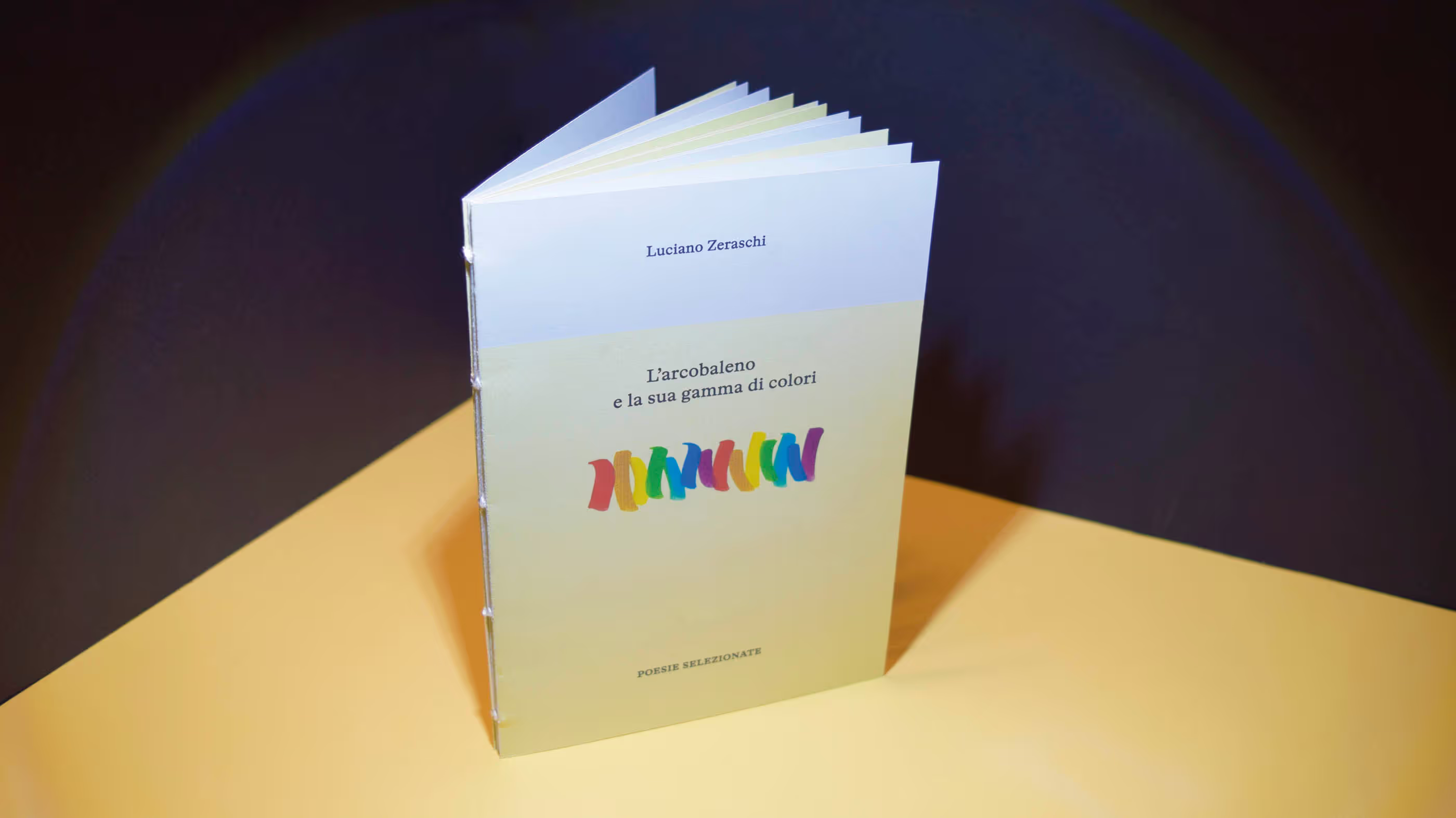
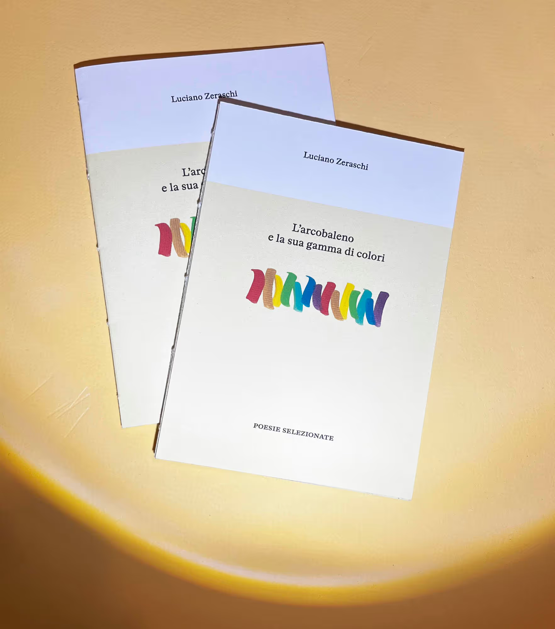
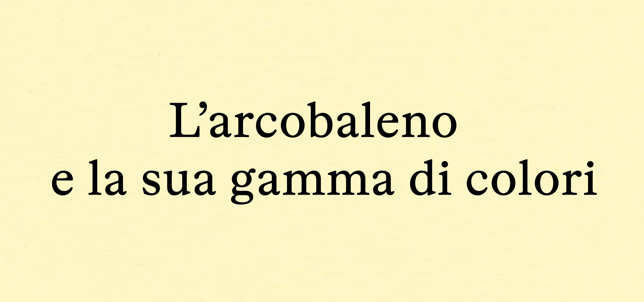
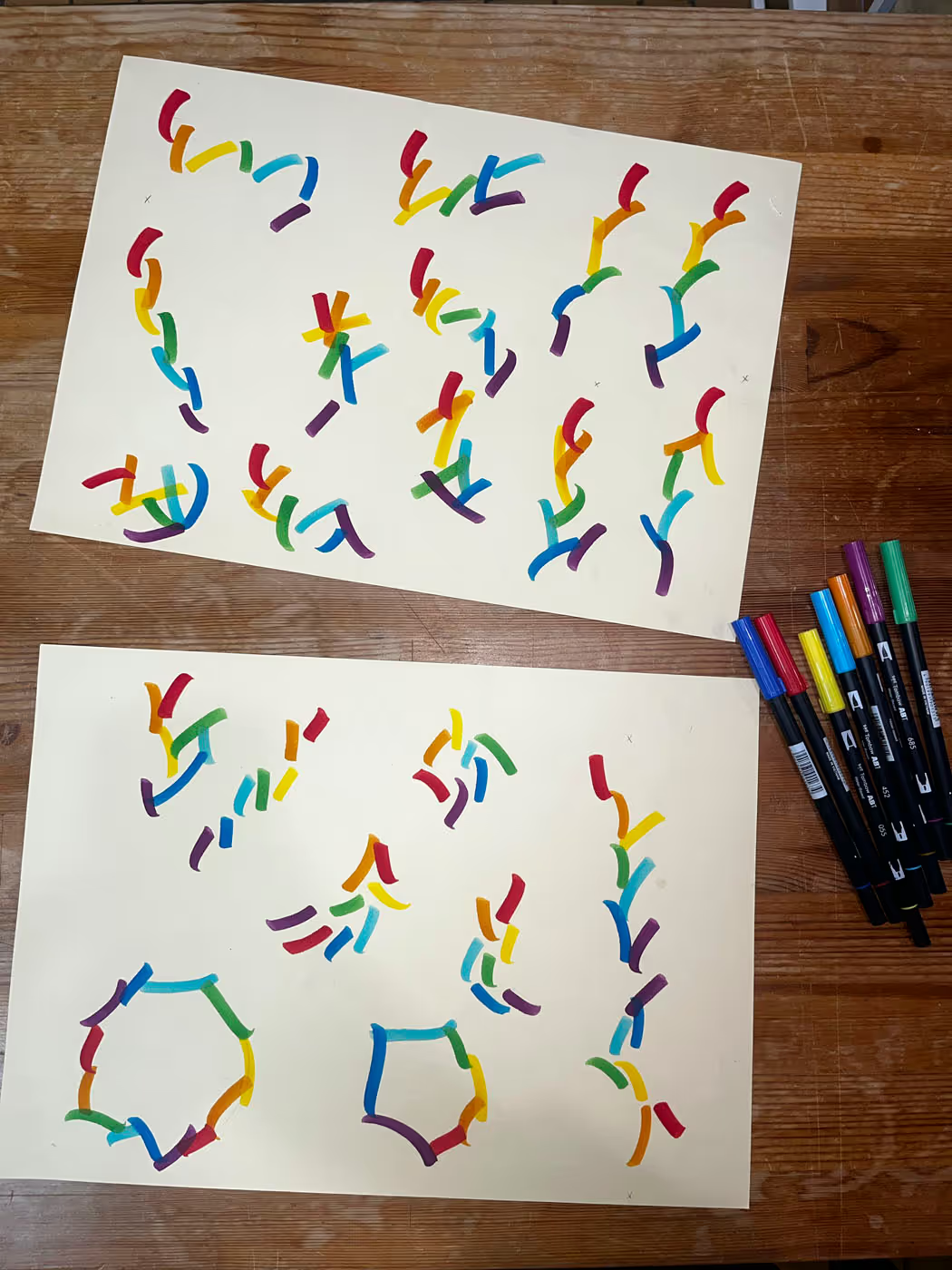
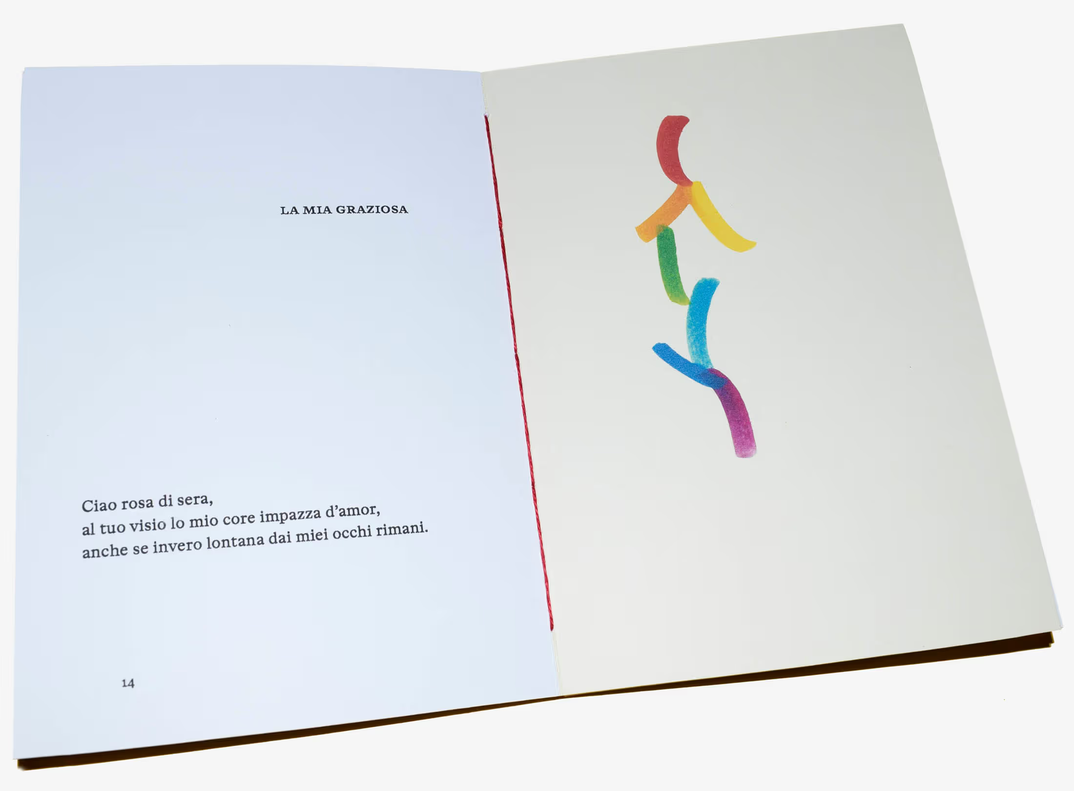
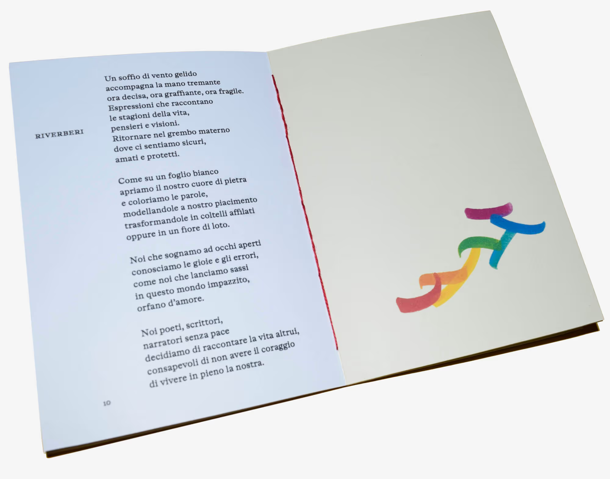
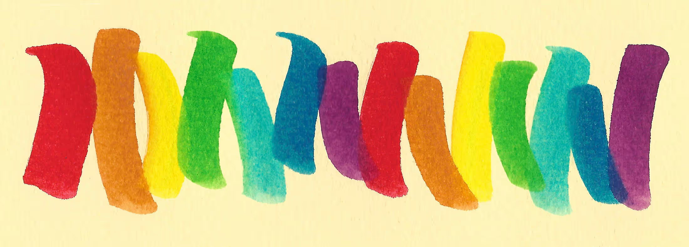
“L’arcobaleno e la sua gamma di colori” means “The rainbow and its spectrum of colours.” This title served as the starting point for the illustrations.

No items found.
Illustrations
No items found.
Interior views
No items found.
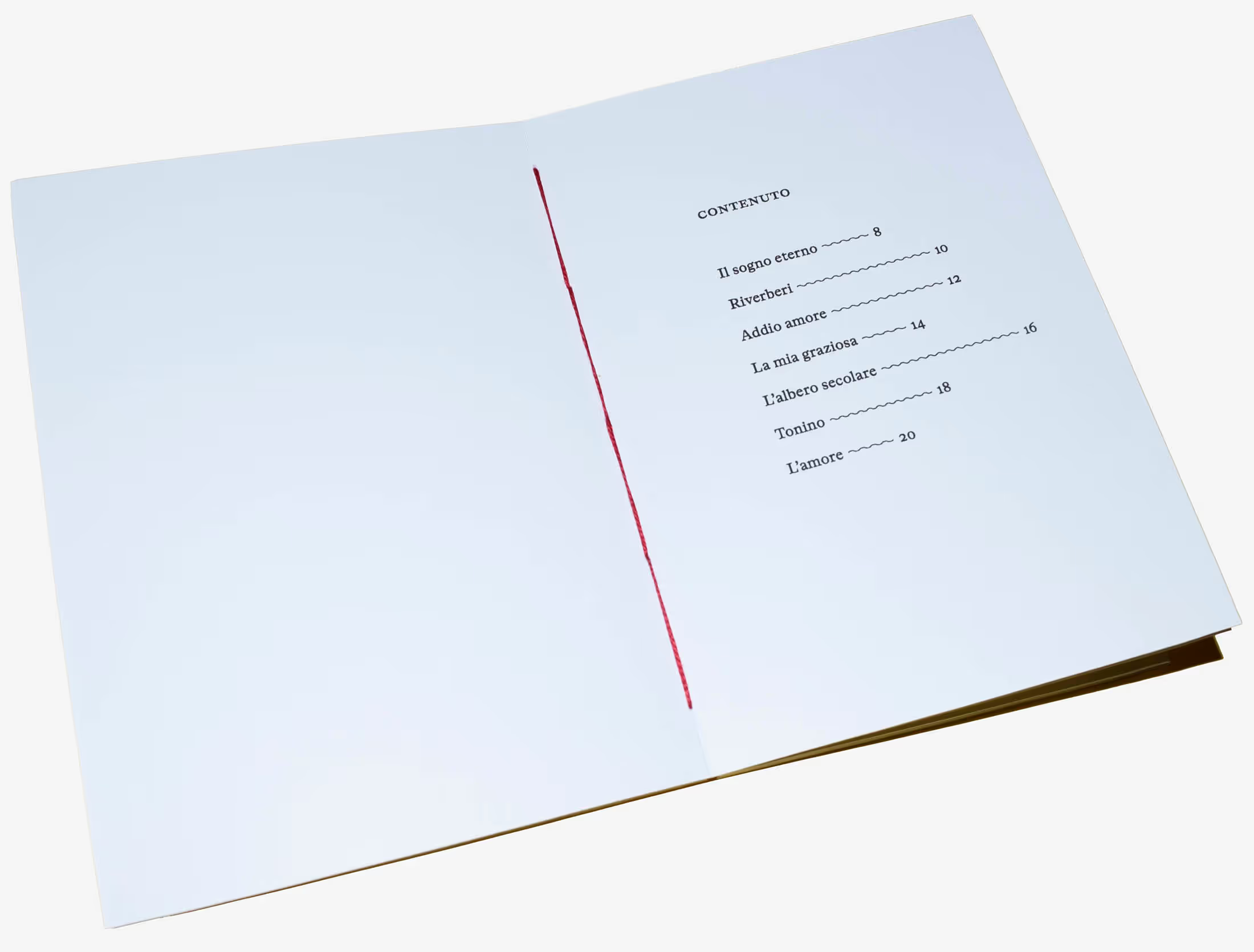
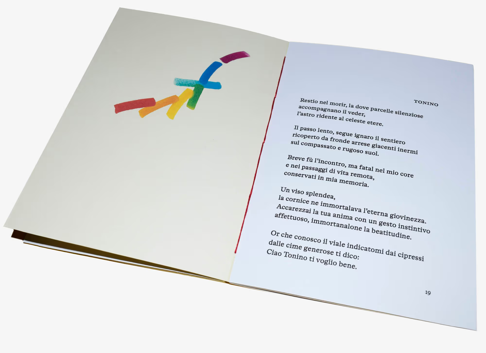
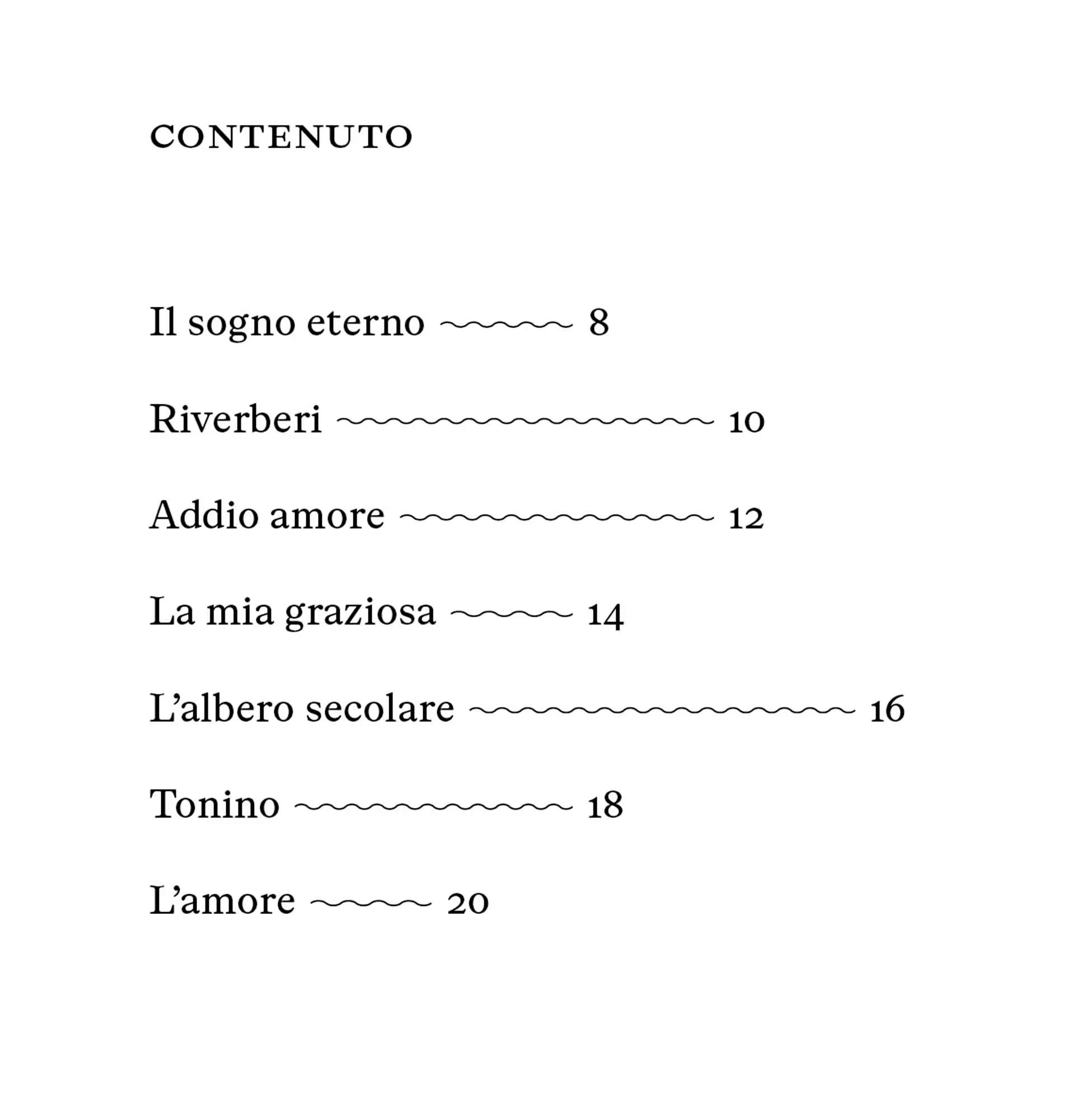
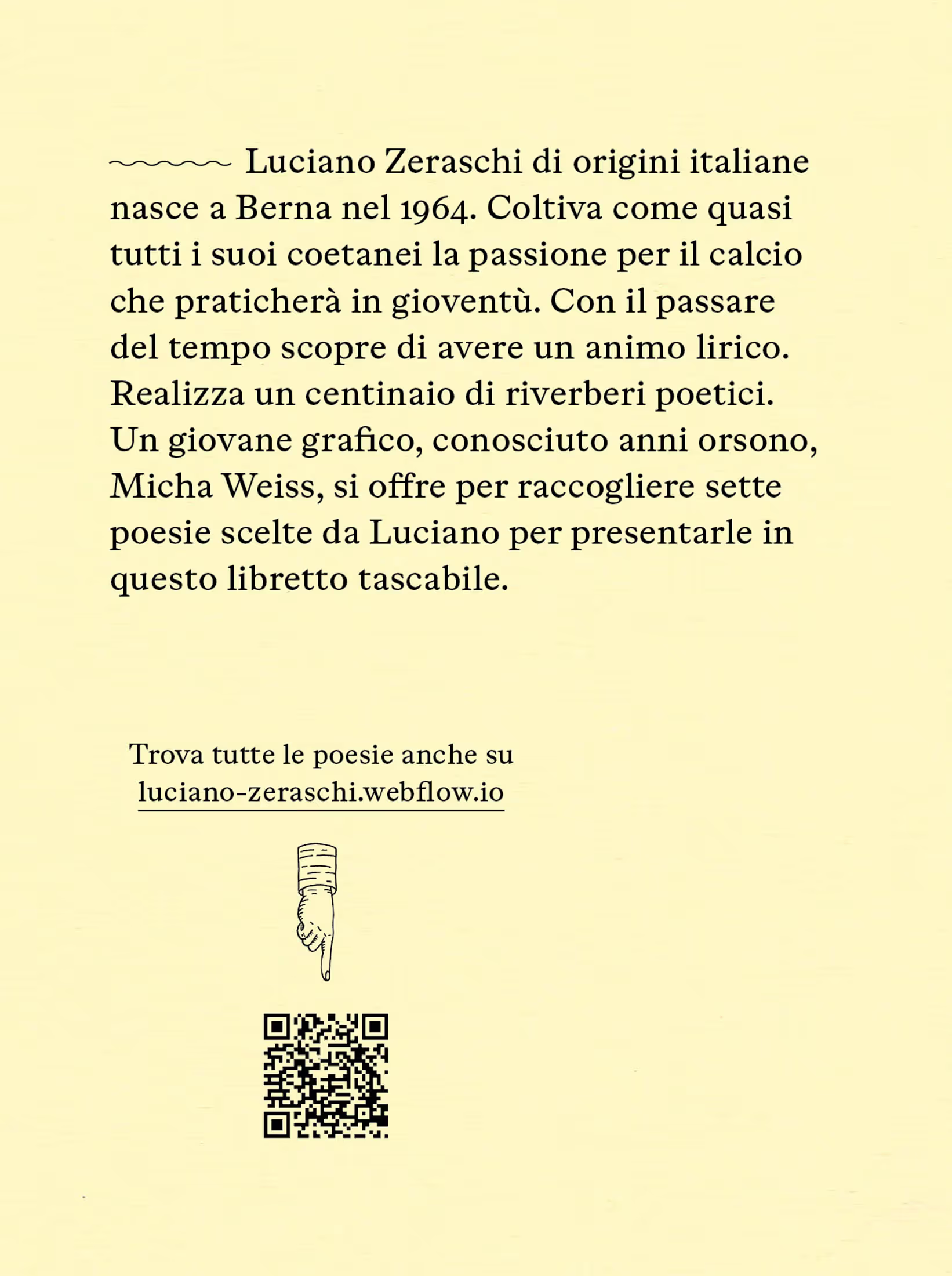
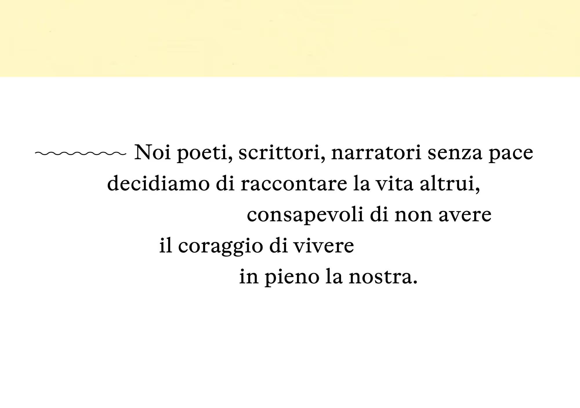
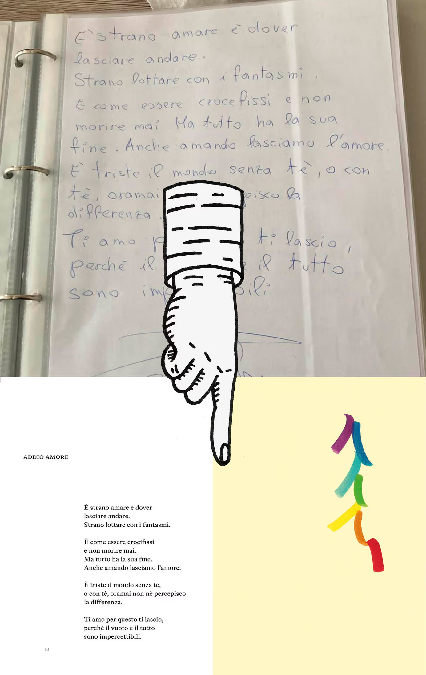
Excerpts and detailed views. Font in use: ABC Otto by Dinamo Typefaces

No items found.
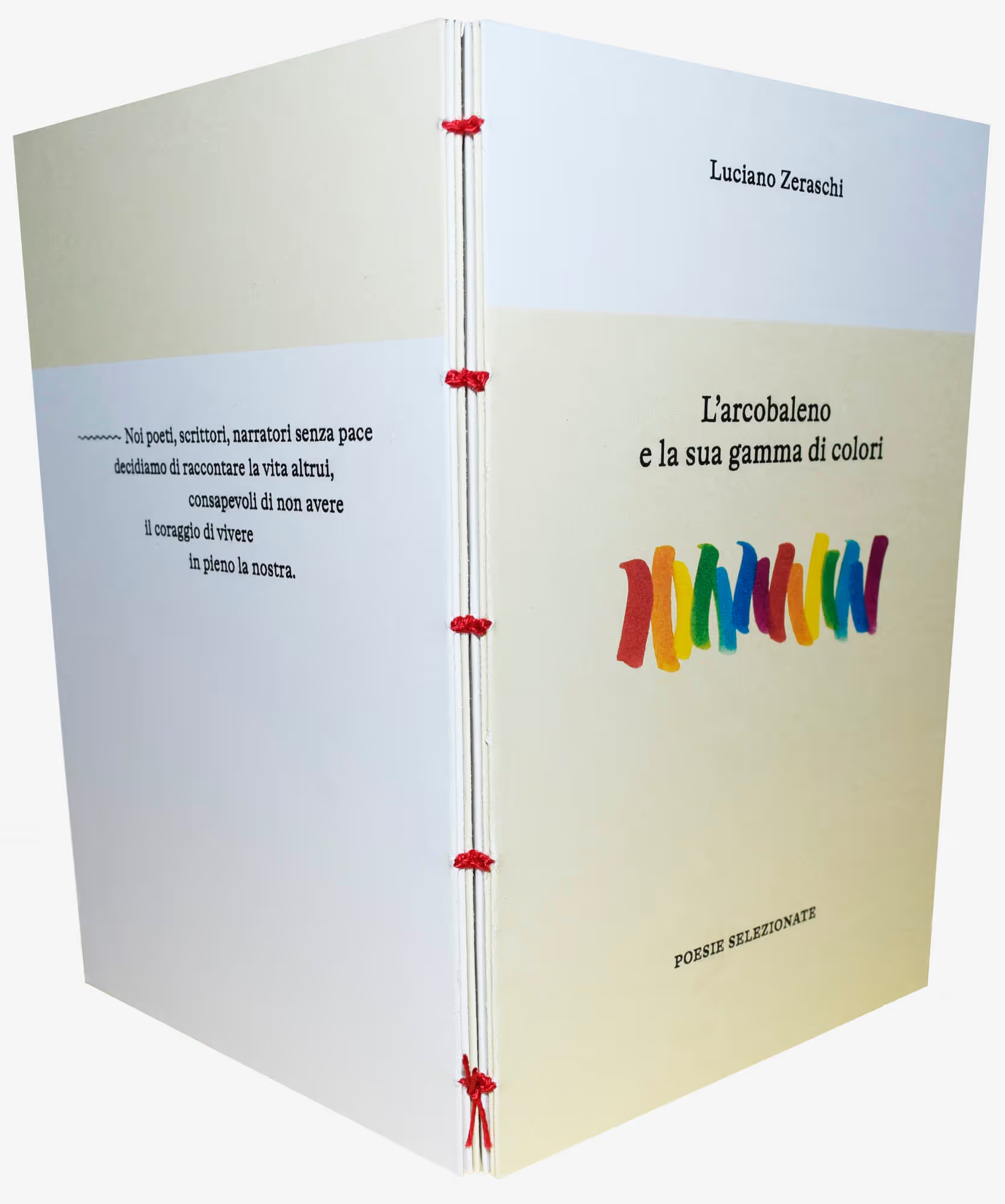
Coptic thread binding. I bound the second edition with red thread—somewhat more striking than the white one.
No items found.
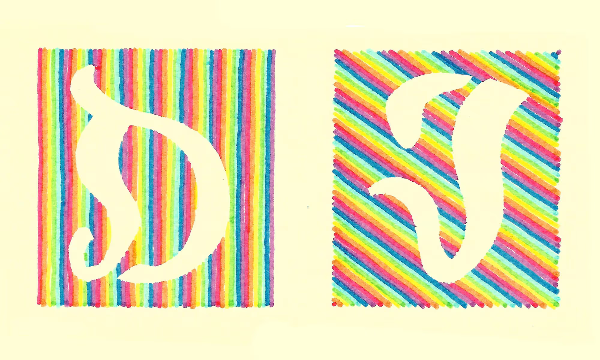
An idea at the beginning of the project: to have the poems begin with initials.
No items found.
The illustrations reveal the texture of the paper, giving them a vibrant, tangible quality.
No items found.
The starting point and the outcome
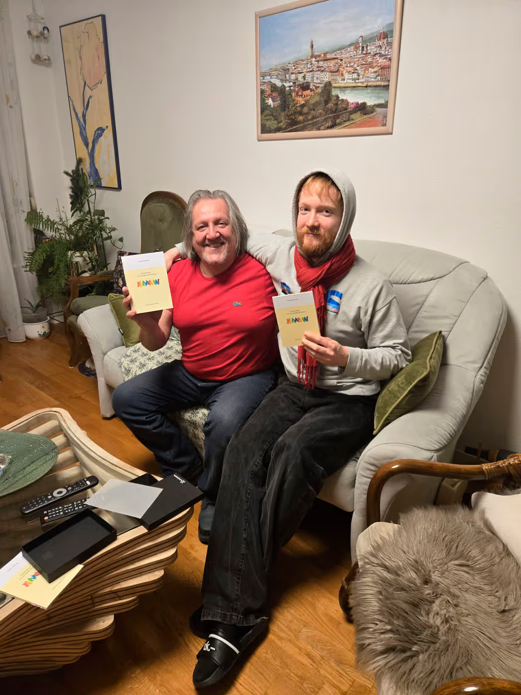
Der Poet und der Grafiker
Challenges & Solutions
×
Goals | Challenges | Solutions | Learnings
Luciano gave me complete creative freedom for this project. Ironically, that freedom was exactly what made it so difficult to find a starting point. The book's evocative title quickly gave me a conceptual framework for the illustrations, but beyond that, the direction was wide open. For the book design, typography, and format, I chose a more restrained, almost "traditional" approach, drawing inspiration from the familiar visual language of poetry collections. That felt especially fitting, as Luciano's poems are written in a slightly archaic form of Italian. The little book—or, as the Italians so nicely put it, libretto—has since reached its second edition, featuring refined typography along with general improvements to the layout and binding. One of the most fascinating aspects of the project was designing a book in a language I don't speak myself.
Goals | Challenges | Solutions | Learnings
Luciano gave me complete creative freedom for this project. Ironically, that freedom was exactly what made it so difficult to find a starting point. The book's evocative title quickly gave me a conceptual framework for the illustrations, but beyond that, the direction was wide open. For the book design, typography, and format, I chose a more restrained, almost "traditional" approach, drawing inspiration from the familiar visual language of poetry collections. That felt especially fitting, as Luciano's poems are written in a slightly archaic form of Italian. The little book—or, as the Italians so nicely put it, libretto—has since reached its second edition, featuring refined typography along with general improvements to the layout and binding. One of the most fascinating aspects of the project was designing a book in a language I don't speak myself.


.gif)

© MW 2026 | Made with ❤ in Webflow
“Of all the achievements of the human mind, the birth of the alphabet is the most momentous.”
Frederic Goudy