


No items found.
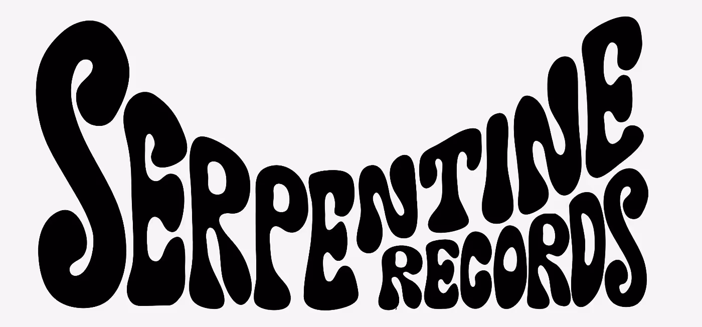
Font in use for the logo: Neue Haas Unica by Toshi Omagari.
No items found.
Slogan. Verwendete Schrift: Neue Haas Unica von Toshi Omagari.
No items found.
Alternative design
No items found.
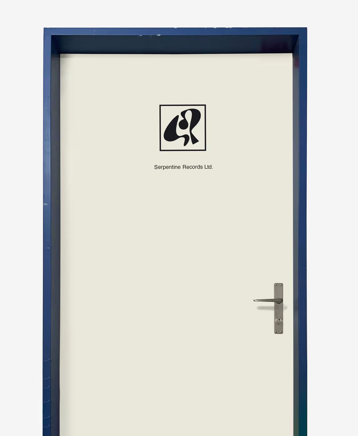
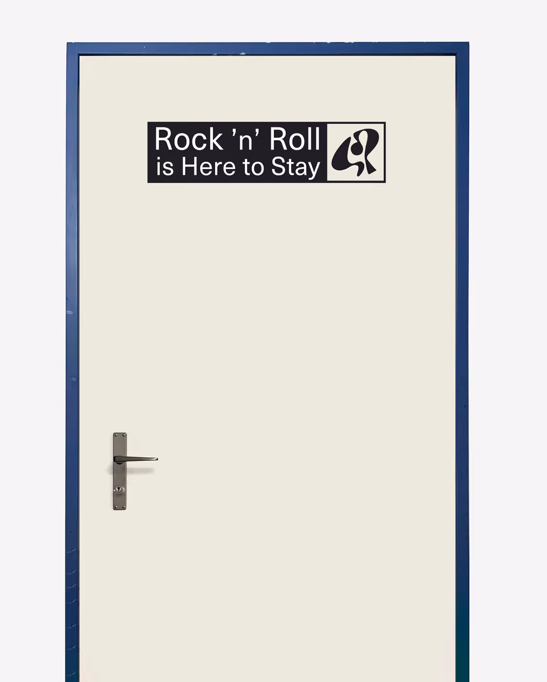
Door signage
No items found.
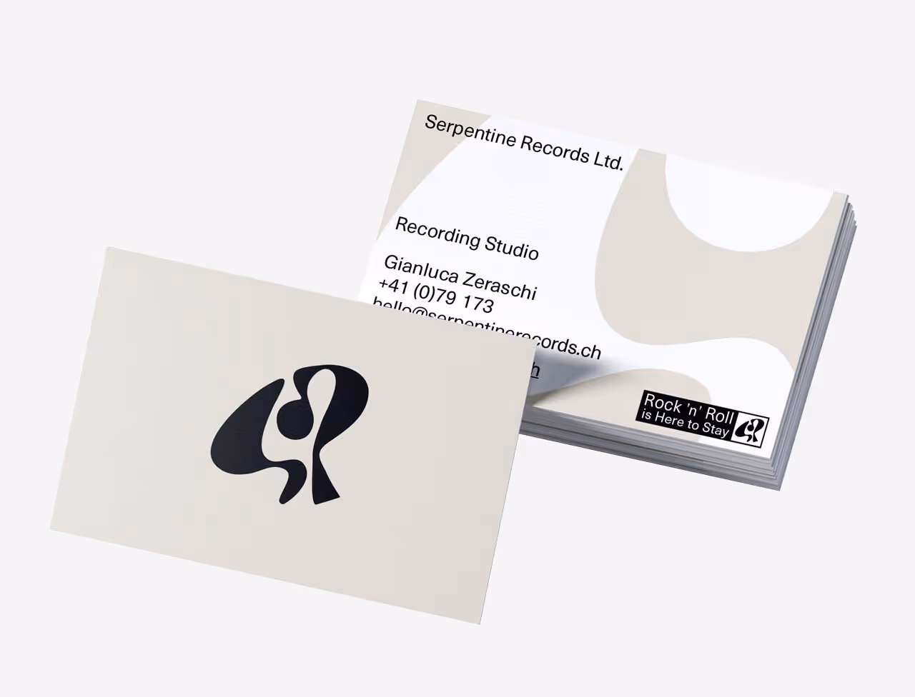
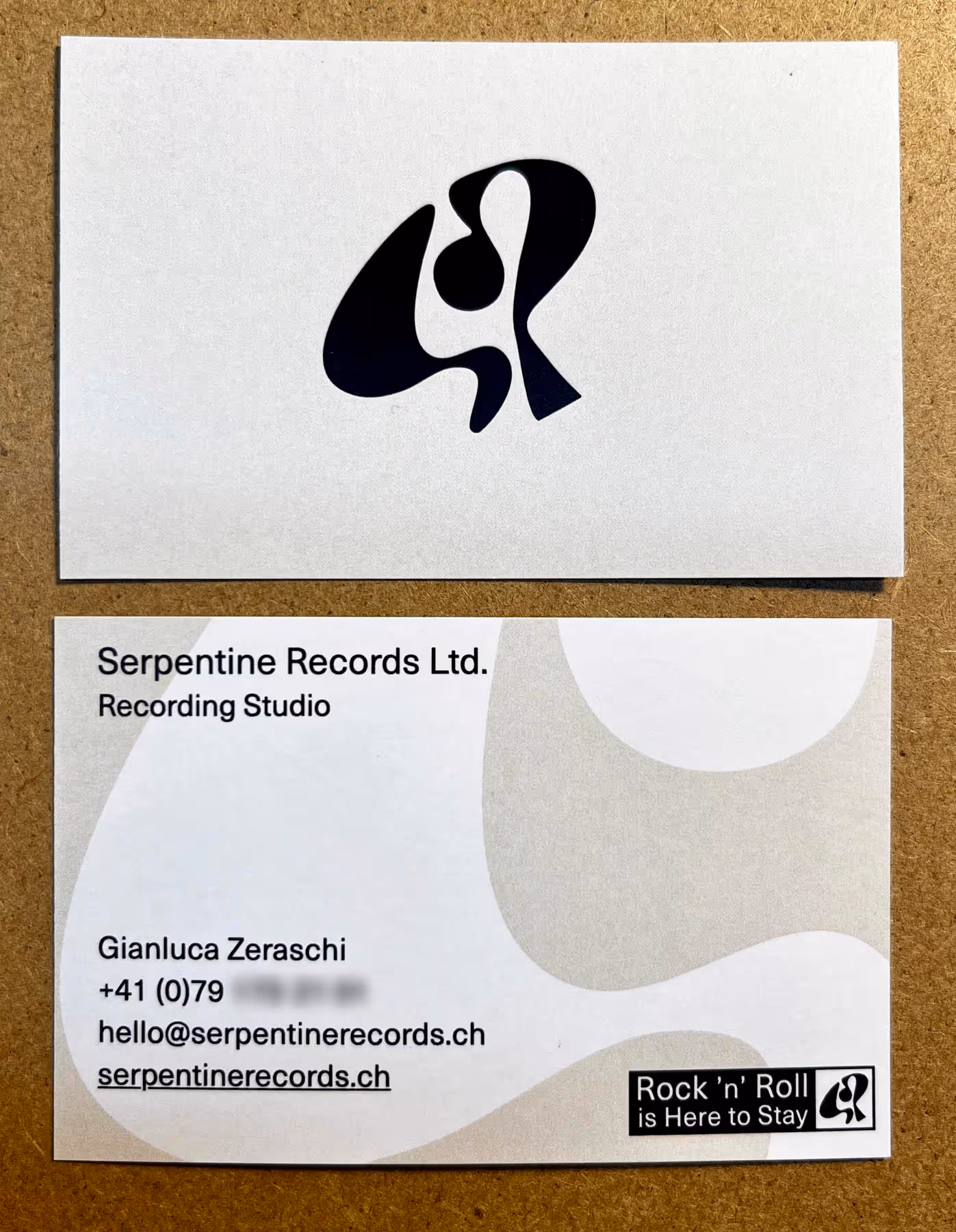
Business card. The logo can be used with or without a frame, depending on context and surroundings. When applied in a setting that naturally creates a visual frame—such as the business card—the frame is not necessary. In larger, more open applications like door signage, the frame helps position the logo within the space.
No items found.
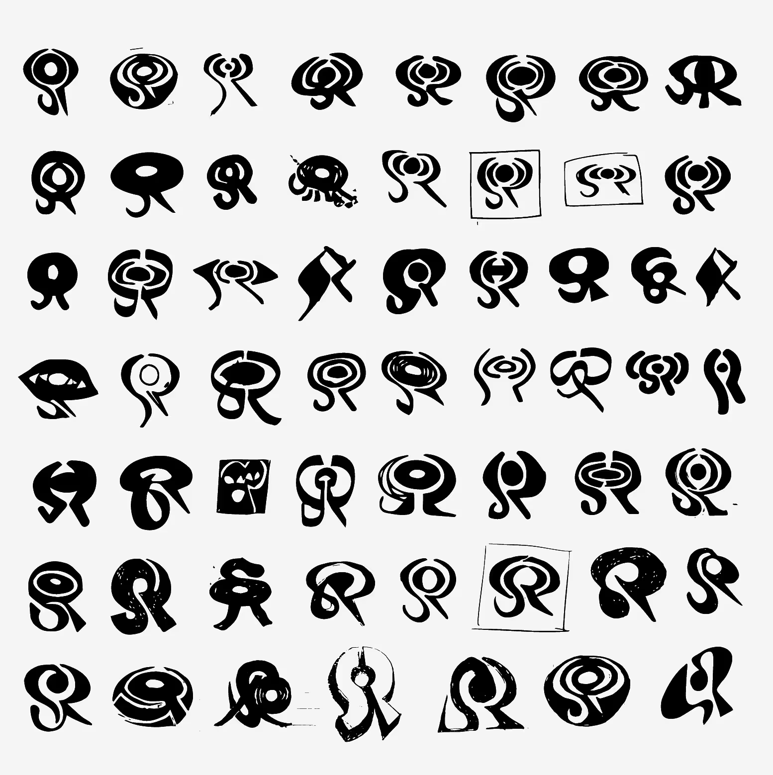
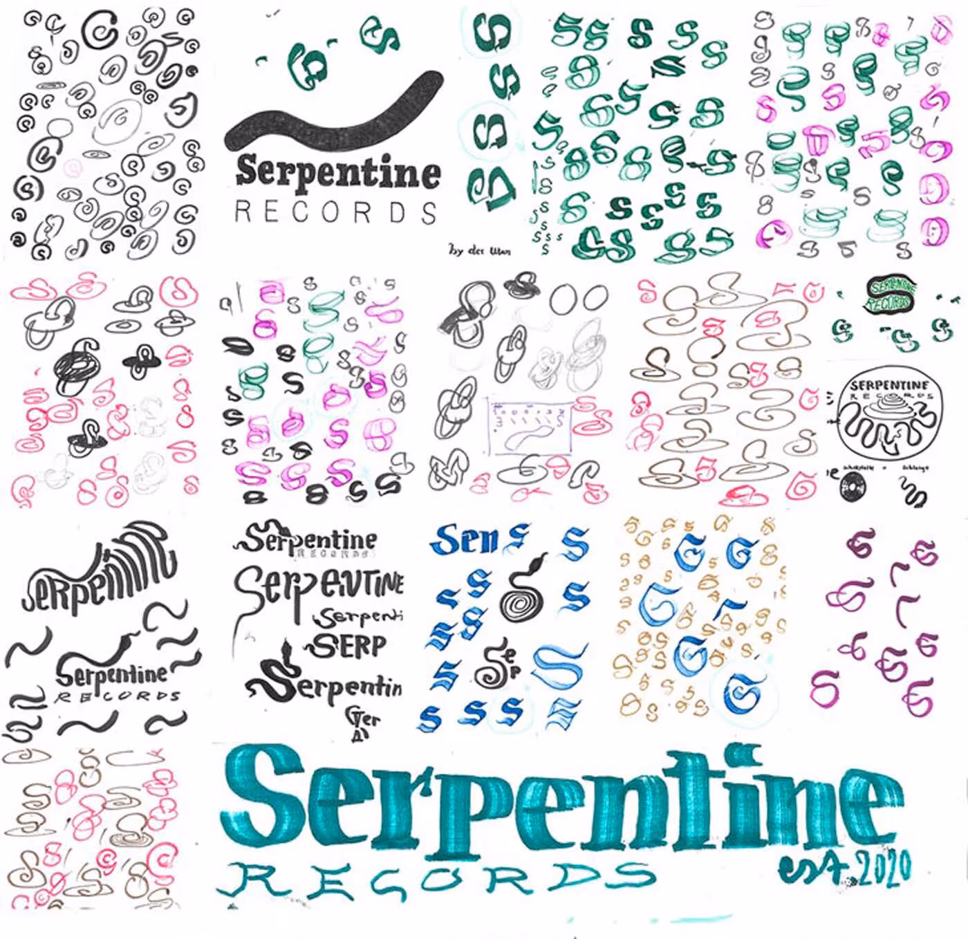
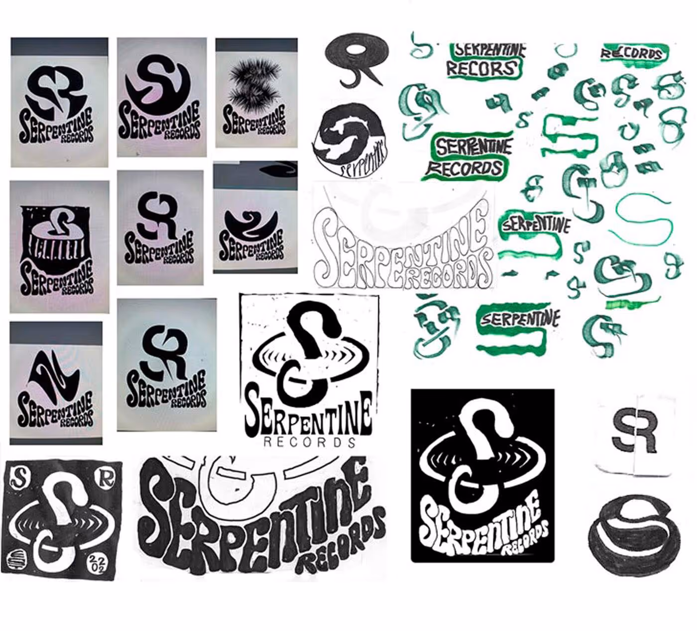
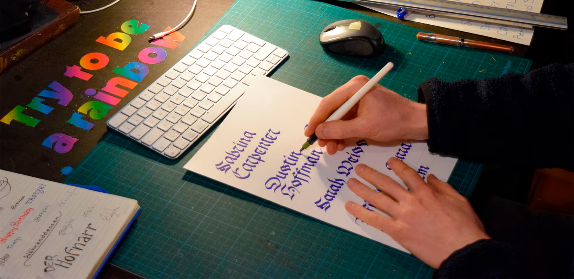
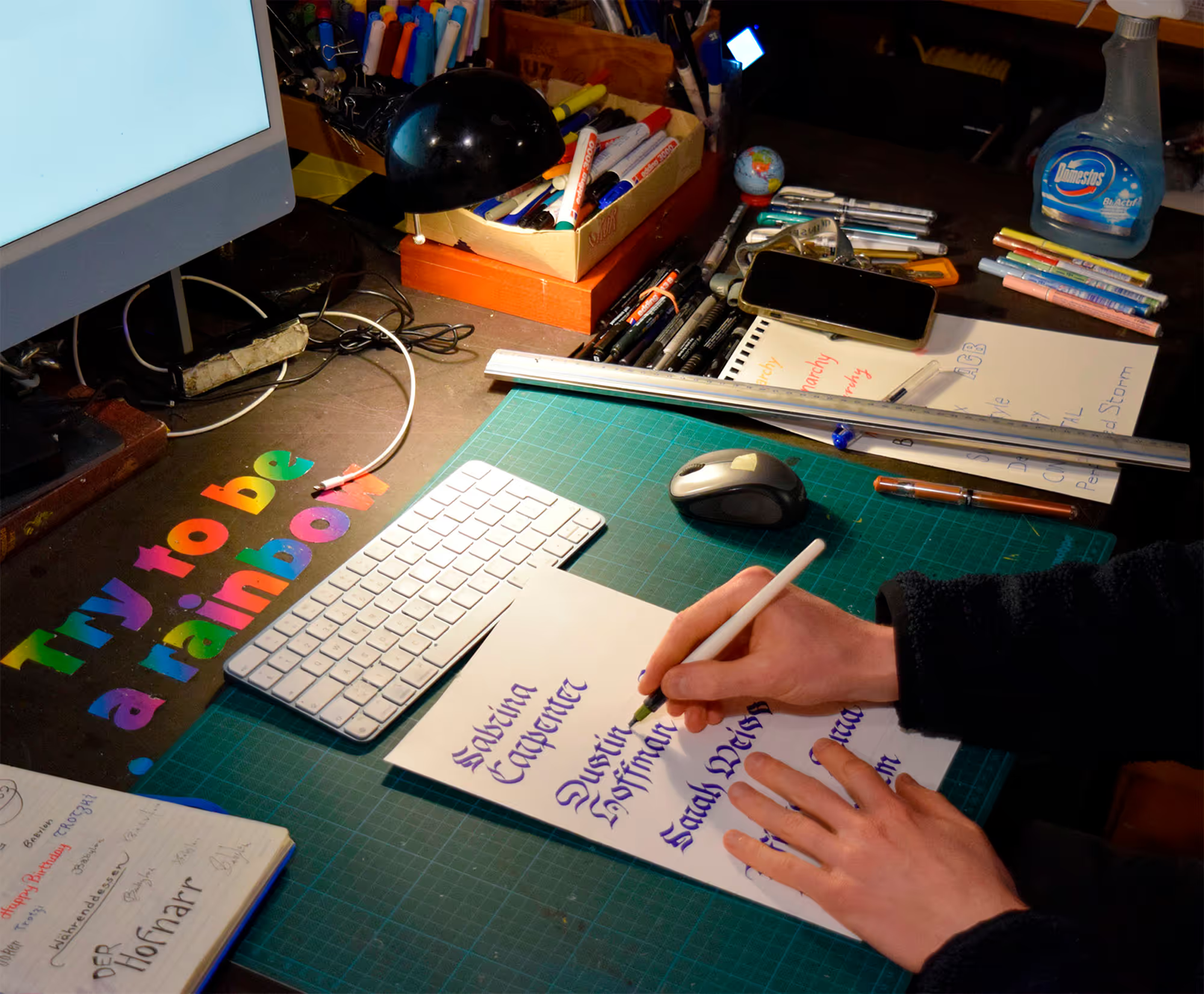
Process
No items found.
More process
No items found.
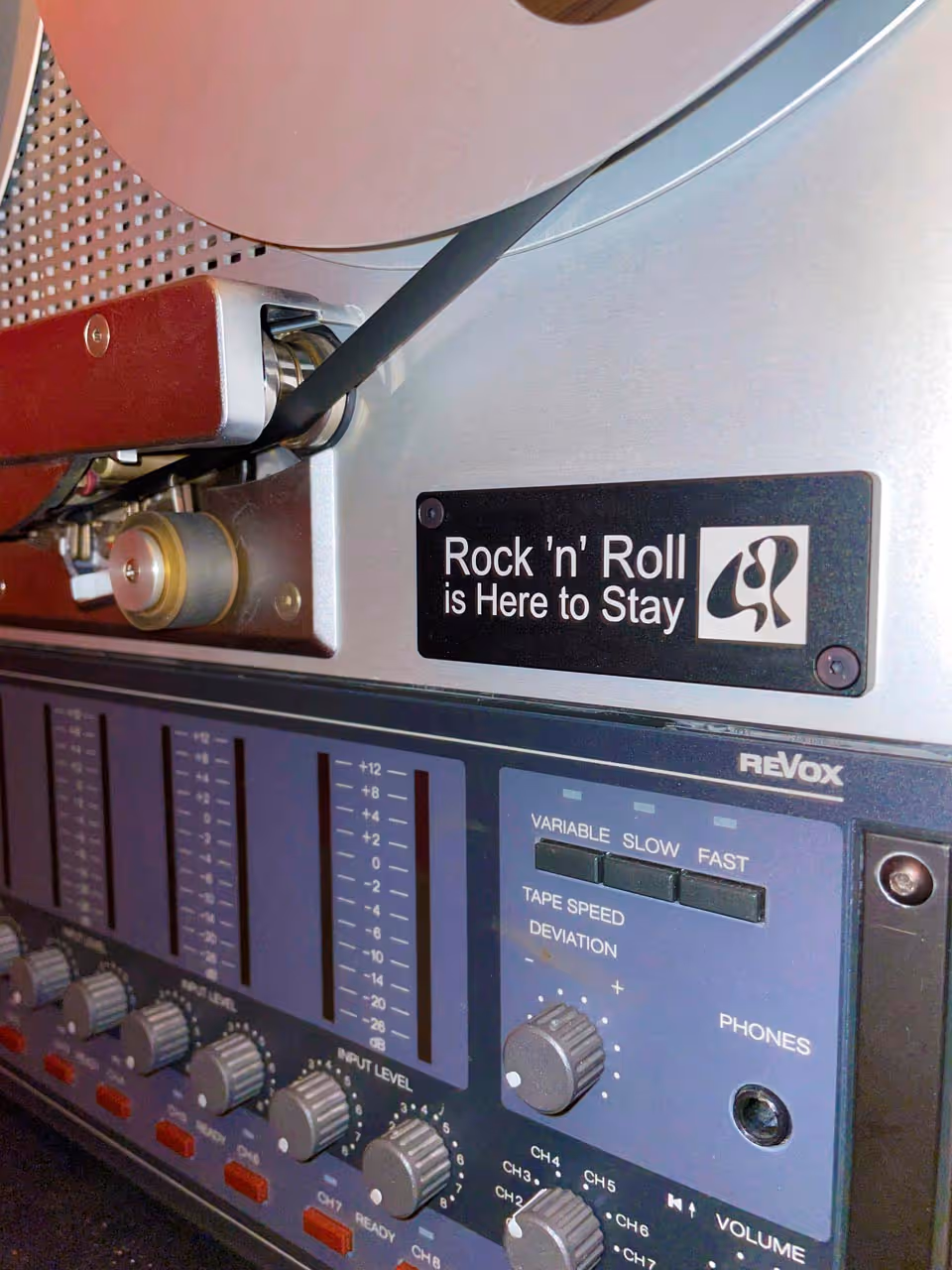
Logo on tape machine

No items found.
Conceptual idea behind the logo
No items found.
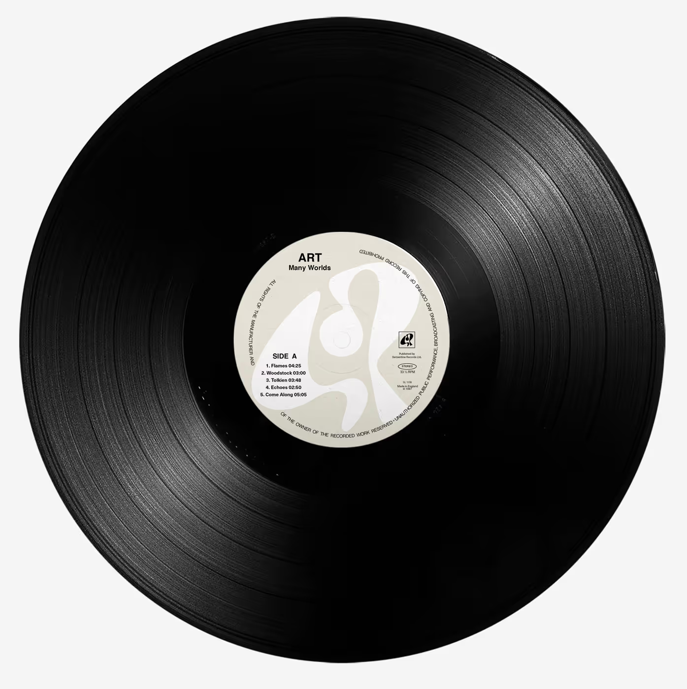
Possible application, visualization

A look inside Serpentine Records
Challenges & Solutions
×
Goals | Challenges | Solutions | Learnings
It took quite a long time and required many sketches and iterations to arrive at the final logo. Sometimes this kind of process is necessary, but I have also learned to work more efficiently and purposefully since then (project is from 2023). The business card reminded me of the existence of the simultaneous contrast—an optical effect in which colours are influenced by their surroundings. This can be seen in the business card: on the back, the beige appears slightly darker when surrounded by white than on the front with the black logo. The colour therefore needs to be subtly adjusted to counteract this visual illusion. Of course, this is hardly noticeable in practice, as the front and back are rarely viewed or compared side by side. Still, it is an interesting detail worth considering.

Simultaneous contrast in action: the grey appears darker when surrounded by white.
Goals | Challenges | Solutions | Learnings
It took quite a long time and required many sketches and iterations to arrive at the final logo. Sometimes this kind of process is necessary, but I have also learned to work more efficiently and purposefully since then (project is from 2023). The business card reminded me of the existence of the simultaneous contrast—an optical effect in which colours are influenced by their surroundings. This can be seen in the business card: on the back, the beige appears slightly darker when surrounded by white than on the front with the black logo. The colour therefore needs to be subtly adjusted to counteract this visual illusion. Of course, this is hardly noticeable in practice, as the front and back are rarely viewed or compared side by side. Still, it is an interesting detail worth considering.
Simultaneous contrast in action: the grey appears darker when surrounded by white.
Read more …


.gif)
© MW 2026 | Made with ❤ in Webflow
“Of all the achievements of the human mind, the birth of the alphabet is the most momentous.”
Frederic Goudy