

No items found.

No items found.
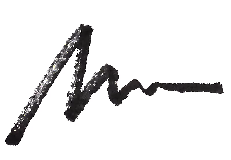
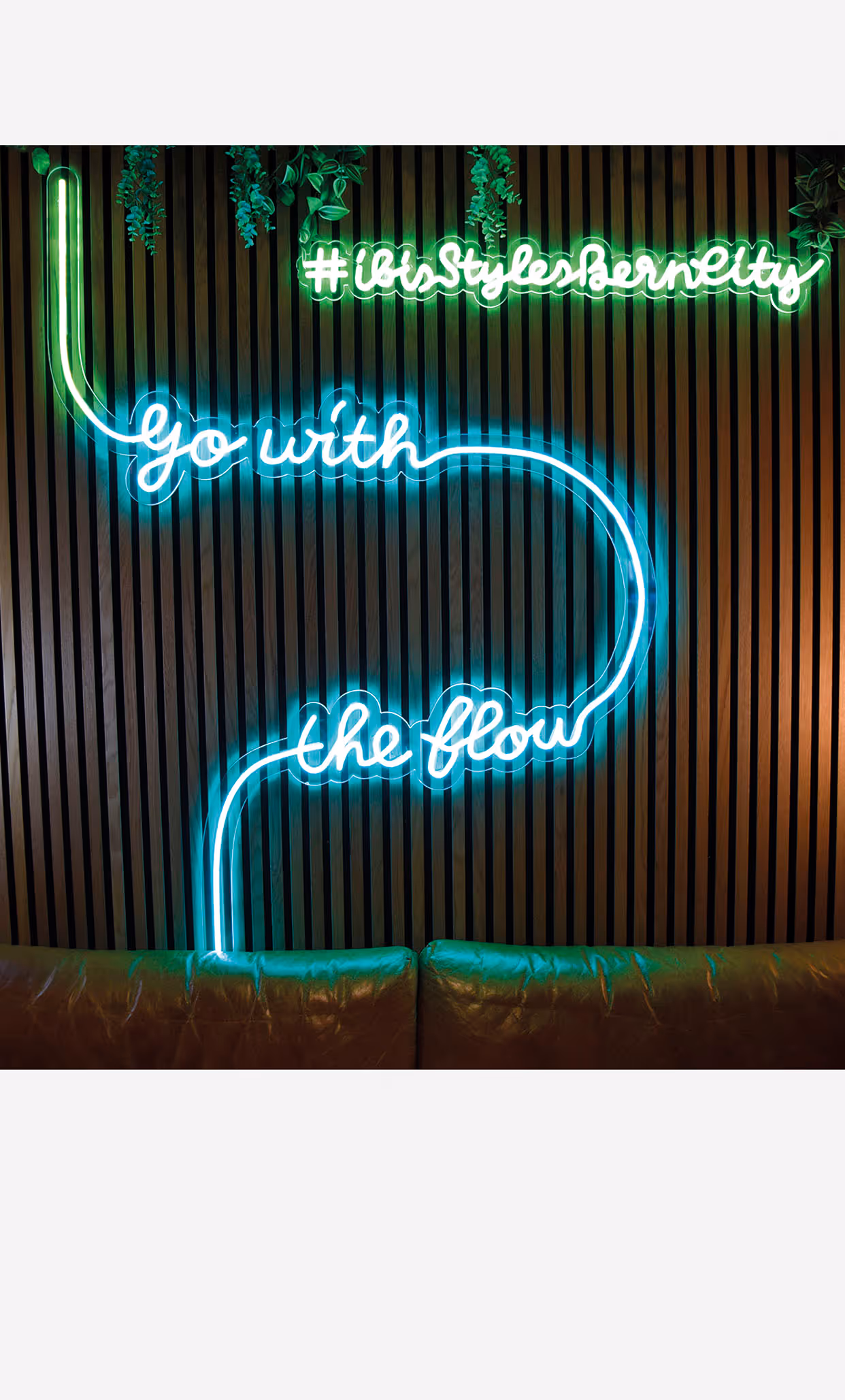
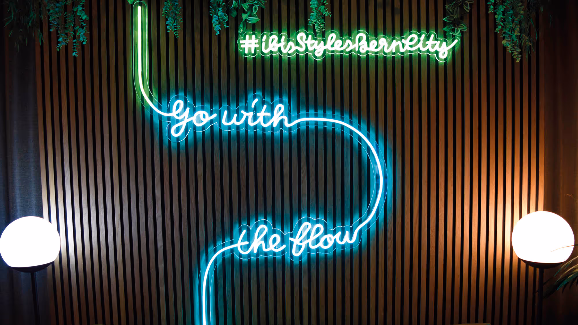
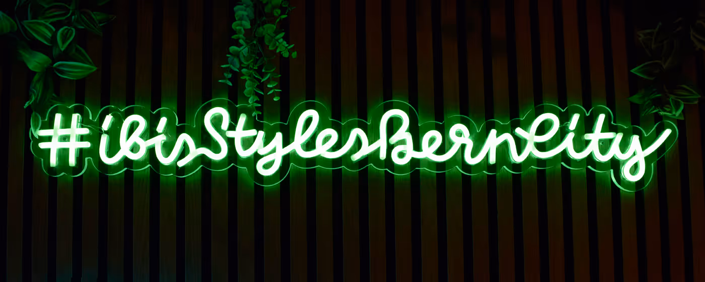
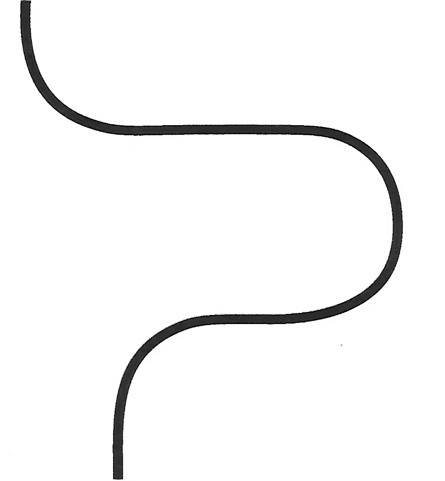
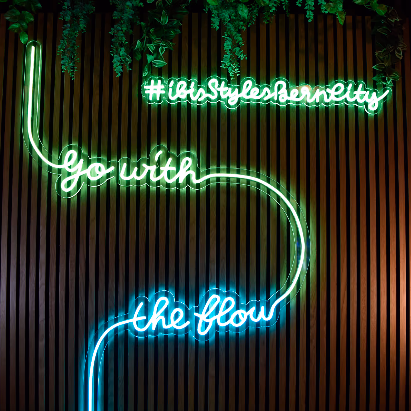
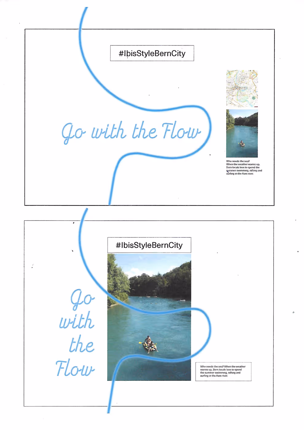
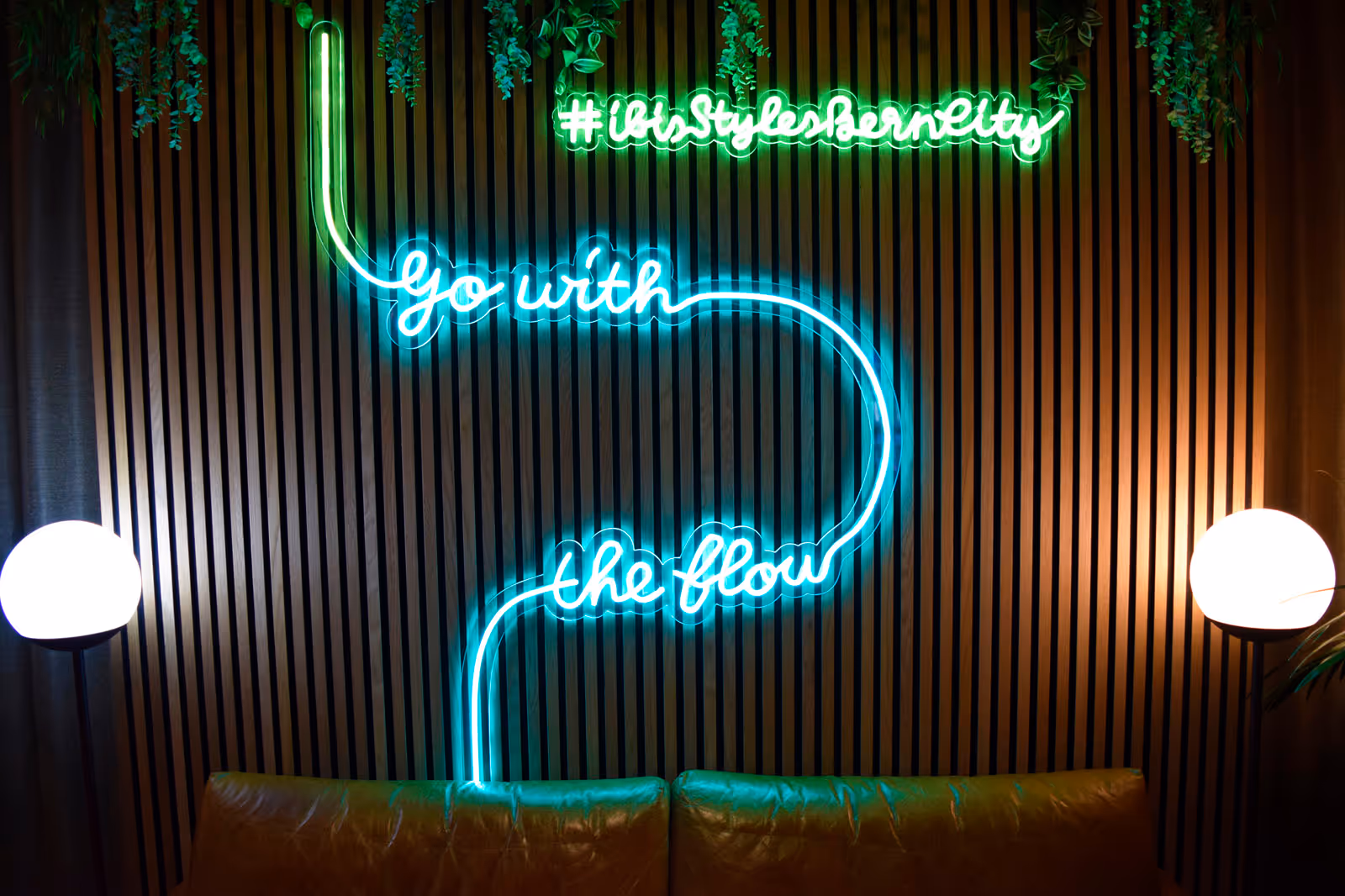
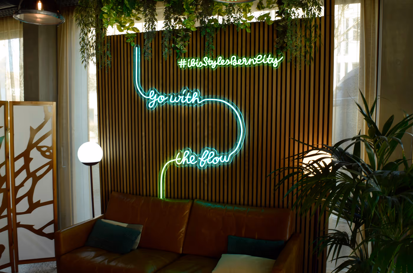
From the meanders of the Aare to a neon sign. Partner: NeonDreams.ch
No items found.
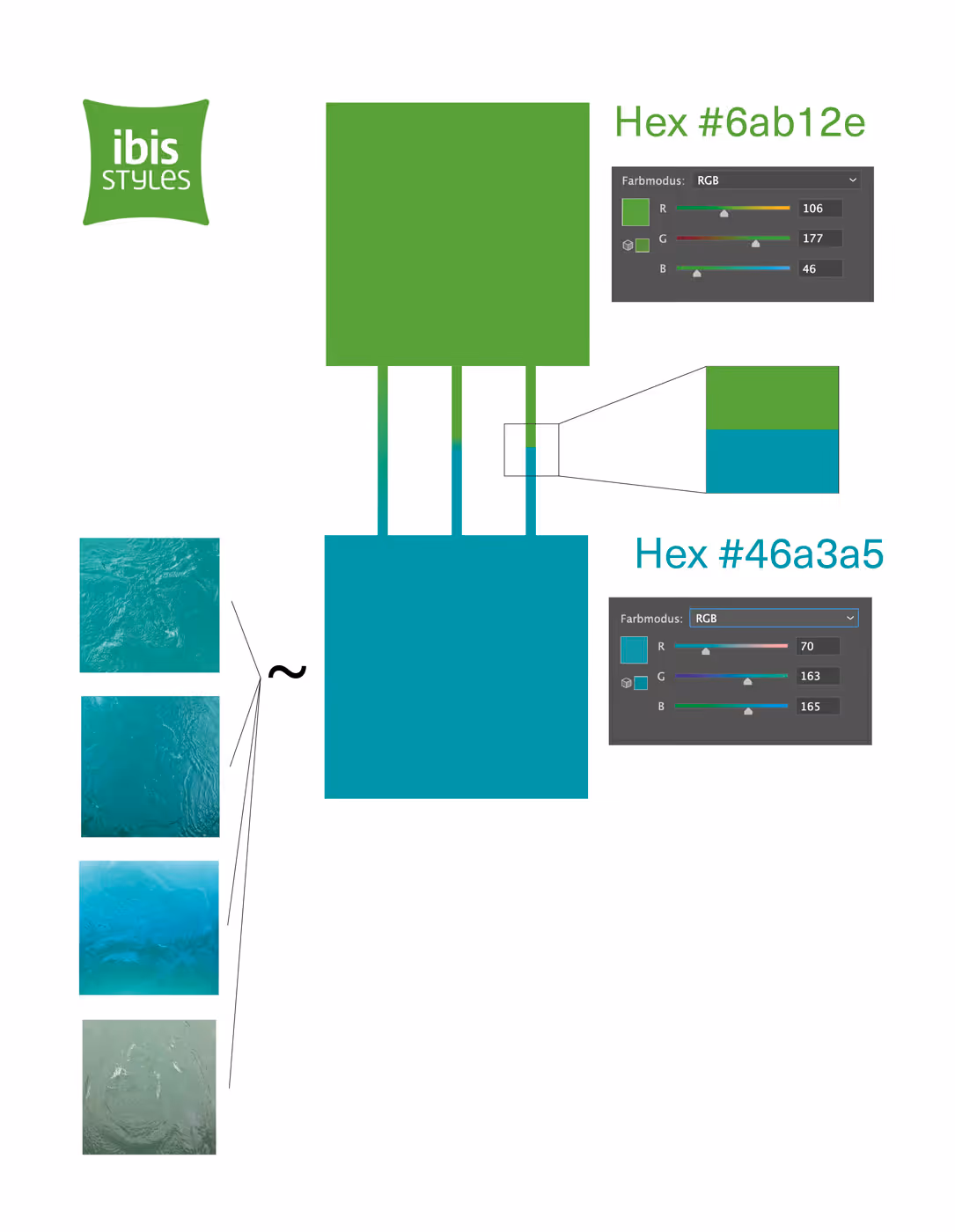
Colour palette: Aarefarbe.ch was a helpful reference in this process. Furthermore, it was also convenient that the hotel has a green logo.
No items found.
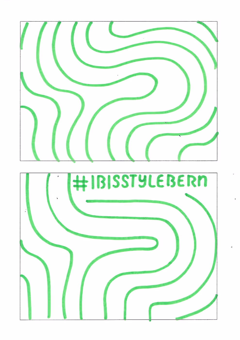
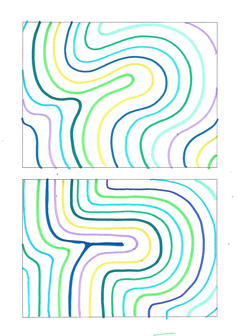
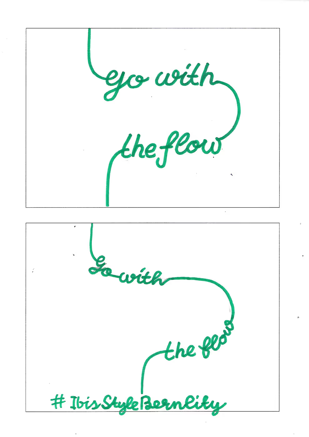
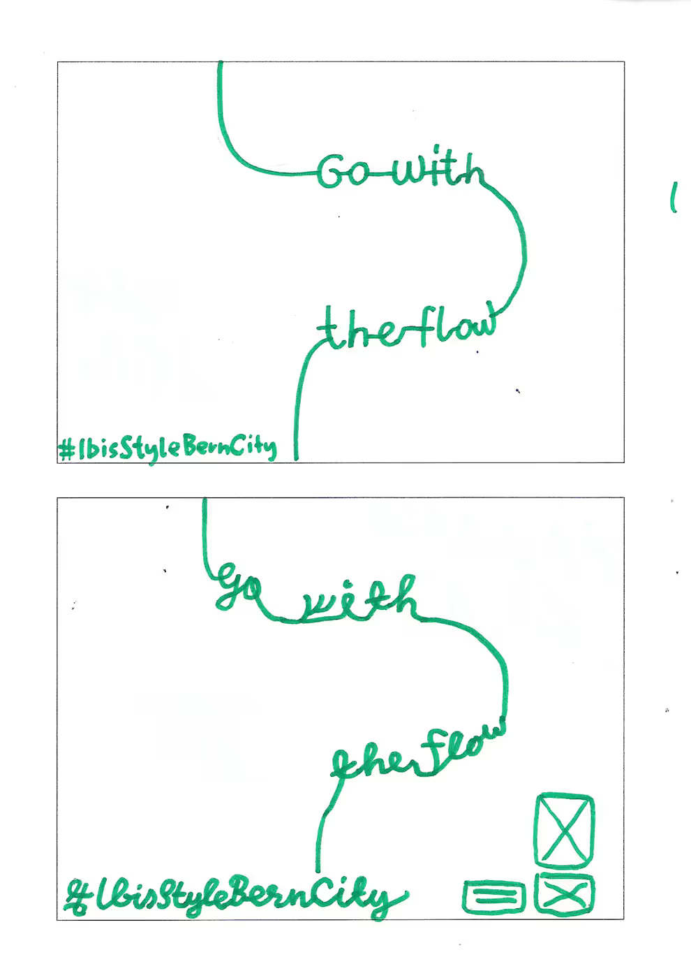
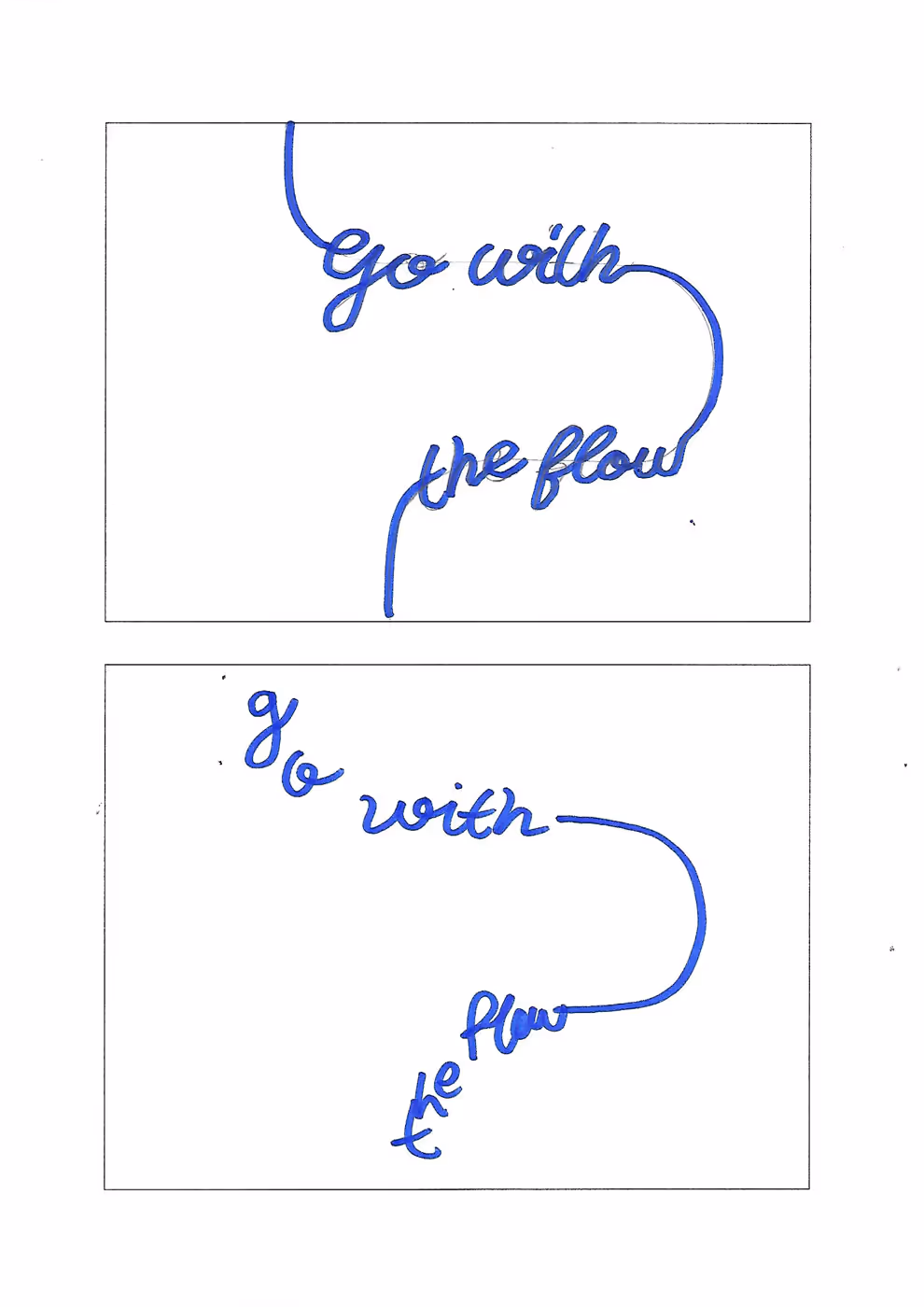
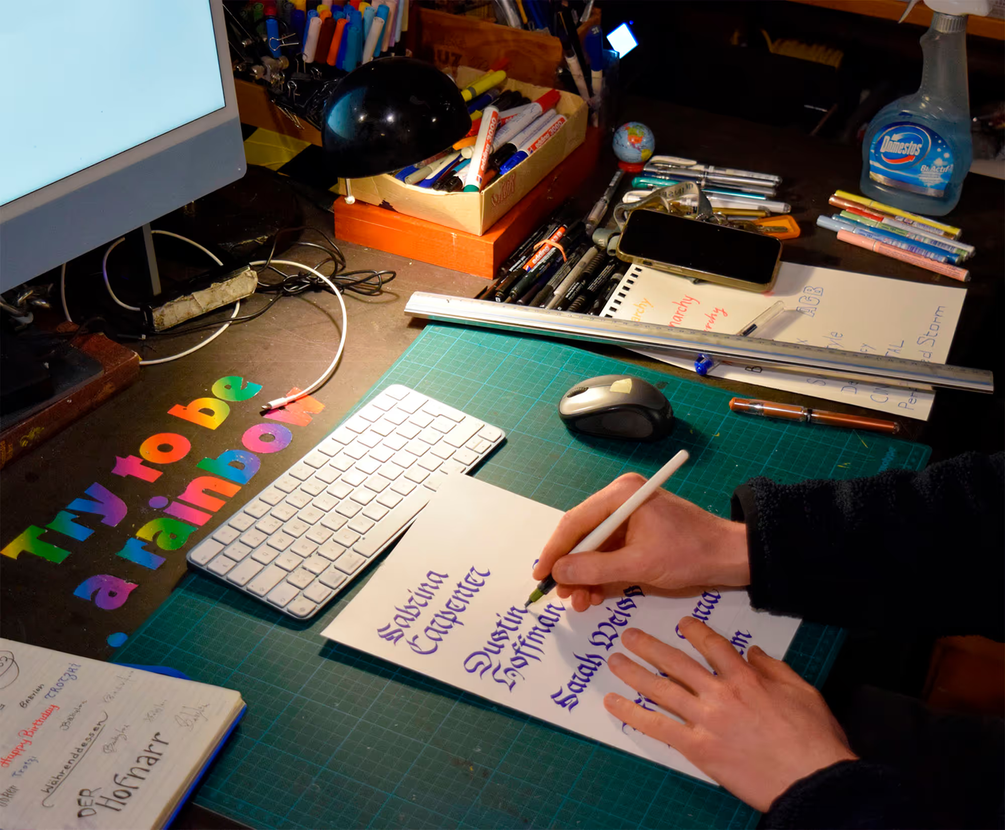
Sketches and process

No items found.
Challenges & Solutions
×
Goals | Challenges | Solutions | Learnings
The main challenge with this kind of script lettering is legibility. The hotel wanted a neon sign that would appeal to its international guests, which is why the phrase is in English. As a non-local, the reference to the meanders of the River Aare is probably not immediately recognisable. However, the sign also works as a visual highlight without this context. And as a tourist, you usually end up with a city map in your hands anyway—so the connection may still “click” at some point. The wall on which the neon sign is installed is also intended as a backdrop for selfies, which is why a hashtag was included.

.gif)
© MW 2026 | Made with ❤ in Webflow
“Of all the achievements of the human mind, the birth of the alphabet is the most momentous.”
Frederic Goudy