


No items found.
Close-ups | Small type: Jali Greek by Kostas Bartsokas and Mohamad Dakak (Foundry5)
No items found.
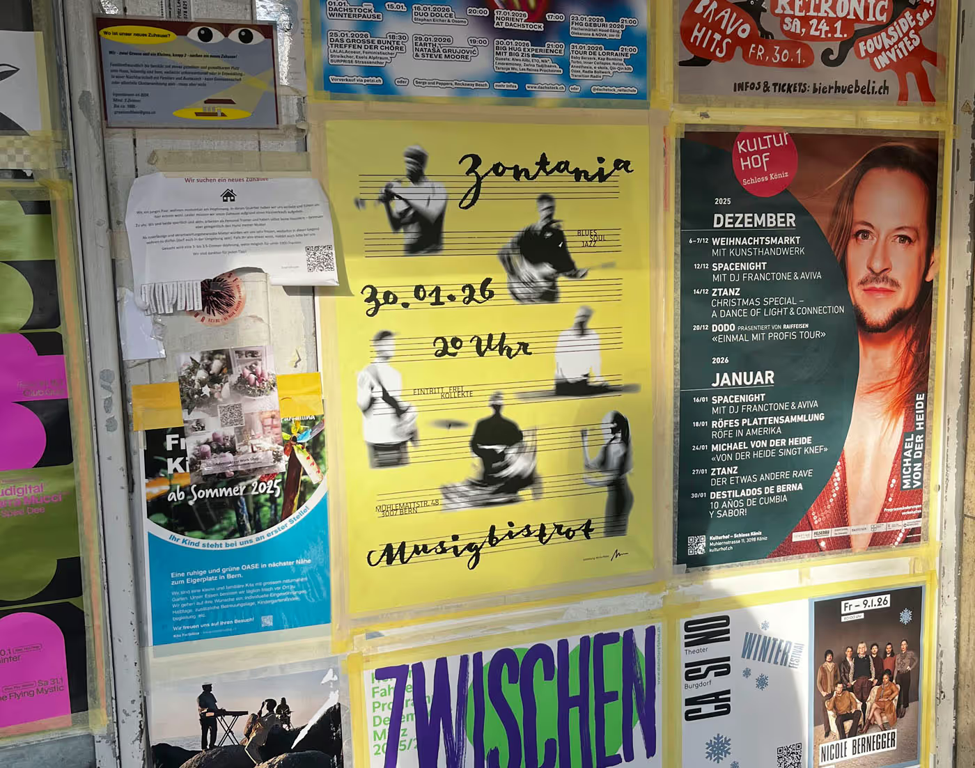
Out in the wild
No items found.
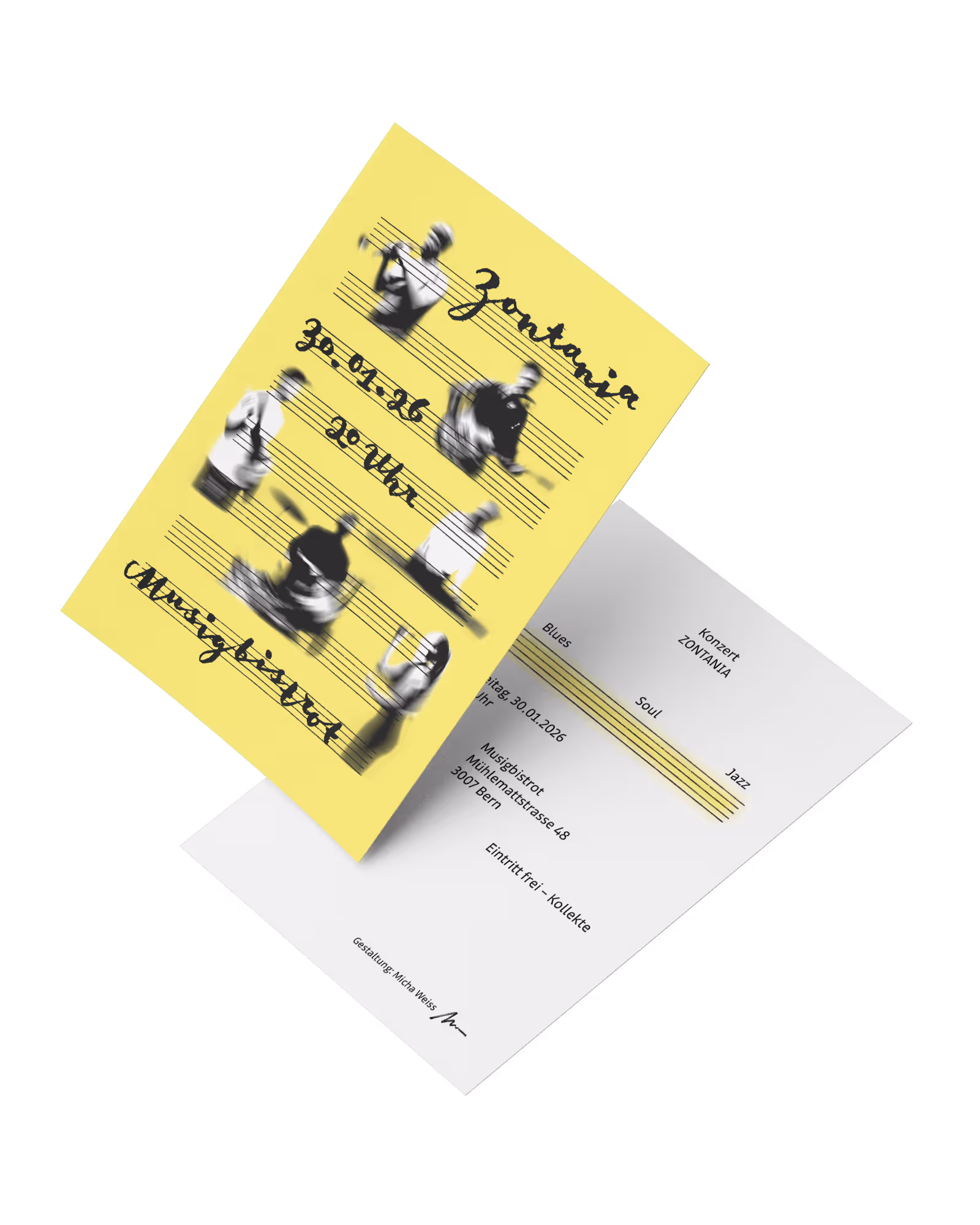
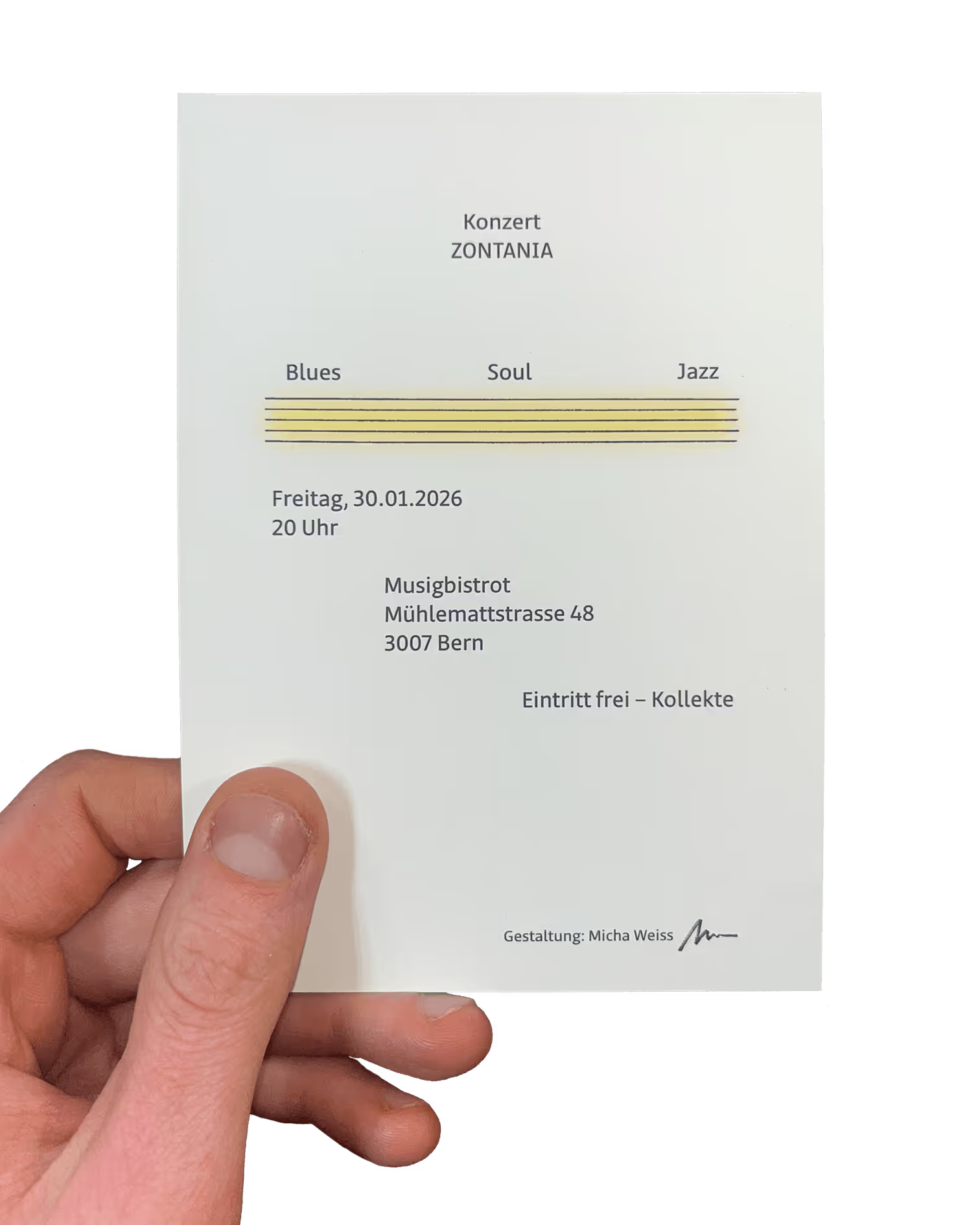
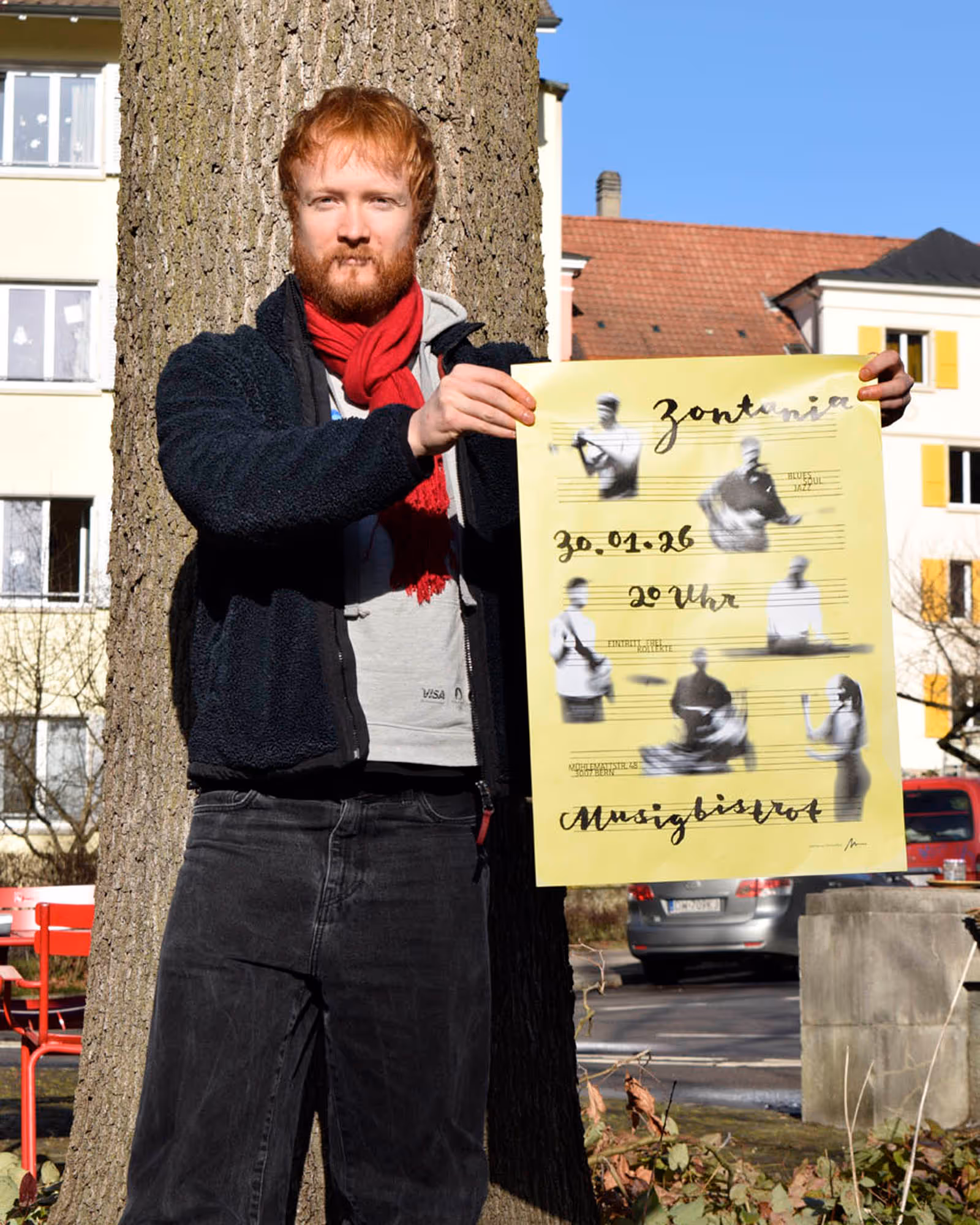
A6 flyer with adapted layout: the small text between the staff lines is too small for this format and works better on the back of the flyer.
No items found.
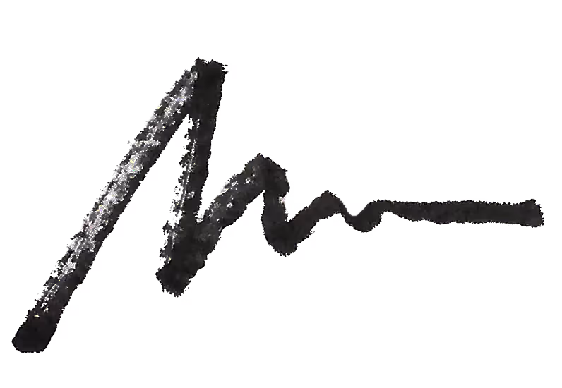
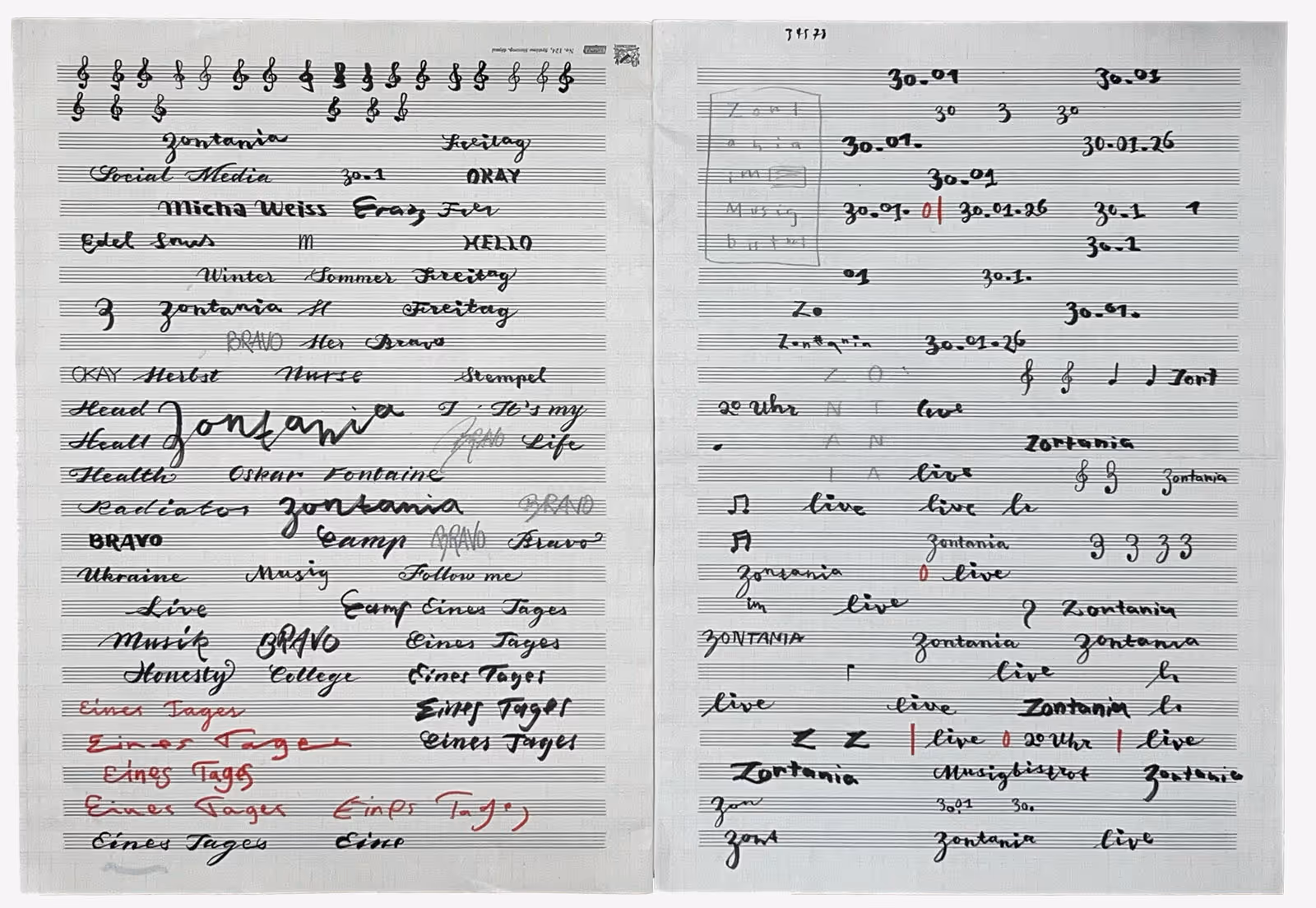
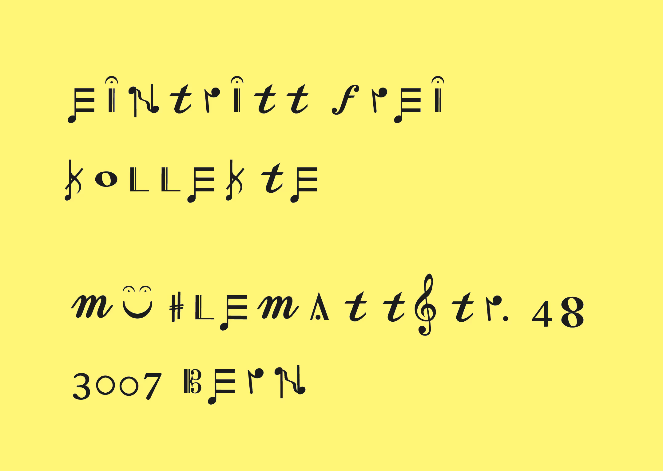
Development of the lettering on a music sheet.


No items found.
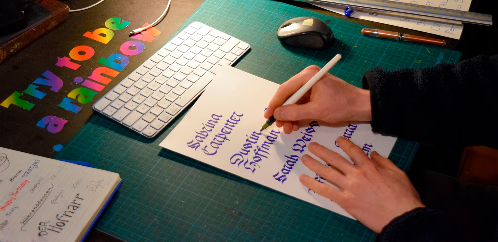
Process and experiments
No items found.
Experiments with the typeface “Tchaikovsky” by Joanna Vu (not used)
No items found.
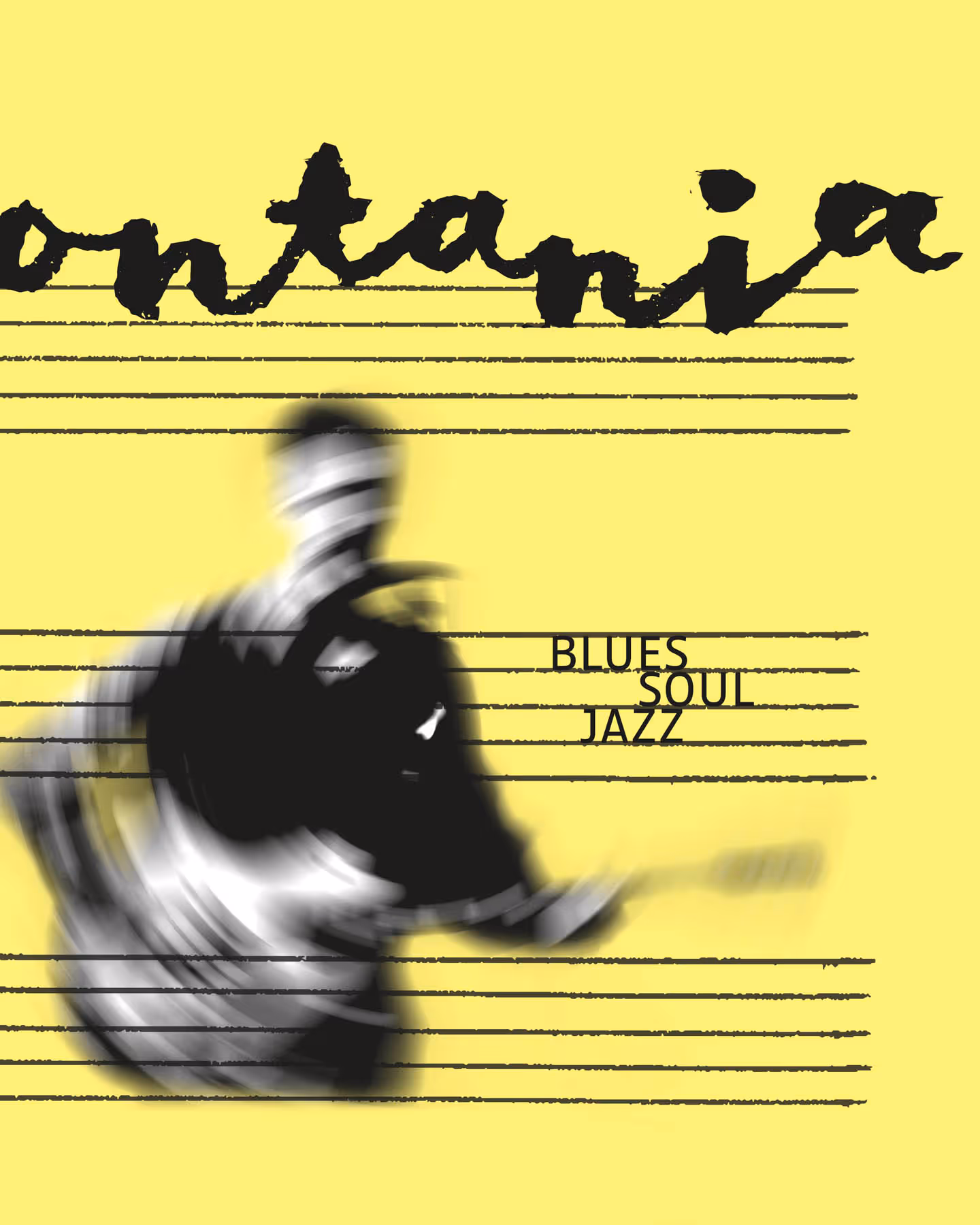
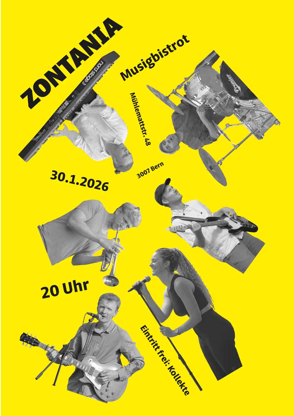
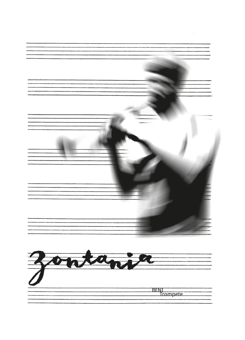
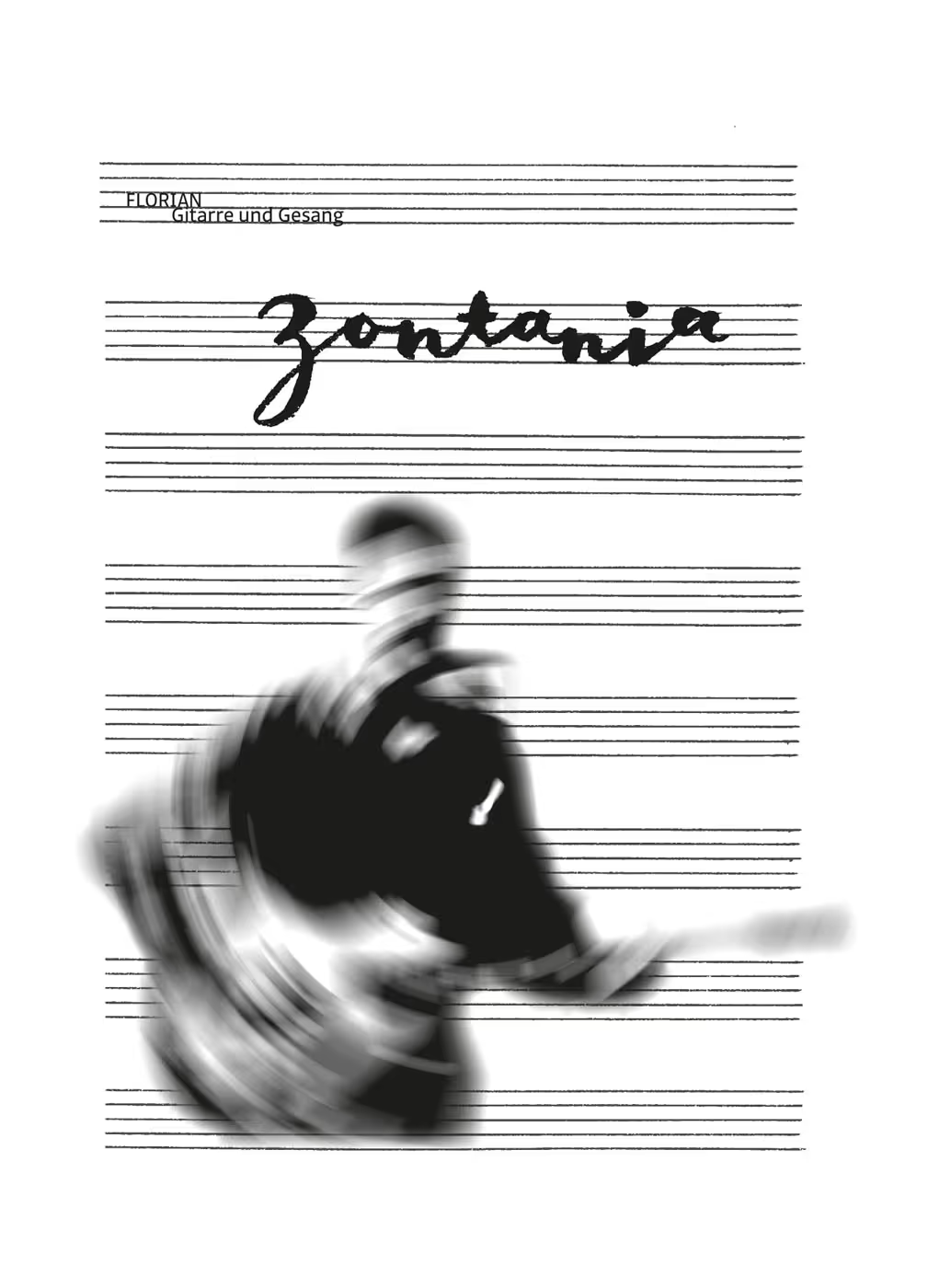
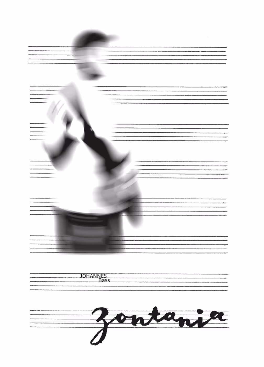
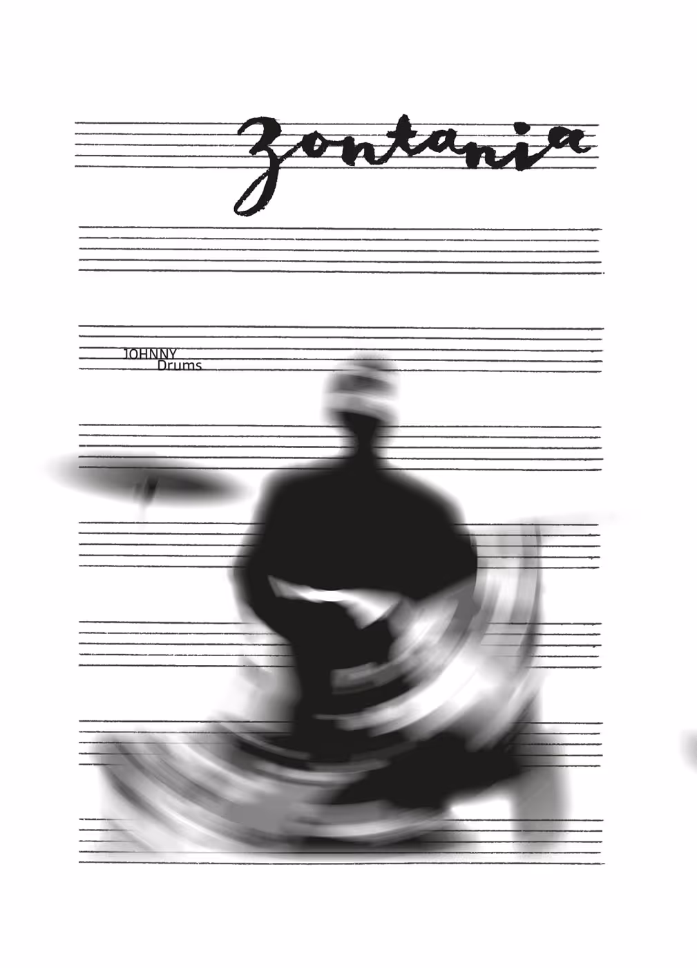
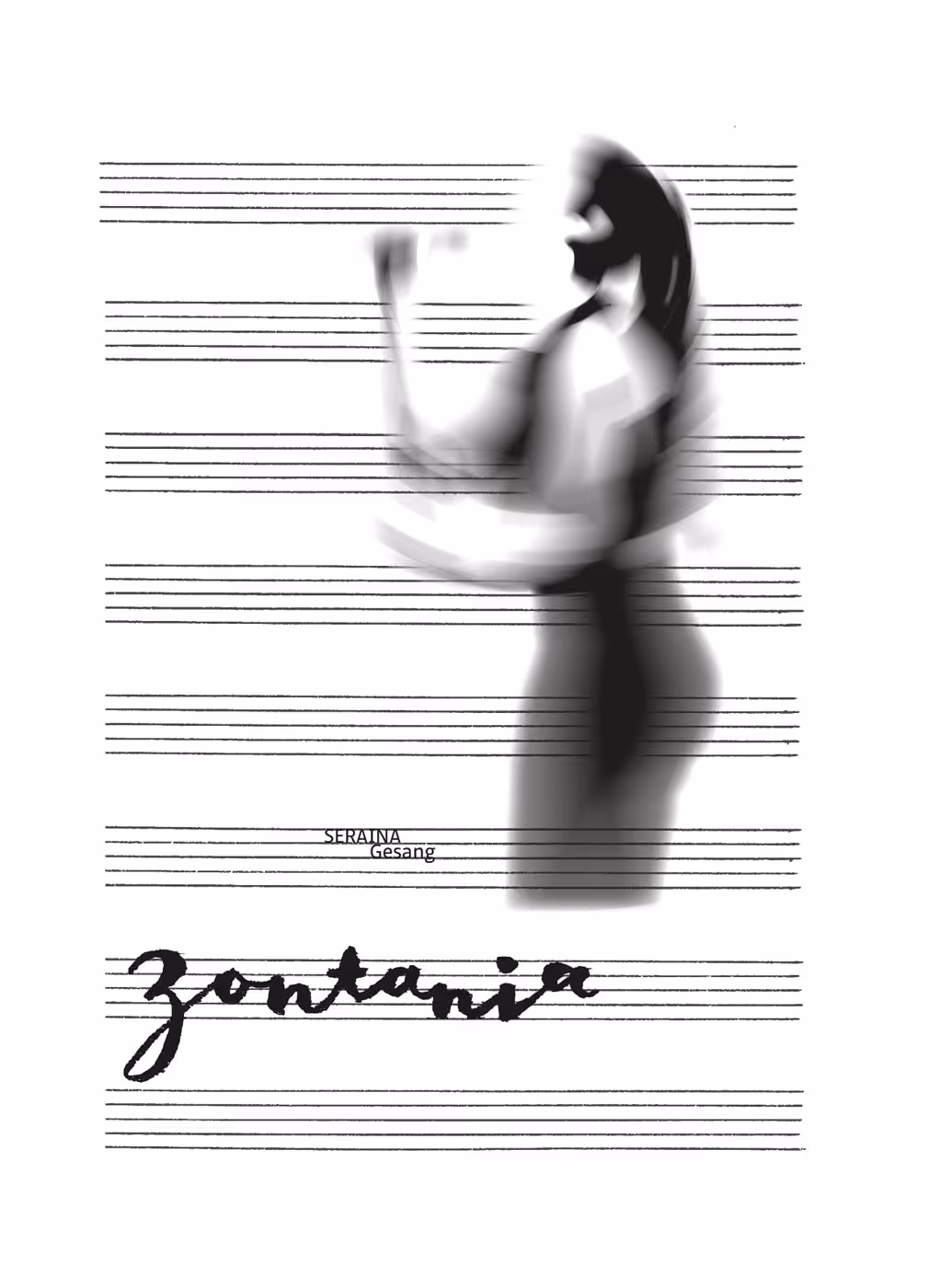
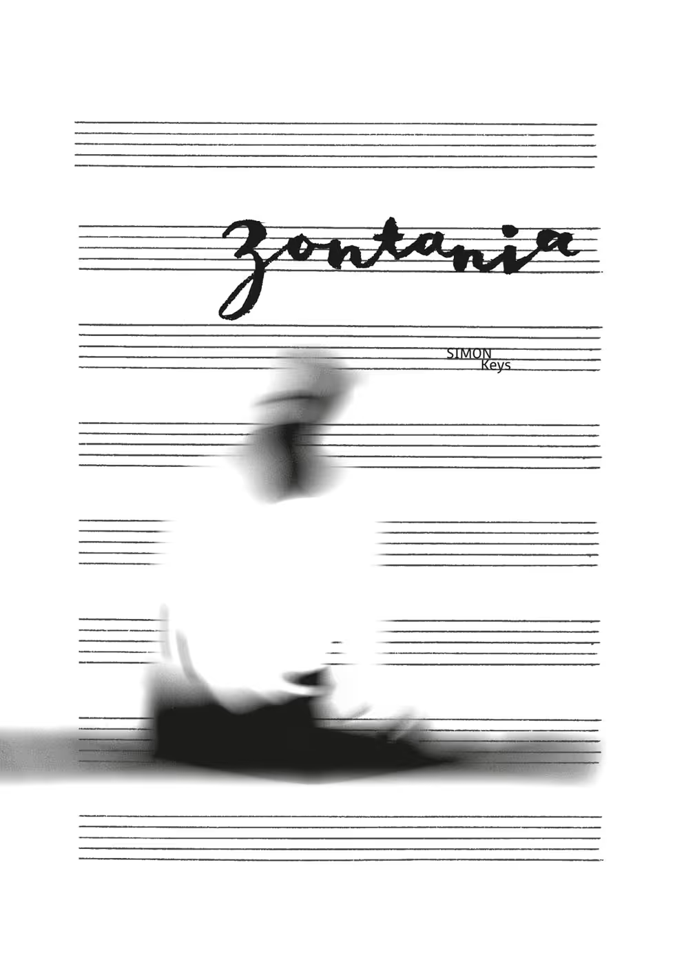
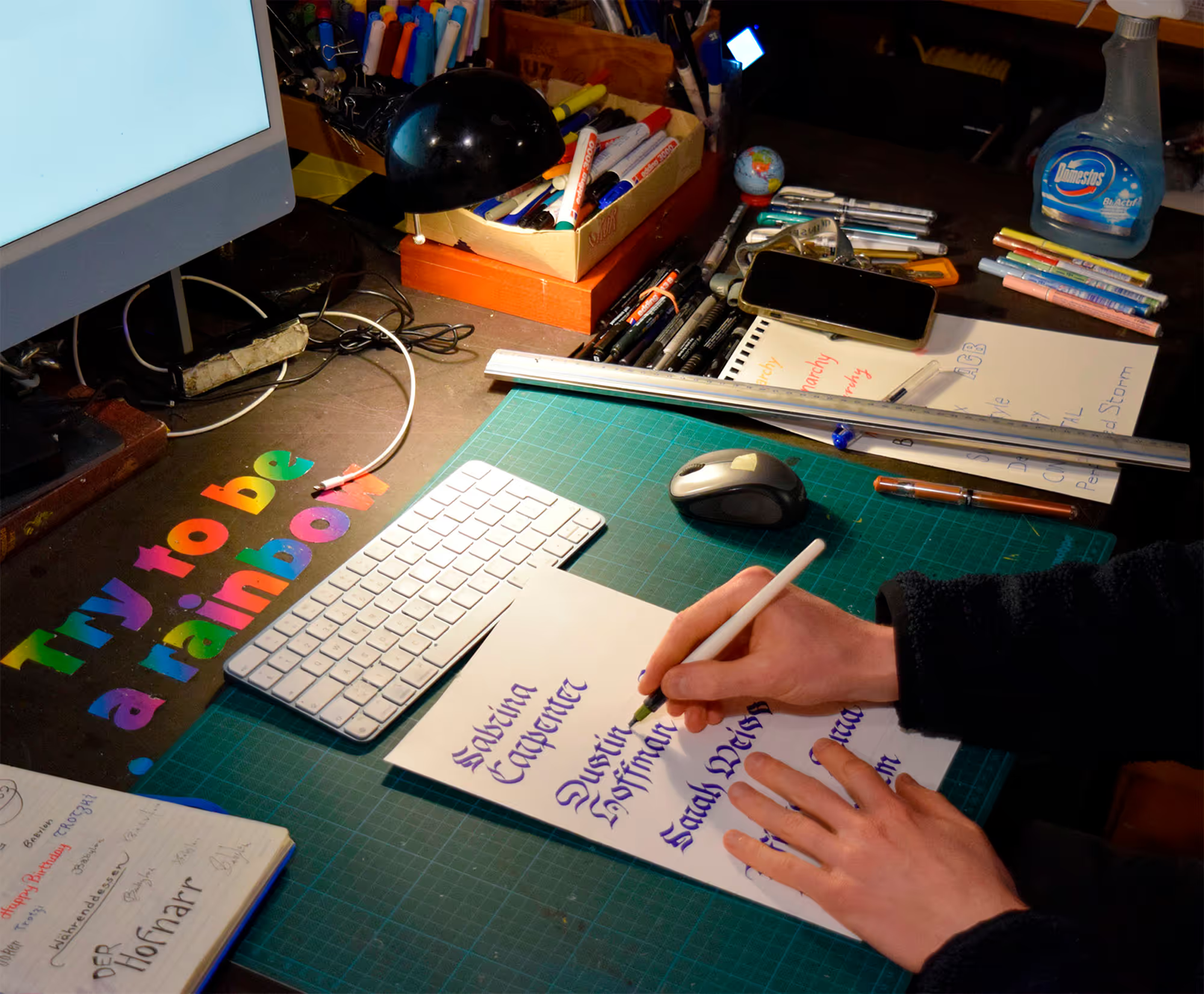
Individual band members

No items found.
Challenges & Solutions
×
Goals | Challenges | Solutions | Learnings
One challenge—one I had, in a way, created myself through the chosen concept—was integrating the entire band into a coherent composition without overcrowding the overall image. The airy yellow supports the negative space, while the dancing lettering adds a sense of lightness. Another challenge was translating the band’s sound and atmosphere into a visual language without falling into clichés. With blues and jazz, familiar motifs such as a guitar as a central element quickly suggest themselves. I wanted to step away from these conventions while still integrating recognisable elements such as musical staff lines. Finally, working with a six-piece band also meant it was not easy to meet all expectations and preferences. In the project “Zontania zum Zweiten,” I explore this topic further.
Read more …


.gif)
© MW 2026 | Made with ❤ in Webflow
“Of all the achievements of the human mind, the birth of the alphabet is the most momentous.”
Frederic Goudy