


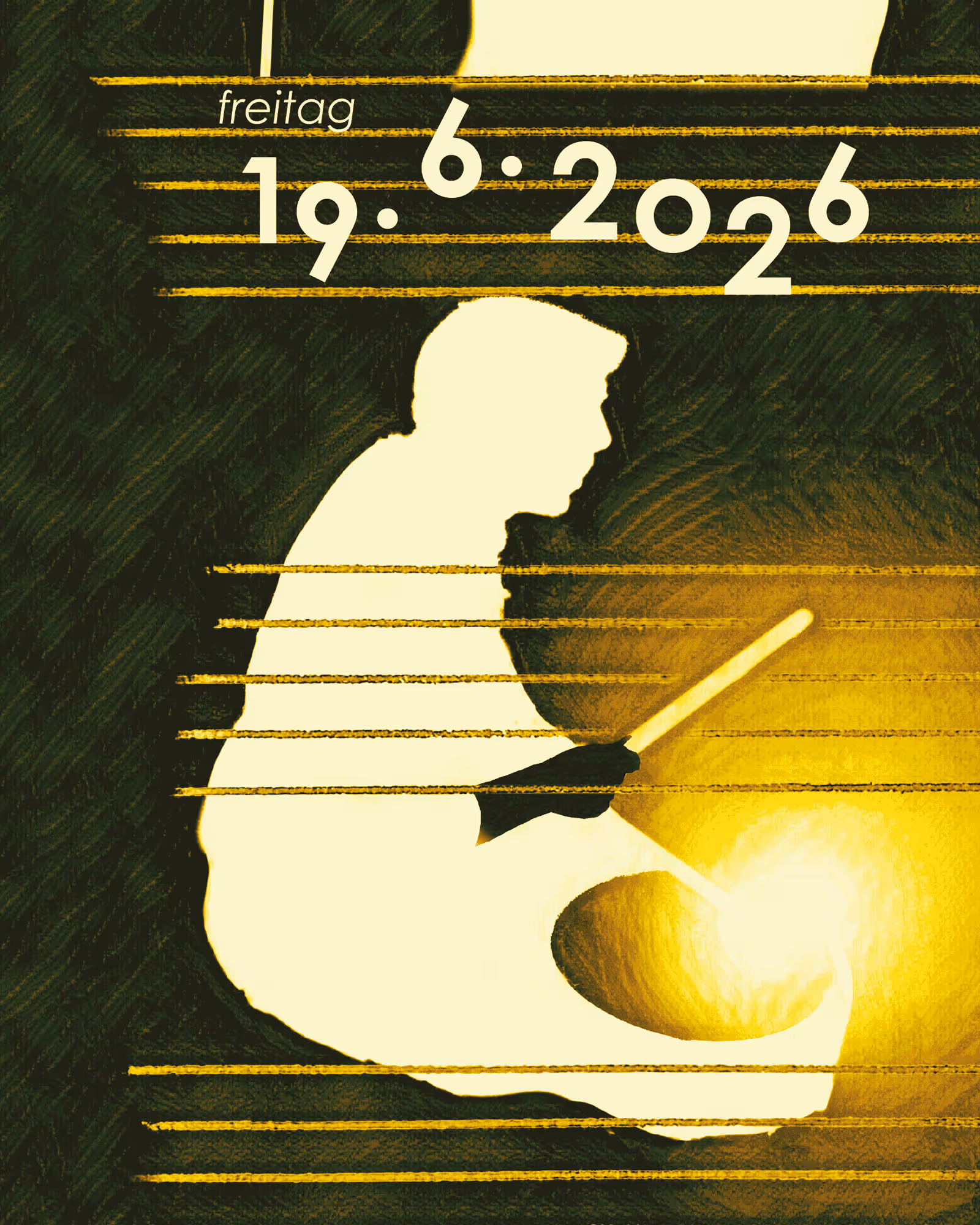
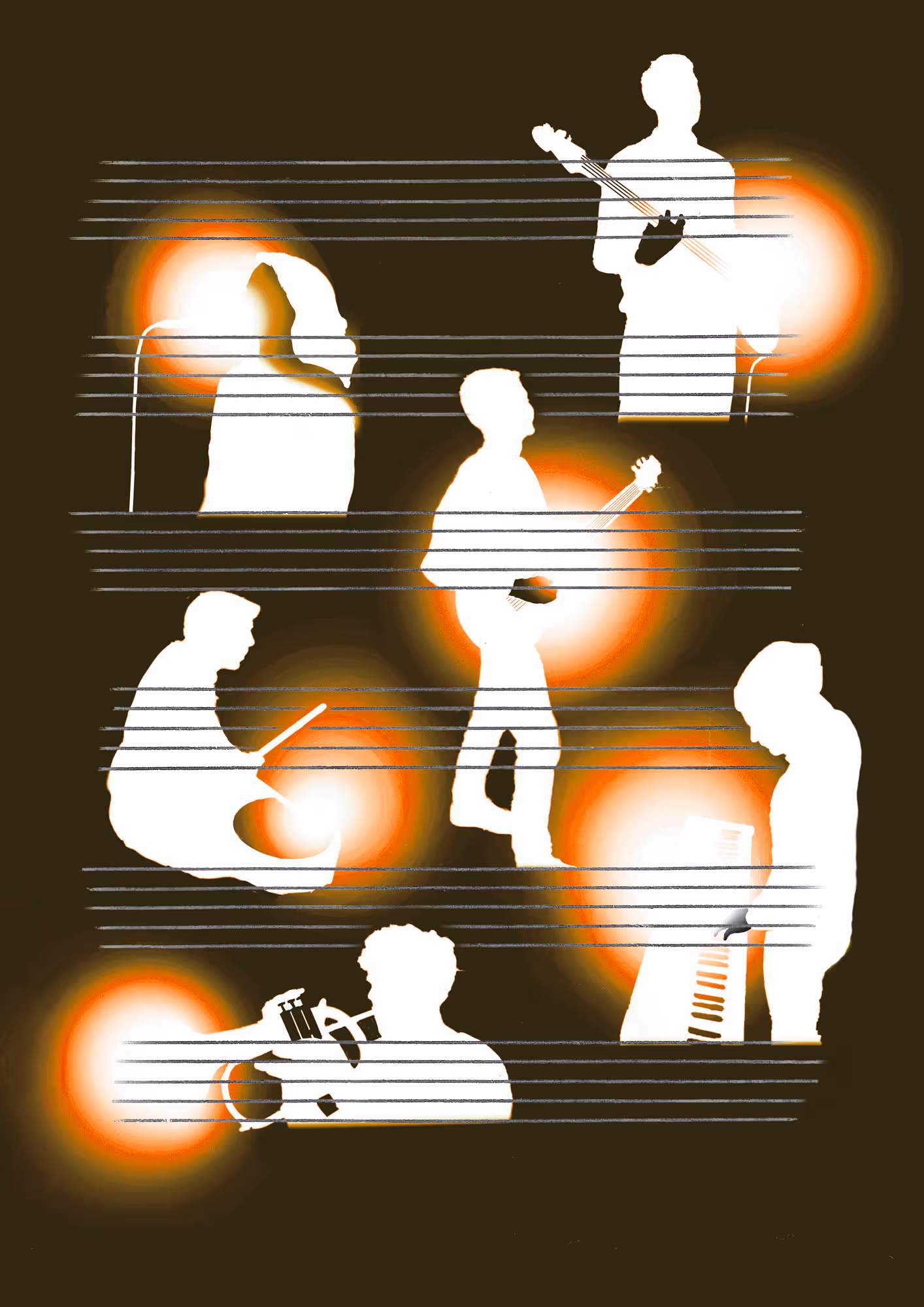
A2 poster close-up | Font in use: Century Gothic by Sol Hess

No items found.
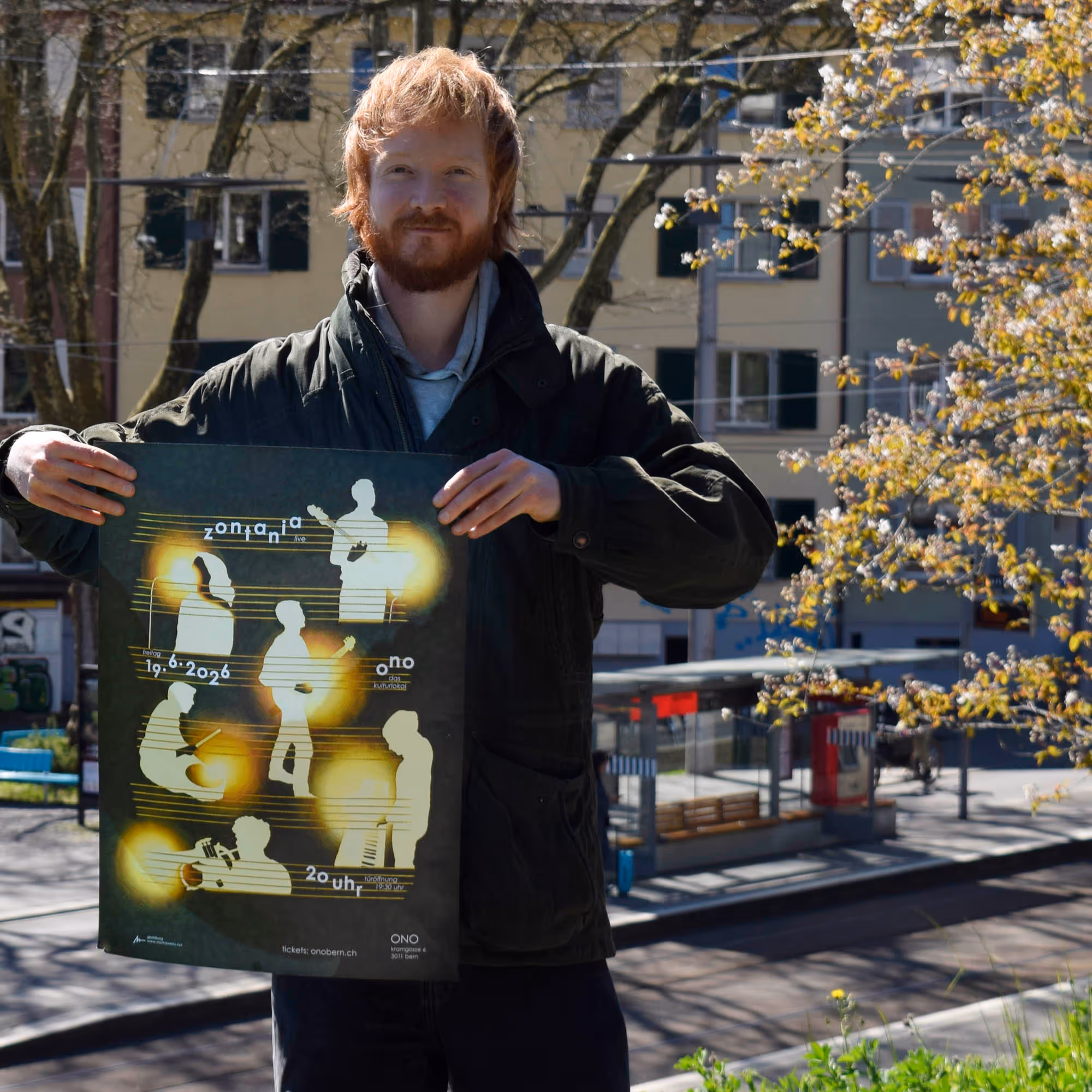
A6 flyer: While the A2 poster version needs to present all information at a glance, the A6 format allows the details to be moved to the back, giving the design more breathing space.


No items found.
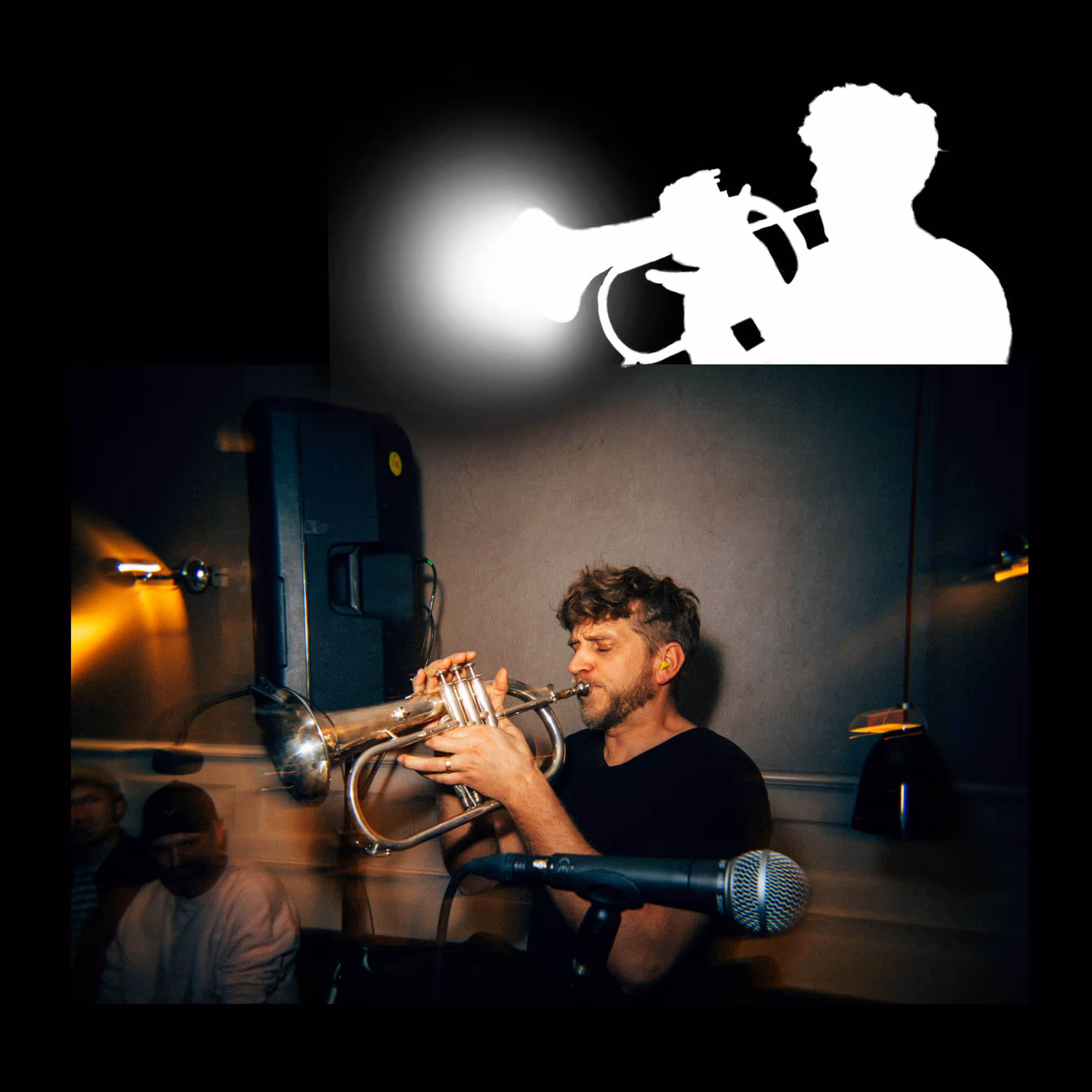
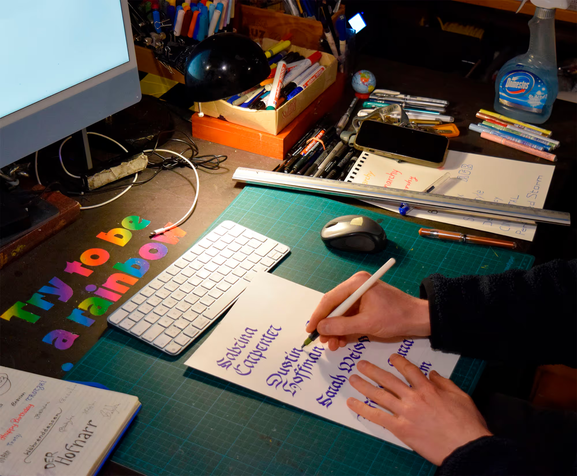
The stylized images were based on concert photos.


No items found.
Color variations

No items found.
The two sister posters (the smaller one in the top right, featuring fire, is part of the project ‹Archive: Flyers and Posters›)
Challenges & Solutions
×
Goals | Challenges | Solutions | Learnings
The same challenge arose as with the first poster in this series: bringing all six band members into a composition that feels both harmonious and dynamic. It’s important to be able to assess one’s own work critically; when I look at the poster closely—perhaps too closely—it feels slightly overcrowded and could benefit from more breathing space. I recommended the black-and-white version to the band, as it expresses the core graphic idea most clearly (see color variations). In the end, however, they chose a colored version with added texture. This touches on a common dilemma in graphic design: you provide multiple sketches or variations, often because clients expect it or to involve them in the decision-making process. And then you may end up not satisfied with the final choice. One might ask: why present options you’re not fully convinced by? The truth is, designers usually have an intuitive favorite. A notable perspective on this comes from the American designer Paul Rand: “At the heart of Rand’s philosophy was an […] unwavering belief in his expertise. He likened himself to a doctor or a lawyer, professionals who diagnose a problem and offer a singular solution. Imagine visiting a doctor and being presented with three potential diagnoses and treatments. It would instill doubt, not confidence. Rand believed that offering multiple design options indicated a lack of clarity or conviction in understanding the problem. It was his job, as the expert, to immerse himself in the client’s world, understand their challenges, and then craft a singular, well-informed solution.” *
*Source: JP Holecka. (2023, August 26) The Singular Vision of Paul Rand’s One-Design Philosophy. Medium. Visited on April 19, 2026, https://jpholecka.com/the-singular-vision-of-paul-rands-one-design-philosophy-acc26f308992
Read more …


.gif)
© MW 2026 | Made with ❤ in Webflow
“Of all the achievements of the human mind, the birth of the alphabet is the most momentous.”
Frederic Goudy